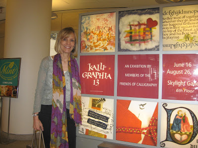
Kalligraphia 13

San Francisco Public Library

My whole family went with me to the opening reception for Kalligraphia 13 last Saturday!  Okay, I had to bribe them with lunch beforehand...but they were gracious and enthusiastic while I oohed and aahed over the amazing, varied, and outstanding work of my SF Friends of Calligraphy colleagues.


I'll never forget the thrill, six years ago, of seeing my Letters of Note exemplar displayed in the Kalligraphia 11 exhibit!  The show happens every three years, but I missed Kalligraphia 12 during the year I couldn't hold a pen due to adhesive capsulitis (frozen shoulder).  It was good to be back.

I came upon my piece, Grace, close to the entrance in a case right next to (gulp) the venerable Thomas Ingmire.  Susie Taylor--gifted calligrapher, Harrison Collection curator, and overseer of the exhibit---made sure I knew that show placement had to do only with where the pieces fit physically, not with comparative artistry.  Well, duh!  Lucky for me, they let anyone in...


Also sharing "our" display case was Ann Miller, who had been my teacher for a summer course in 2004 at the Academy of Art University, a fantastic overview of pretty much the whole history of calligraphy.  That foundation has served me well. Thank you, Ann!
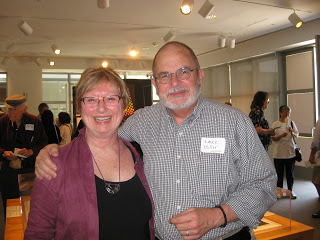
Ann & Lance Miller
Seems as if six years ago I was just getting going with pen and ink, a stranger in a strange land;  this time I was delighted at how many of the artists I knew, and how many of the pieces I had seen in process during various classes and workshops.  Case in point, Ruth Korch's Hyacinths for the Soul from the Liesbet Boudens weekend last August:
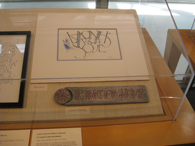
Ruth Korch (top)
I didn't attend the Lisa Engelbrecht workshop last summer but wish I had!  Here's Carla Tenret's piece on fabric:

Carla Tenret
I've never met Marsha Brady but I'm a big fan:
Marsha Brady 
A record 98 calligraphers are represented in the show.  If you're anywhere near the Bay Area before August 26, treat yourself to a visit.  If you go on a Saturday, you might catch a demo by one of the Friends of Calligraphy rock stars (see schedule here) from 2-4 pm.  In the meantime, you can see a lot more of the pieces in the album Raoul Martinez, talented calligrapher and ace photographer, has posted here!

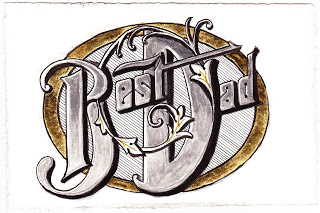
Best in the Business


Sweet discussion this morning over Father's Day brunch:  my kids say that not every "father" is a "dad", and theirs is a gem and definitely a "dad"!

Hence this doodle on hot press paper:  Pitt marker and brush pens, pewter Derwent metallic pencil, gold pen, and gold leaf over Instacoll.  And the debut of my section liner!  Any irregularities due to user error...

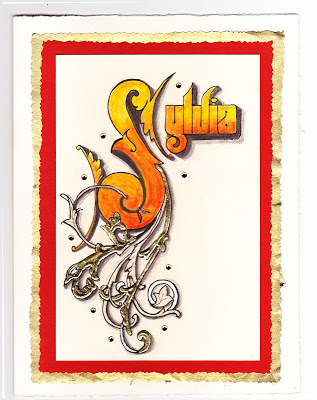
Sayonara Sylvia


A longtime colleague is departing at the end of this week, and it is bittersweet for her as well as for those of us staying on.  For some time, she has wanted to teach at the same school her children attend--which will significantly simplify her life, we hope--but she has been with us for many years and we all feel like family.

She loves orange, and wears it well.  I wanted to make a going-away card for her that expresses both her favorite hue and the fire within her that makes her so strong and ambitious!  Inktense pencils, lightly brushed with water, give a flame-like feeling.  For the ornamentation, I remembered learning from Harvest Crittenden how lovely it is to combine gold leaf and shell gold (see the halo in this post);  this is the "poor man's version" with gold leaf over Instacoll, and painted Finetec gold and silver.  I love the dimensional look it gives!

The shadows on the Sickels lettering are Zig gray suede (a heretofore under-appreciated brush pen that has patiently awaited attention in my studio) and HB graphite;  outlining is done with a fine-tip Pitt pen.  The paper is Crane's correspondence card, mounted on a piece of old greeting card (cut with deckle scissors), a piece of metallic gold (ditto), and a Fabriano Medioevalis card.  The final touch was a scattering of random crystals from Michaels, glued on.  Hope she likes it!

Engrossed in Graduation

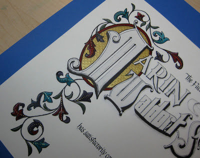
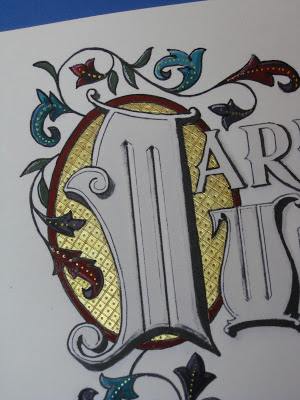
Once again I was delighted to be asked to design a diploma for the graduating class of the school my kids attended oh-so-long-ago, and to work with the parents on the illumination while the eighth graders were off on their class trip.  The Engrossing Saga I attended last fall was still very much with me, and I went for a kind of turn-of-the-twentieth century look with a twist: part color, part black-and-white.  

The idea is to keep it simple enough that the group can complete the painting in a three-to-four-hour crash course in engrossing.  The design was hand-drawn (Sickels alphabet), calligraphed (Johnstonian Italic), scanned and cleaned up in Photoshop (both twenty-first century luxuries), and inkjet-printed on New Diploma Parchment, whose praises I must join the chorus and sing!  I inscribed the names in Copperplate with Moon Palace Sumi, chose a gouache palette and mixed the colors.  For the gold we used Spectralite, which held up nicely to burnishing and tooling.  Outlining was done with a fine black Pitt pen, and leaf vein dots with a gold gel pen.


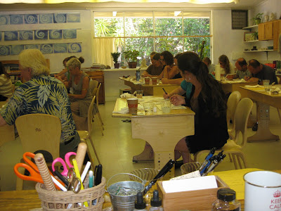
We settled into the classroom for a Sunday afternoon and several hours later...


...nineteen diplomas, ready for signatures!


It always amazes me to think that one could actually make a living as an engrosser back in the day!  If only I'd been born in the 1800s--and male, of course--this would have been the profession I aspired to.  Sigh.

A Sphinx @ Sixty


So, I turned 60 today!  I'm feeling pretty great about it, despite a young mom at work telling me she couldn't believe I was that old because I'm so "spry".  Ouch.

Anyway, I've had a great day, taking off from work and spending the morning in San Francisco to visit the stunning Cult of Beauty exhibit at the Palace of the Legion of Honor which includes, among multitudinous other treasures, many original William Morris drawings, fabrics and wallpapers.  More peacock feathers and acanthus leaves than you can shake a nib holder at!

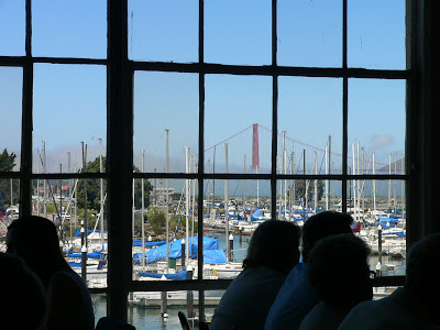
Afterward, at the legendary Greens for lunch, we enjoyed great food and a great view (yep, that's our Golden Gate Bridge, turning 75 on May 27th...and I guess she's pretty spry too).


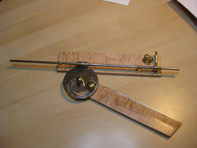
Then my sweet husband presented me with THE coolest gift ever!  You can tell you've been with someone more than half your life when he knows you would be over the moon to receive one of these:


Whatever is it, you might ask?  (The waiter at Greens did!)

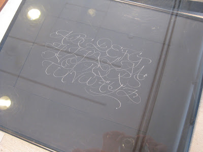
Well, have you ever wondered how the old penmen did those amazing perfectly-spaced lines for shading and definition in black-and-white, like this

or this?

Bookplate, 1900

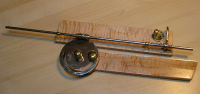
Many used a now-antique drafting tool called a Sphinx Section Liner, also known as a parallel ruler.


They've been very hot items on eBay since pointed pen people caught on to them, sometimes going for several hundred dollars apiece.  Michael Sull demonstrated one (which had been a gift to him from Harvest Crittenden) at the Engrossing Spencerian Saga last October.  I showed Bob Hurford's write-up on the subject (IAMPETH Penman's Journal Summer 2010) to Bruce and he was fascinated with how it worked.  Who knew what he was doing out there in his shop these last few weeks?

Is it not a thing of beauty?!?  Gorgeous, smooth-as-silk fiddlehead maple and elegant brass parts, the straightedge raised just enough to avoid smudging, and finished off with a beautiful engraved plaque.


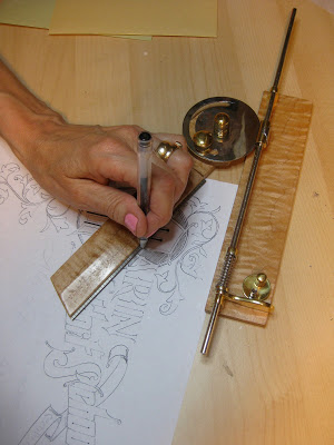
Of course I had to try it out as soon as we got home!  The old masters would have used a ruling pen (another must-have drafting tool) but I went with a G-Tec for my first try.  In the photo I'm kind of using it upside-down and backwards, but as Sheila Waters is fond of reminding me, we left-handers 'have to figure out our own way of doing things'.  Of course, it works perfectly!  And I will treasure it always.


I think sixty might be my new lucky number.

Top Brass

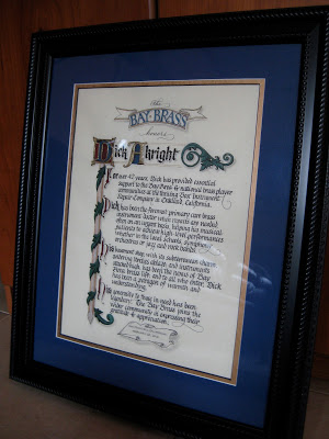
Finished size approx. 12" X 16"
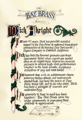
The GRAMMY-nominated Bay Brass (has a nice ring to it, does it not?) had organized a concert to honor the recently-retired repairman who has kept their horns--and those of most brass players in the area--in working condition for many years, and to benefit a music camp scholarship fund in his name.  Last-minute scroll request + free design reign + school vacation week = BLISS!  On break from my day job (only job, actually...), I barely left the studio for ten days;  my sweet husband kept me supplied with liquid and solid refreshment while I put to use some of the techniques I have learned in classes these last several years!

As I've said before, Pergamanata paper is a dream for corrections and that's my kinda paper!  I did have a little trouble with the brushed Finetec metallics buckling and flaking off the page, but after a brief consultation with the inimitable Heather Held (thanks, Heather!) I played around with the thickness and that seemed to do the trick.  Next time I would probably pre-treat with gum sandarac, another of her great suggestions.

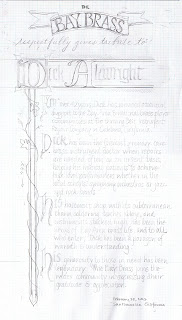
My initial sketch (full-size):


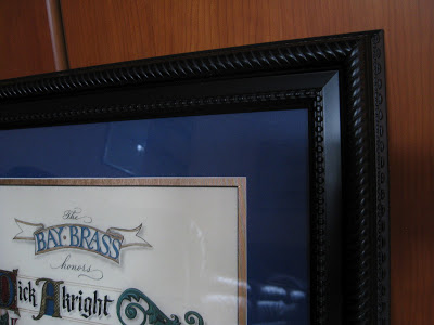
As usual--and especially since this was a hurry-up job--I planned for it to fit in a standard-sized frame (in this case 16" X 20") from our local craft store.  With my trusty compact mat cutter I double matted it in blue and gold, 2" and 2-1/2" respectively.


Tools and supplies:  Moon Palace sumi; 23k gold leaf; Instacoll; gouache; Finetec gold and silver; Derwent graphite 3B; Zebra G pointed nib; Brause 1mm, 1.5mm and 3 mm;  Micron pigma 005; Uniball signo .18; Copic multiliner .03; Neopiko Line 2 005;  Pergamanata heavyweight paper.  And last but certainly not least:  X-acto knife with #4 stencil blade and Faber-Castell Perfection 7058B eraser!

Handwriting on the Wall Vol. 3


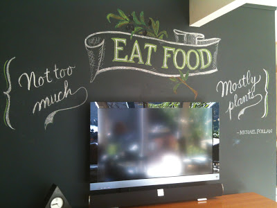
I am having so much fun with chalk on this big blank wall!  Of course, that pesky TV is in the way but I just view it (so to speak) as a design challenge.  This quote from Bay Area icon Michael Pollan's In Defense of Food: An Eater's Manifesto is a seven-word rule-of-thumb for taking care of ourselves.  (By "food" he means real food as opposed to "edible food-like substances"...).  

To this he has added some new rules in his new illustrated version of Food Rules: An Eater's Manual:  "Give some thought to where your  food comes from."  "If you're not hungry enough to eat an apple, then you're probably not hungry."  "Place a bouquet of flowers on the table and everything will taste twice as good."

Of course this does mean we have to close our eyes when we're packing away a pint of mocha chip...

Puttin' on the Glitz

So a while back, I mentioned that I had done some lettering for a group my husband plays in called the Bay Brass, and that they had been nominated for a Grammy, and that of course we didn't get to go to the awards.  Well, guess what?
Unfortunately, they didn't win, but it was amazing and very far from the universe I inhabit.  A once-in-a-lifetime experience!

Here's the screen projection when their category was announced at the pre-televised ceremony--they're at the bottom.

Here's the adorable Taylor Swift presenting at the televised ceremony...and the pink arrow is pointing to Sir Paul McCartney!


Nothing to do with calligraphy...but thought I'd share it nonetheless!

Handwriting on the Wall


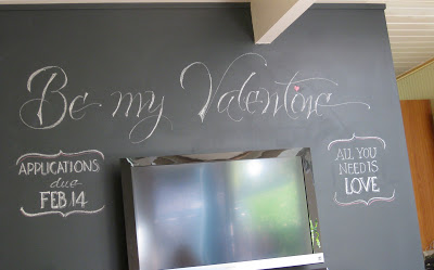
Finally got around to taking down (well, actually just erasing) the Christmas "graffiti" I had done on the almost-black family room wall.  But then it looked kind of empty, so I decided to kick off the next holiday with some more doodling.  Though I have neither the time nor the talent to "chalk up" like the amazing Dana Tanamachi, I find her work inspiring and a whole bunch of fun!  Check out her time-lapse videos here!

Penwork Where You Find It

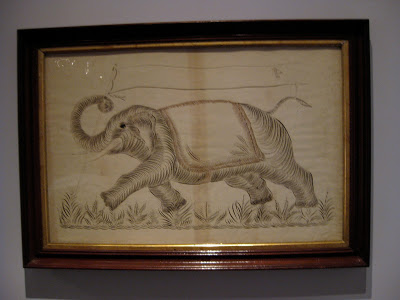
"Elephant with Banner", Anonymous
Colby College Museum of Art
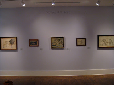
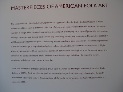
The first time I attended Parents' Weekend at Colby College in Maine, I made sure to visit their impressive art museum, one of the finest on any campus anywhere.  I was amazed and delighted to find several examples of penwork hanging proudly in their American Folk Art exhibit.


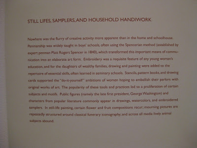
They even mentioned old Platt Rogers Spencer!  Pretty cool, I thought, since I had just come from the Spencerian Saga...


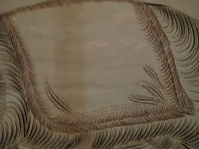
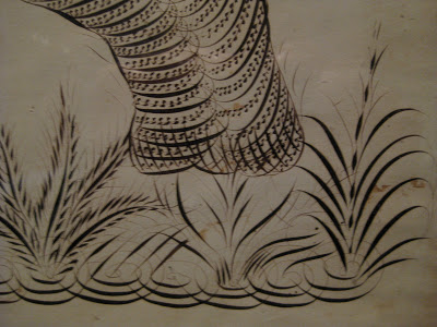
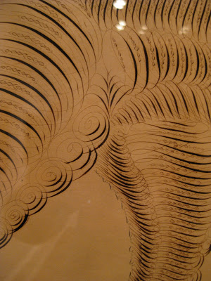
Some detail on that elephant:


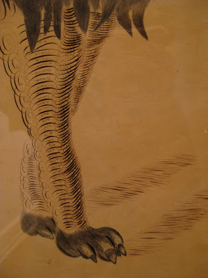
Then there's the King of the Jungle:


"Lion", C.L. Horton
Colby College Museum of Art


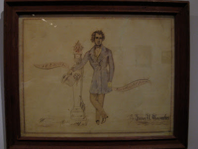
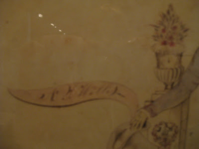
And finally, a memorial piece by James Macomber.  Apologies for the blurry photos....


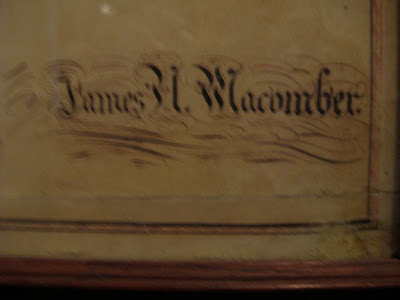
"Mourning Picture of  N.L. Willis", James H. Macomber
Colby College Museum of Art
 The artist rendered his own name in Masterpiece Flourishing!


"Done with a steel pen"

A lovely visit all around!


The Way I See It

©2011 Jody Meese
We lettering-type people see things a little differently sometimes.  This was a design I'd had in mind for some time, and finally got together for a Christmas gift this year.

A couple who are some of my dearest friends have these names that a) work in crossword form, and b) are perfectly symmetrical when they do. Amazing!  First I drew the letters in Roman caps with a pointed pen, then the ampersand with a broad nib, then mashed them up on PSE9 (BTW the stuff I learned in Harvest Crittenden's"Photoshop for Calligraphers" online class saved me countless hours this holiday season--take it next time it's offered!).  The finished design was uploaded to zazzle and applied to a set of lovely and useful sandstone coasters.
©2011 Jody Meese
(Of course, etched on glass and without the ampersand, the design would be completely reversible!  I'm just saying.  Welcome to the calligrapher's mind...)


Christmas Past

Christmas chalk graffiti in the family room
The photos are a little impressionistic, just like our memories of last night:  twenty-four places set for family and friends...
The Gold Table
The Red Table
The Holly Table
...good food, good wine, good cheer...hugs and happy conversation...enthusiastic singing of carols...saying "farewell" to guests as they drift off into the frosty night...


...and before sleep, a few quiet moments to reflect upon these very special people in our lives, and on what it means to celebrate this beautiful season with them.  May the spirit of Christmas stay with you all year long!

Among Friends


Last summer at the wonderful Liesbet Boudens class sponsored by the Friends of Calligraphy in San Francisco, I was lucky enough to once again share a table with the inimitable Ruth Korch.  As usual we had w-a-a-ay too much fun, and toward the end of the workshop, our esteemed FOC President Meredith Klein approached us about collaborating on the cover and alphabetical headings for the new membership directory, specifically in a Boudens-inspired style.  I'm much too busy preparing for Open Studios, said Ruth; I'm much too busy getting the school ready to open, I said;  then, Okay, we surprised ourselves by saying.

Ruth, always full of ideas, immediately started making thumbnail sketches and drawing a few stylized letters.  Within a week or so she had come up with a complete, gorgeous, quirky and fun alphabet, part of which is shown here:

© Ruth Korch 2011


With such a great starting point, it only took about a hundred drafts (instead of the usual two hundred) for me to put together the titles.  I love that the cover is hot, hot pink!  On the title page it's black & white and a little smaller:


Even without the privacy blur, Ruth's letters practically dance right off the page!


Thank you, FOC, for giving us the opportunity to work together on a very special project!


My Brush with Greatness


What is it about white on black that makes lettering look better than it is?  Kind of like candlelight that way.


Earlier this year I was asked to make some signs for a local chamber ensemble, the Bay Brass.  They were performing at the San Francisco Conservatory of Music to celebrate the release of their CD "Sound the Bells", a labor of love eight years in the making. 


Little did I know at the time that the CD would go on to be nominated for a Grammy! Since my husband plays in the group, my first thought was--do we get to go to the awards?!?  But I think the classical small ensemble awards are probably handed out the night before, maybe in the basement, or the parking lot...drive-by...oh well.  Lady Gaga will have to wait to meet me.

Anyway, you can hear samples of, and/or purchase, this amazing recording here, along with their Christmas album which is awesome and has been a favorite for over ten years.  Be sure to mention you know their calligrapher...

Calligraffiti


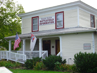
While researching annotations for my great-great-grandfather Charles' Civil War diary, I followed up on his reference to Brandy Station, Virginia, where he was sent in April of 1864 for medical care ("a rather poor place for a sick man," he declared).

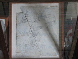
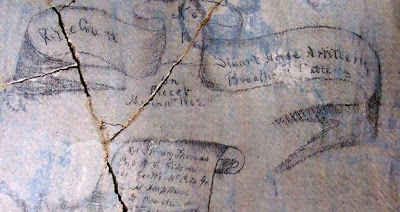
It turns out the building in which he would have received treatment is now known as the "Graffiti House", because the walls of the second floor contain inscriptions, drawings, messages, and signatures of Civil War soldiers that were concealed under wallpaper, etc. for many years.  The graffiti, according to the Brandy Station Foundation website,  "could have been made by soldiers recuperating in the hospital, by other soldiers posted at Brandy Station, or by soldiers passing through the town."  There are signatures, drawings, and of particular interest to engrossers (check out that shading!), the "Maryland Scroll".  At one point the scroll was removed from the house and acquired by a private collector, but later returned to the Graffiti House in its frame.


"Maryland Scroll", Graffiti House, Brandy Station VA

"Maryland Scroll" detail, Graffiti House, Brandy Station VA

The building changed possession from the South to the North, and a Union soldier made his mark thusly:
"Army of the United States of America", Graffiti House, Brandy Station VA
Love the flourishing!

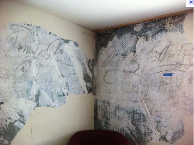
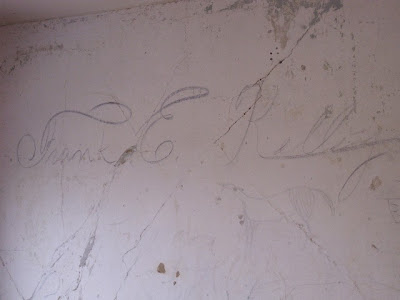
About a year ago, a stabilizing process was begun on the plaster walls and lo and behold, another signature was uncovered.  This is what Michael Sull might call "pedestrian Spencerian", but I think the "F" and "E" caps are pretty cool!  I'm guessing they are about a foot tall.

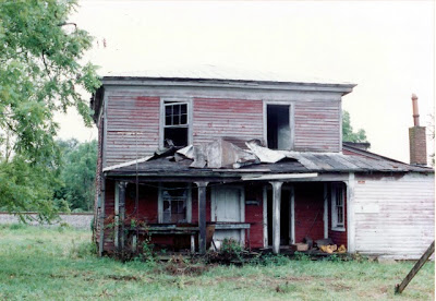
  I find it inspiring that at one time, handwriting was a skill that many could do so beautifully, even in pencil on a plaster wall.  By the way, here's what the building looked like when the Foundation acquired it:

Cheers for the preservationists!

The Saga Continues

One of the highlights of October was my third visit to Geneva-on-the-Lake, Ohio for the Spencerian Saga.  The sunset over Lake Erie the first night could not have been more welcoming.


This year it was the Engrossers' Saga--a once-every-five-year occurrence--and the 25th anniversary of the annual workshop.  I've already said plenty about the Saga here, but this one seemed to bring together a lot of things I had been dabbling with and helped me see how I could put them to use in a cohesive piece.  Stay tuned for that one...

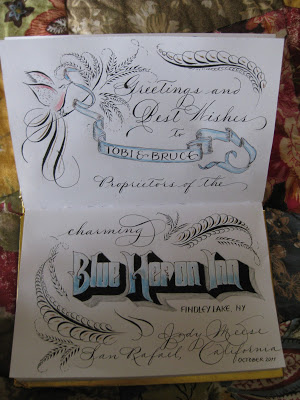
From Ohio I went to meet my sister at my beloved Findley Lake, New York, to stay at the Blue Heron Inn bed-and-breakfast...in the Lakeview Room, of course!


I decided to put some of my new-found skills to work as I signed the guestbook.  Maybe no one will ever see it, but I love knowing that it's there!


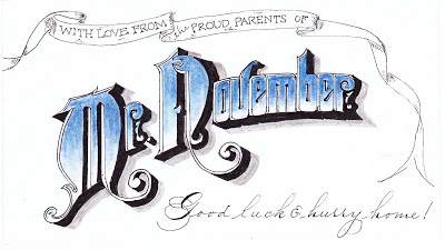
Back home, while messing around on the internet I discovered that my son had been named "Mr. November" at his college back East.  Not sure what that's all about, but used it to adorn the 3 X 5 card that will be enclosed with his exam-week care package:


Onward to December...!

Finding Light in the Darkness

Photo by Steve Johnston

At the little school where I am Director (i.e., administrative staff of one), we have a wonderful annual tradition called the Lantern Walk.  In the weeks leading up to the event, the teachers help the children craft beautiful little square lanterns out of watercolor paper with tissue-paper star-shaped windows.  A little tealight is glued into place and the families search for a Y-shaped stick to hold the lantern.  We practice our four traditional songs (which the children are usually too awestruck to actually sing at the festival) and then all of the families gather just after dark on a Sunday evening as we approach the Winter Solstice.  They are greeted with several hundred luminarias (candles set in sand in white paper bags) showing the pathway.  Being as quiet and reverent as possible with three-to-five-year-olds in attendance, we proceed with our lighted lanterns to a large field, where we stand in a circle around a small bonfire and sing.  Simple, short, meaningful and memorable.

It is my job to "make the call" if the weather is questionable, often a source of agony and stress.  Sometimes I have decided to go ahead, only to be greeted with a downpour moments before the families arrive.  Other years it has been so windy that there was no hope of keeping the lanterns lit.  Usually we manage to get through it with whatever weather northern California provides.

But every once in a while--and this was one of those times--it is absolutely perfect, and just magical.  The night before, there were torrential rains--I mean drenching downpours--and there didn't seem to be any chance it would be happen tonight.  BUT...the weather was progressively clearer, and by the time I had to decide (2 pm) it felt right to say yes, yes we will go ahead.  It turned out there were a few clouds, and a little wind, but a lovely bright three-quarter moon and a little nip in the air.  One of the best years ever.


The last time it was this special,  one of our parents was inspired to write a poem, and I was moved to letter it.  


Poem by Daniel Polikoff
Artwork by Jody Meese


Poem by Daniel Polikoff
Artwork by Jody Meese

Poem by Daniel Polikoff
Artwork by Jody Meese


This was done some years ago, so I don't remember much about the details. I believe it was Doc Martin's bleed-proof white, and I recall sponging on the moon and sprinkling salt on the blue paint to make the starry night.  The little yellow blobs, of course, are the children's lanterns in procession.