Belated Bunnies
Easter was weeks ago but I'm just getting around to sorting out photos. My dear friend Kathleen sets a beautiful table for every holiday, and since I'm not much of a cook, my contribution is always place cards. I fell in love with these and the tutorial, with template, here.
I used carnations for the tails (so sweet smelling!) but roses would be cute too.
The stem on the back side holds the bunny upright. They were a big hit!
Summer Fun in the Family Room
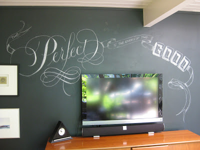 |
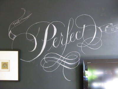
| "The Perfect is the enemy of the Good." ~Voltaire |
I thought I'd share a bit of process this time. I started with a little doodle on a graph-paper sticky note; as usual, television = design challenge.
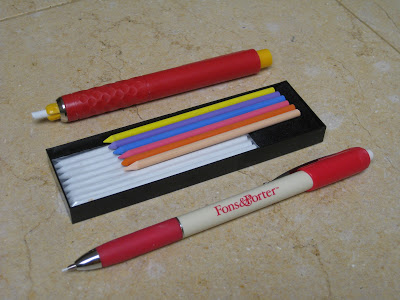
Although the finished project is done with dime store chalk, for some reason it was hard for me to get started with such a blunt tip. Enter two handy tools, both marketed primarily to quilters:
I started out sketching with the Fons & Porter...
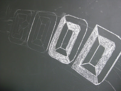
Then defined lines a little more with the chalk pen:
Gradually I filled in and tweaked:
Engrossed in Graduation
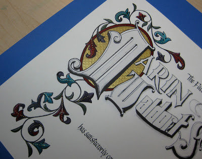
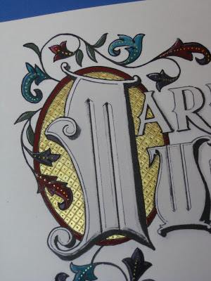
Once again I was delighted to be asked to design a diploma for the graduating class of the school my kids attended oh-so-long-ago, and to work with the parents on the illumination while the eighth graders were off on their class trip. The Engrossing Saga I attended last fall was still very much with me, and I went for a kind of turn-of-the-twentieth century look with a twist: part color, part black-and-white.
The idea is to keep it simple enough that the group can complete the painting in a three-to-four-hour crash course in engrossing. The design was hand-drawn (Sickels alphabet), calligraphed (Johnstonian Italic), scanned and cleaned up in Photoshop (both twenty-first century luxuries), and inkjet-printed on New Diploma Parchment, whose praises I must join the chorus and sing! I inscribed the names in Copperplate with Moon Palace Sumi, chose a gouache palette and mixed the colors. For the gold we used Spectralite, which held up nicely to burnishing and tooling. Outlining was done with a fine black Pitt pen, and leaf vein dots with a gold gel pen.
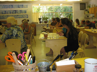
We settled into the classroom for a Sunday afternoon and several hours later...
...nineteen diplomas, ready for signatures!
Grace Under Pressure
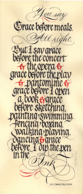 |
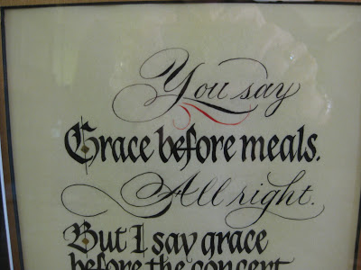
| "Grace", original size approximately 8" X 18" |
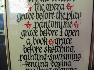
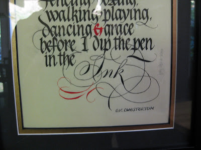
It truly has been a gift to have access to Ward & Linnea's wisdom and expertise these last four-and-a-half years at their monthly Saturday "Black Sabbath" classes in San Francisco where we explored Textura, Batarde, Uncial, Johnstonian Italic (aka Pointed Gothic)--in short, all things Blackletter. Very early on, after Ward made some jokingly snide remarks about Pointed Pen People, I sent them a New Years card I had designed in Spencerian, knowing that I was "outing" myself as a PPP. They both responded with one of their famous postcards, enthusiastically encouraging me to work with the two styles "for ultimate contrast", and encouraging me to "look to your Bickham". "Be the one," wrote Linnea, "to combine the two with panache." I've never forgotten that, and have always been grateful.
At every Black Sabbath class we painstakingly ground our black Chinese stick ink, and occasionally used Chinese vermillion for electric red accents. With this piece I wanted to stay faithful to that. I had originally planned to illuminate the "G" but in looking at my roughs, Linnea encouraged me to keep it simpler. The diamonds on the G and B are gilded.
When Sheila Waters was in town earlier in the year, she had shown us her latest work on Pergamanata paper, singing its praises and vellum-like qualities, in particular the easy correctability. I decided then and there it must be the paper for me, and although it took some getting used to, I am now a devoted fan. It is not at all as mottled looking as in the scan above, and it seemed able to take endless scraping and erasures without complaint.
As I said, there was a deadline involved and with understanding friends and a supportive spouse, I holed up in the studio for days, finally coming through with a piece I could live with, then cutting mats for it and popping it into a frame for the show. I'm looking forward to seeing my classmates' work and getting together one last time; we've all come a long way in 4+ years and there is some amazing and varied talent in the group. It's been a great run and I'm very sad it's over.
Copperplate Goes to Washington
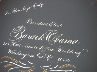
 My storyteller friend Anita had a dream: to tell an African folk tale at the Presidential Inauguration in January of 2009. She had been a passionate campaigner for him, and she wanted to do everything she could to get Obama's attention to her proposal. So she asked me to address an envelope to him and do some offhand flourishing on the folder that contained a copy of the story.
I believe the envelope was actually a "Presidential blue" color, not black as it appears here. The script is Copperplate, or Engrossers' Script; the inks are Dr. Ph. Martin's Bleedproof White and Spectralite gold.
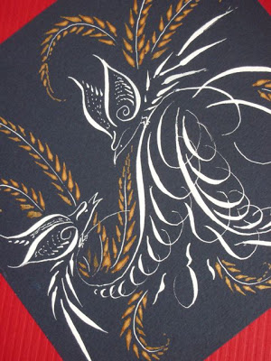
I did three different outer envelope styles and let her choose. This is the one that went to Washington...
...but alas, no response! But as Anita's grandma told her, "The only failure is not trying!"
Mixed Meta-forms
Bickham on Bamboo?
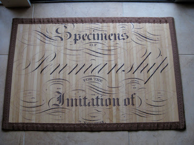
Look what I found yesterday in Columbine, a little local gift shop! It's a bamboo floor mat about 2' x 3' in size, made for indoor use. There's another design you can see here. Presumably the artwork is taken from the cover of a handwriting text (unfortunately the binding partially obscures the last word, "youth"), could be Bickham Sr. or Jr., (or any number of other penmen) and features pointed pen, Roman, and blackletter styles blended artfully and flourished beautifully. Perfect for my studio!
