Engrossed in Graduation

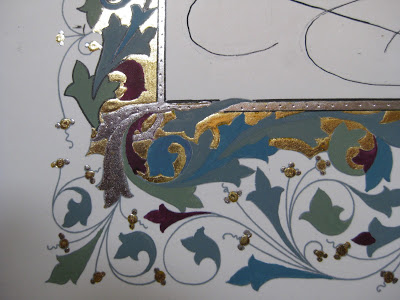
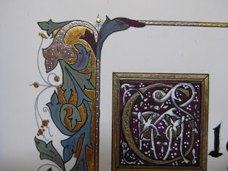
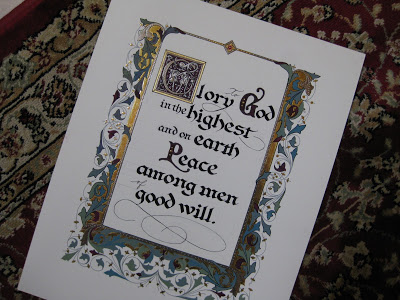
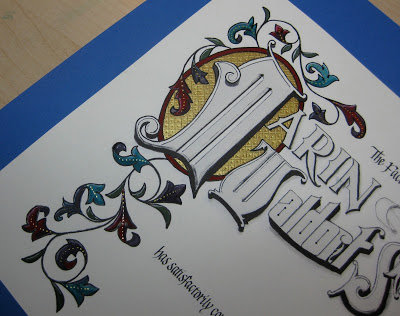
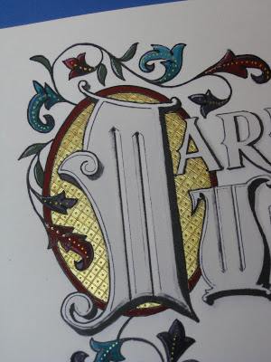
Once again I was delighted to be asked to design a diploma for the graduating class of the school my kids attended oh-so-long-ago, and to work with the parents on the illumination while the eighth graders were off on their class trip.  The Engrossing Saga I attended last fall was still very much with me, and I went for a kind of turn-of-the-twentieth century look with a twist: part color, part black-and-white.  

The idea is to keep it simple enough that the group can complete the painting in a three-to-four-hour crash course in engrossing.  The design was hand-drawn (Sickels alphabet), calligraphed (Johnstonian Italic), scanned and cleaned up in Photoshop (both twenty-first century luxuries), and inkjet-printed on New Diploma Parchment, whose praises I must join the chorus and sing!  I inscribed the names in Copperplate with Moon Palace Sumi, chose a gouache palette and mixed the colors.  For the gold we used Spectralite, which held up nicely to burnishing and tooling.  Outlining was done with a fine black Pitt pen, and leaf vein dots with a gold gel pen.


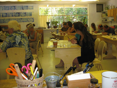
We settled into the classroom for a Sunday afternoon and several hours later...


...nineteen diplomas, ready for signatures!


It always amazes me to think that one could actually make a living as an engrosser back in the day!  If only I'd been born in the 1800s--and male, of course--this would have been the profession I aspired to.  Sigh.

Penwork Where You Find It

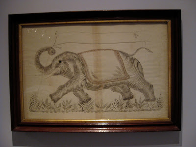
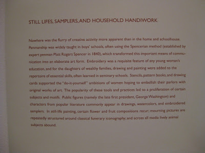
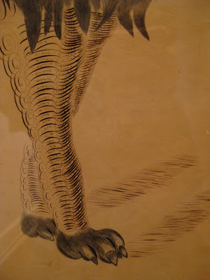
"Elephant with Banner", Anonymous
Colby College Museum of Art
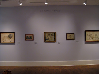
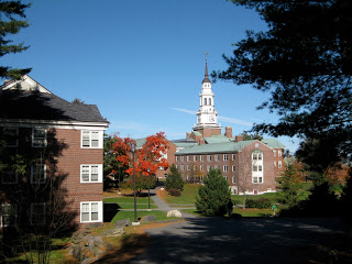
The first time I attended Parents' Weekend at Colby College in Maine, I made sure to visit their impressive art museum, one of the finest on any campus anywhere.  I was amazed and delighted to find several examples of penwork hanging proudly in their American Folk Art exhibit.


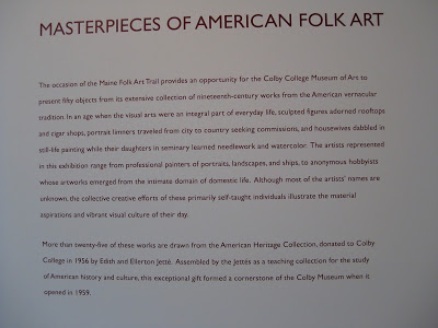
They even mentioned old Platt Rogers Spencer!  Pretty cool, I thought, since I had just come from the Spencerian Saga...


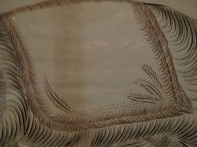
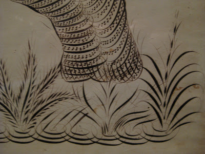
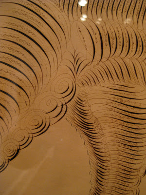
Some detail on that elephant:


Then there's the King of the Jungle:


"Lion", C.L. Horton
Colby College Museum of Art


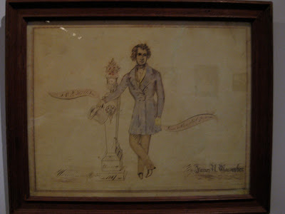
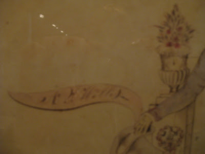
And finally, a memorial piece by James Macomber.  Apologies for the blurry photos....


"Mourning Picture of  N.L. Willis", James H. Macomber
Colby College Museum of Art
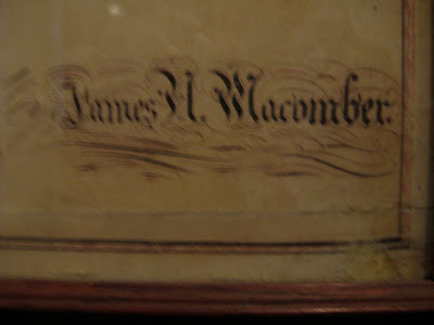
 The artist rendered his own name in Masterpiece Flourishing!


"Done with a steel pen"

A lovely visit all around!


The Saga Continues

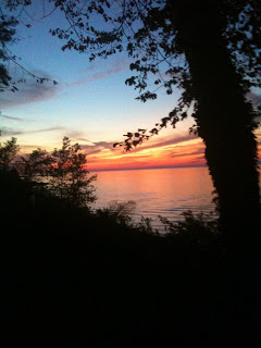
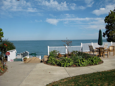
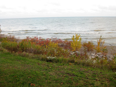
One of the highlights of October was my third visit to Geneva-on-the-Lake, Ohio for the Spencerian Saga.  The sunset over Lake Erie the first night could not have been more welcoming.


This year it was the Engrossers' Saga--a once-every-five-year occurrence--and the 25th anniversary of the annual workshop.  I've already said plenty about the Saga here, but this one seemed to bring together a lot of things I had been dabbling with and helped me see how I could put them to use in a cohesive piece.  Stay tuned for that one...

From Ohio I went to meet my sister at my beloved Findley Lake, New York, to stay at the Blue Heron Inn bed-and-breakfast...in the Lakeview Room, of course!


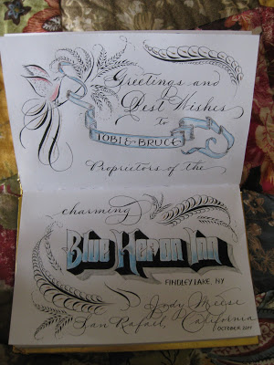
I decided to put some of my new-found skills to work as I signed the guestbook.  Maybe no one will ever see it, but I love knowing that it's there!


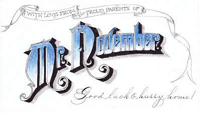
Back home, while messing around on the internet I discovered that my son had been named "Mr. November" at his college back East.  Not sure what that's all about, but used it to adorn the 3 X 5 card that will be enclosed with his exam-week care package:


Onward to December...!

Once Upon an Island

The work in progress...
It was an impulsive and fortuitous decision, clearly meant-to-be:  just a week ahead of time, I put in motion a plan to attend a workshop at the St Michael Institute of Sacred Art entitled "The Decorated Page", taught by the incomparable Harvest Crittenden, herself rather decorated as a Master Penman and Master Engrosser.  I had blocked out a week's vacation--the same week I had gone to the Spencerian Saga the last two years, but I had done a third West Coast Saga in April this year in Berkeley--and had not been able to come up with something that appealed to me to do.  Then I woke up one morning and the plan seemed to have fully formed itself in the night:  Enders Island, Mystic, Connecticut.

A few emails and phone calls were made, and before I knew it I was on a plane bound for Providence, armed with my left-handed nibs and some delicious anticipation.  Any picture I had in my mind was pale compared to the real thing:
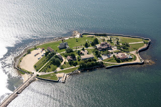
Enders Island, Mystic CT
It was sheer magic from the moment we arrived.


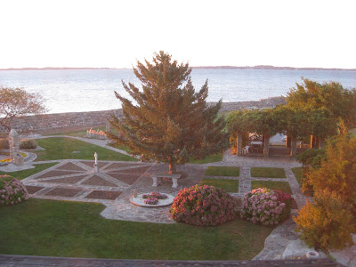
This was the view from my room, the first morning at sunrise:


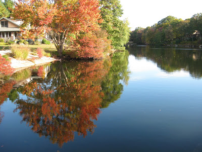
Autumn was in its full glory and I gratefully got my "fix" of fall color.  This was taken on a walk in a nearby neighborhood.


Add to this some fantastic meals and a whole island of friendly people, and the stage was set for an incomparable experience.

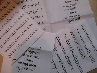
The first two days were spent studying the work of local hero Angelo Rassu, (a mid-20th century engrosser whose amazing collection is housed on Enders and curated by Harvest--stay tuned for her forthcoming publication on him!); practicing Engrosser's Text (new to me, not to be confused with Engrosser's Script!) with a broad nib;  laying out our text designs; and finally, putting the lettering onto the page Harvest had prepared for us with the outline of the border design.


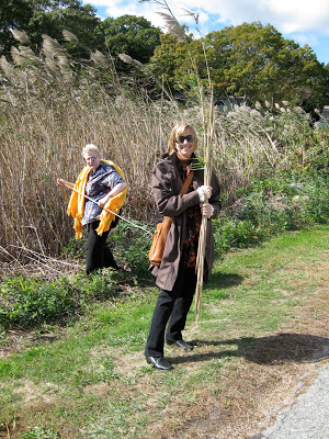
Next we learned to apply gold and palladium leaf.  This included a field trip to a nearby marsh to collect reeds to cut into tubes with which to moisten the dried Instacoll for receiving the leaf.


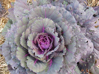
With the gilding beautifully in place, we then were extensively schooled in color theory--specifically Harvest's fabulous CMYK primary palette--and set about creating our colors, hues and shades.  I was drawn to the seasonal decorations in front of the main building (where our scriptorium was housed) which included this ornamental kale...


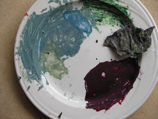
...and became, with much tutelage from Harvest, this palette of gouache.


Thus began the Painting of the Acanthus Leaves, a relaxing and pleasurable activity accompanied by Gregorian chant from the workshop upstairs, and/or conversation  (oh, and some SF Giants radio baseball, too, couldn't help myself!)  among the most simpatico group of women I have had the pleasure to be in a class with.
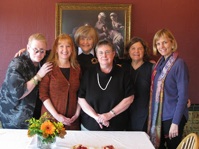

Some of us worked into the wee hours and all enjoyed every minute.  Here are some of the "raw" painted leaves:


...later shaded and outlined to make them "pop", along with some tooling on the gold.  The illuminated G includes a traditional white vine design.


It is difficult to express how enlightening and restorative those few short days were for me. The place, the people, the art.  In some ways it felt so personal and inward that it is daunting to attempt to put it into words.  I can't say enough about Harvest's teaching: she is thorough, original, imaginative, attentive and flexible---and it goes without saying that her artistry is magnificent inspiration.

I don't know if I'll ever finish this piece, or whether it would even be possible to know when it was finished.  But maybe that's the way to keep the essence of the experience alive for myself.  It's a wonderful reminder that in this era of instant gratification and 24/7 access, one can delve deeply into something for an entire week and know that it has only just begun.

West Coast Saga


The first-ever West Coast Spencerian Saga with master penmen Michael Sull and Bill Kemp concluded over two weeks ago, and I'm still digesting it all.
It was a completely different experience from the longstanding Geneva-on-the-Lake Sagas, which are retreat-like in nature, held at the beautiful Lakehouse Inn on the south shore of Lake Erie in October when the air is crisp and the leaves are turning. Platt Rogers Spencer himself lived, taught, and is buried in Geneva.

In April the Berkeley venue, Castle in the Air, is busy, lively, and very connected to the Fourth Street goings-on, with lots of great places to eat and shop during breaks from the pen and ink. Art seems to be in the very air there. And... just a twenty-minute drive across the Richmond bridge from my house!


Both experiences are awesome: the former rich with penmanship history and the latter showing Spencerian's relevance in a contemporary setting.

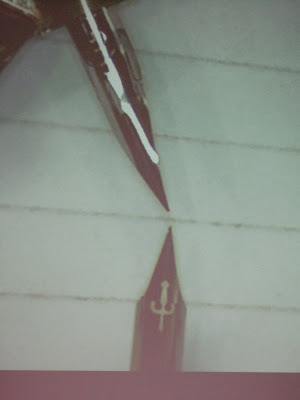
Bill's digital overhead projector enabled this kind of detail! Sure beat struggling to watch over someone's shoulder. This is a comparison of the Nikko G and EF Principal nibs...


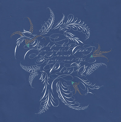
At the top is my final project: My life has a superb cast, but I can't figure out the plot, a quote I love and neglected to attribute to Ashleigh Brilliant. The script is Spencerian, of course, in Dr. Ph. Martin's Bleedproof White with embellishments in Spectralite gold. I used an EF Principal for the text and a Nikko G for the offhand flourishing.

Castle in the Air has published all of our final projects on its blog. I was amazed at the variety and ingenuity as the participants--who ranged from first-timers to twenty-year veterans, hobbyists to seasoned professionals--showcased the variety of techniques we had learned during the week from . It was a fun and lively group!

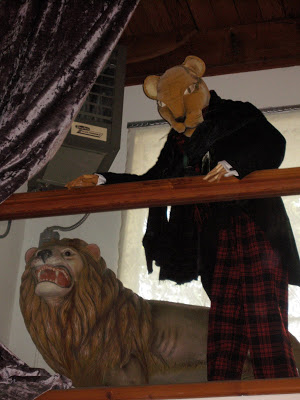
And the entire week we had the strangest feeling someone was watching us...


The Magnolian Hand


I've never looked at nature quite the same since attending the Spencerian Saga in Geneva-on-the-Lake, Ohio. It was there I learned that Platt Rogers Spencer himself took his cue from the oval shapes of the stones he found on the shores of Lake Erie to create the lovely and lively ornamentation of his Spencerian hand. According to Wikipedia, "...because paper was difficult to obtain at the time, Spencer wrote on birch tree bark, sand, ice, snow, the fly-leaves of his mother's Bible and, by permission of a cobbler, the leather in his shop."

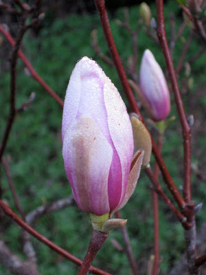
Surely these about-to-burst magnolia blossoms in my front yard this morning could inspire some lovely letterforms! If nothing else, they say that Spring is surely on its way.