Sweet Music

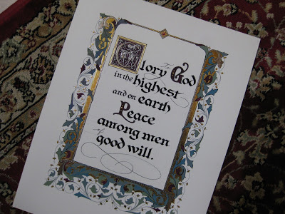
Quote by Stephen Sondheim, Artwork by Jody Meese
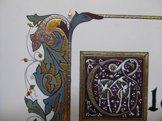
Gouache, Spectralite, gold leaf, colored pencils, "jewels", Pitt marker

 These little 5"X5" illuminated pieces (8"X8" framed) are so much fun to do, and perfect items for charity auctions. This one was for the Marin Girls' Chorus. My daughter, a former chorus member, sits on the Board.


Lucky for me, I had help with gilding from visiting calligraphy royalty, Harvest Crittenden! She also offered valuable critique and encouragement.


The mat is some marbled paper I picked up in town...after this photo was taken, I used a ruling pen to add a gold line about 1/4" from the inner edge.

Always fun to contribute to a worthy cause with something I enjoy creating!

Shades of (Paynes) Gray

Rosemary Buczek design, my attempt at monochromatic painting...

In the "better-late-than-never" department, here is my post on the IAMPETH convention, which took place in Milwaukee in early August.


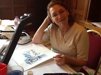
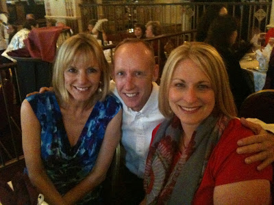
Me & Jane Farr
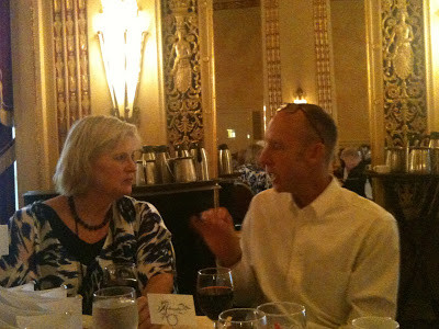
Best part by far:  hanging out every day with Jane Farr and basking in her talent, knowledge and all around wonderful-ness. We pretty much owned this corner of the hotel's spacious and beautiful bar.  Miss you, Jane!

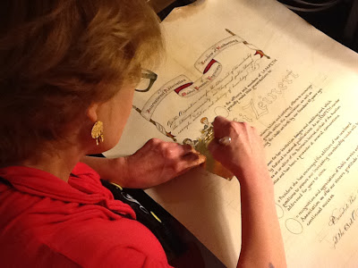
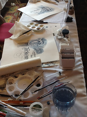
Watching the masters in action was well worth the price of admission (to the conference, not the bar, although it wasn't unusual to see artists like incoming IAMPETH president Bill Kemp or Barbara Calzolari set up at a table in there...).  I also got a sneak peek at Harvest Crittenden's masterpiece certificate for IAMPETH president and conference chair Debi Zeinert in progress.  Here, she's gilding.  What Harvest can do in a hotel room in between classes and socializing, I can only dream of doing with a six-month sabbatical on a desert island!

As it happens, "A Study in Monochromatic Painting" with the inimitable Rosemary Buczek is the only class I took that Jane did not...and her excellent blog posts on the workshops of Joe Vitolo, Pat Blair, Kathy Milici, Barbara Calzolari will tell you all you need to know about the other classes I took!

Here's the article I wrote for Penman's Journal:

Rosemary Buczek


Rosemary Buczek:  A Study in Monochromatic Painting

By Friday morning of IAMPETH week I was thoroughly steeped in black and white, and wondering if perhaps I ought to have signed up for something involving color.  But “A Study in Monochromatic Painting” was my next scheduled class, and it turned out to be just the ticket:  while it is true we worked with just one tube of Winsor Newton Paynes Gray (and a touch of Dr. Ph. Martin’s Bleedproof White), the result was exquisitely colorful!
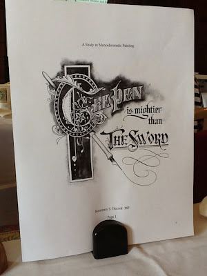
Rosemary Buczek sample sheet for workshop

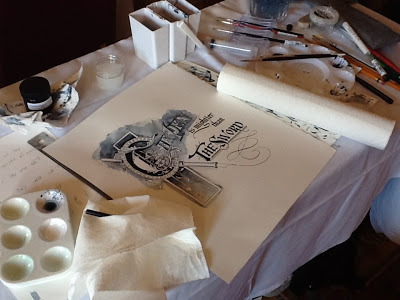
Master Penman Rosemary Buczek guided us step-by-step with warm enthusiasm and expertise.  With the smallest dab of Winsor-Newton Paynes Gray--and an armload of brushes, rulers, pens, water containers, blotting towels, and other assorted supplies--forty eager IAMPETH members set out to embellish her beautiful rendering of the apt phrase, “The pen is mightier than the sword,” in the style of P.W. Costello and other early 20th century engrossing artists.

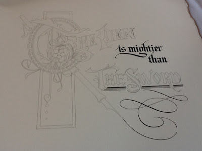
Rosemary Buczek design
Starting with the basic design, printed on very heavy hot press paper by Rosemary’s husband Steve, we re-outlined the shapes and letterforms with pen and waterproof ink.  Not only did this give definition to the design, it was a good way to acquaint oneself fully with all of its details.


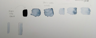
With our pointed round watercolor brushes (#0 #1, #2), we created small sample sheets for ourselves, practicing painting the Paynes Gray in a variety of ways and creating levels of color saturation: dry into dry (for the darkest, most opaque shades) and dry into wet, wetter and wettest (for progressively more transparent tints).  We learned how to use the light of the paper to give further dimension to the design elements, and very helpfully, how to correct when the paint did not distribute itself as intended by rewetting and moving the color around. 

We then applied our newly-learned techniques to the study piece, beginning with the sections to be painted in the darkest shades and working toward the lighter areas.  Thanks to digital technology, we were able to watch in enlarged detail as Rosemary demonstrated the teasing of color from the darkest areas to the lightest, creating a background shadow that set off the piece handsomely.  Some letters were painted with the very palest tint, others with the deepest shade; both were embellished them with bits of white applied with ruling pen and pointed pen.
Rosemary Buczek design            
To be sure, Rosemary was able to de-mystify a technique which, with practice, will be simple and dramatic addition to this engrosser’s bag of tricks! It was a fun and inspiring class.

Rosemary Buczek design


end of article

The banquet on the final night was great fun, with Joe Carbone apparently playing "Where's Waldo?", appearing in every picture I took!


Me, Joe, JP Panter

Pat Daley, Joe, Harvest Crittenden

Joe & Harvest
Elizabeth Kenney & Joe with special party headpieces?
Next year:  Albuquerque.  Be there!

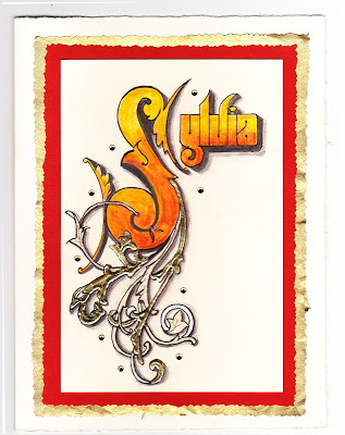
Sayonara Sylvia


A longtime colleague is departing at the end of this week, and it is bittersweet for her as well as for those of us staying on.  For some time, she has wanted to teach at the same school her children attend--which will significantly simplify her life, we hope--but she has been with us for many years and we all feel like family.

She loves orange, and wears it well.  I wanted to make a going-away card for her that expresses both her favorite hue and the fire within her that makes her so strong and ambitious!  Inktense pencils, lightly brushed with water, give a flame-like feeling.  For the ornamentation, I remembered learning from Harvest Crittenden how lovely it is to combine gold leaf and shell gold (see the halo in this post);  this is the "poor man's version" with gold leaf over Instacoll, and painted Finetec gold and silver.  I love the dimensional look it gives!

The shadows on the Sickels lettering are Zig gray suede (a heretofore under-appreciated brush pen that has patiently awaited attention in my studio) and HB graphite;  outlining is done with a fine-tip Pitt pen.  The paper is Crane's correspondence card, mounted on a piece of old greeting card (cut with deckle scissors), a piece of metallic gold (ditto), and a Fabriano Medioevalis card.  The final touch was a scattering of random crystals from Michaels, glued on.  Hope she likes it!

A Sphinx @ Sixty


So, I turned 60 today!  I'm feeling pretty great about it, despite a young mom at work telling me she couldn't believe I was that old because I'm so "spry".  Ouch.

Anyway, I've had a great day, taking off from work and spending the morning in San Francisco to visit the stunning Cult of Beauty exhibit at the Palace of the Legion of Honor which includes, among multitudinous other treasures, many original William Morris drawings, fabrics and wallpapers.  More peacock feathers and acanthus leaves than you can shake a nib holder at!

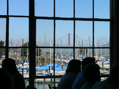
Afterward, at the legendary Greens for lunch, we enjoyed great food and a great view (yep, that's our Golden Gate Bridge, turning 75 on May 27th...and I guess she's pretty spry too).


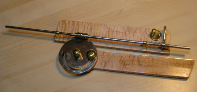
Then my sweet husband presented me with THE coolest gift ever!  You can tell you've been with someone more than half your life when he knows you would be over the moon to receive one of these:


Whatever is it, you might ask?  (The waiter at Greens did!)

Well, have you ever wondered how the old penmen did those amazing perfectly-spaced lines for shading and definition in black-and-white, like this

or this?

Bookplate, 1900

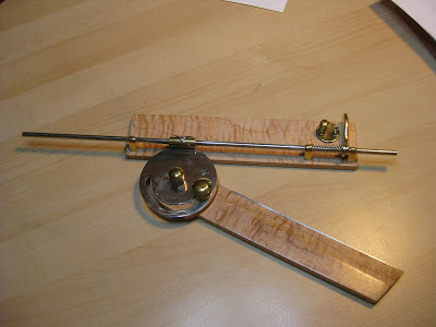
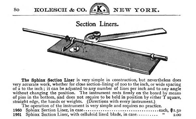
Many used a now-antique drafting tool called a Sphinx Section Liner, also known as a parallel ruler.


They've been very hot items on eBay since pointed pen people caught on to them, sometimes going for several hundred dollars apiece.  Michael Sull demonstrated one (which had been a gift to him from Harvest Crittenden) at the Engrossing Spencerian Saga last October.  I showed Bob Hurford's write-up on the subject (IAMPETH Penman's Journal Summer 2010) to Bruce and he was fascinated with how it worked.  Who knew what he was doing out there in his shop these last few weeks?

Is it not a thing of beauty?!?  Gorgeous, smooth-as-silk fiddlehead maple and elegant brass parts, the straightedge raised just enough to avoid smudging, and finished off with a beautiful engraved plaque.


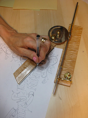
Of course I had to try it out as soon as we got home!  The old masters would have used a ruling pen (another must-have drafting tool) but I went with a G-Tec for my first try.  In the photo I'm kind of using it upside-down and backwards, but as Sheila Waters is fond of reminding me, we left-handers 'have to figure out our own way of doing things'.  Of course, it works perfectly!  And I will treasure it always.


I think sixty might be my new lucky number.

The Way I See It

©2011 Jody Meese
We lettering-type people see things a little differently sometimes.  This was a design I'd had in mind for some time, and finally got together for a Christmas gift this year.

A couple who are some of my dearest friends have these names that a) work in crossword form, and b) are perfectly symmetrical when they do. Amazing!  First I drew the letters in Roman caps with a pointed pen, then the ampersand with a broad nib, then mashed them up on PSE9 (BTW the stuff I learned in Harvest Crittenden's"Photoshop for Calligraphers" online class saved me countless hours this holiday season--take it next time it's offered!).  The finished design was uploaded to zazzle and applied to a set of lovely and useful sandstone coasters.
©2011 Jody Meese
(Of course, etched on glass and without the ampersand, the design would be completely reversible!  I'm just saying.  Welcome to the calligrapher's mind...)


The Saga Continues

One of the highlights of October was my third visit to Geneva-on-the-Lake, Ohio for the Spencerian Saga.  The sunset over Lake Erie the first night could not have been more welcoming.


This year it was the Engrossers' Saga--a once-every-five-year occurrence--and the 25th anniversary of the annual workshop.  I've already said plenty about the Saga here, but this one seemed to bring together a lot of things I had been dabbling with and helped me see how I could put them to use in a cohesive piece.  Stay tuned for that one...

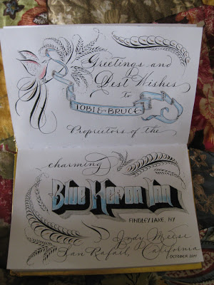
From Ohio I went to meet my sister at my beloved Findley Lake, New York, to stay at the Blue Heron Inn bed-and-breakfast...in the Lakeview Room, of course!


I decided to put some of my new-found skills to work as I signed the guestbook.  Maybe no one will ever see it, but I love knowing that it's there!


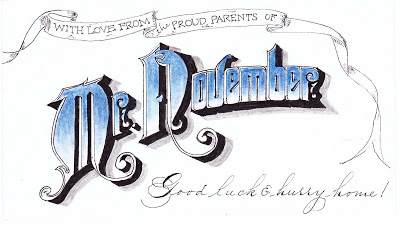
Back home, while messing around on the internet I discovered that my son had been named "Mr. November" at his college back East.  Not sure what that's all about, but used it to adorn the 3 X 5 card that will be enclosed with his exam-week care package:


Onward to December...!

I Yam What IAMPETH

So I never got around to reporting on my first trip to the annual convention of the International Association for Master Penmen, Engrossers, and Teachers of Handwriting  ("engrossers", not "and grocers", as someone thought I was saying). Was there ever an organization more in need of an acronym?  I think not.

IAMPETH was held this July of this year in Phoenix, which I'm sure is lovely in the winter months. [Phoenicians, you have my total admiration for staying cool in the face of three-digit temperatures day after day. I do not possess that kind of stamina.]  The convention is a virtual candy store for, well, penmen, engrossers, etc.  The mostly half-day classes were enough to whet one's appetite for more on a technique, and to see the IAMPETH rock stars in action, up close and personal.  And just as exciting, to meet in person some bloggy-type friends--you know who you are!

By far the most addictive class I attended was "Leaf Script Capitals" with White House calligrapher Rick Muffler.  The wonderful Jane Farr wrote a terrific blog post with tutorial here;  go read it!
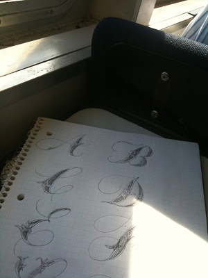
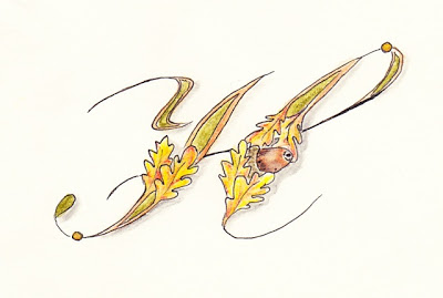
Since my flight home was delayed (we do fog here in San Francisco in the summertime, not great for air travel but nice and cool--okay, freezing), I had plenty of time to start doodling an alphabet while waiting in the airport.


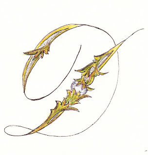
The inimitable Master Penman Harvest Crittenden had sat in on the class and suggested that there would traditionally have been a pearl nested in the greenery, so when I got back into the studio I played around with that a bit...

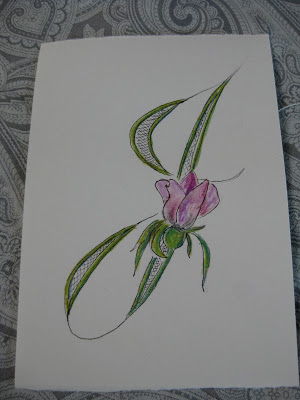
...then tried a rose...


...an acorn (no peeking, Harvest!)...


...and some design elements borrowed from a random cocktail napkin I found in my kitchen.


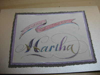
I used it on a birthday card (a little sloppy, rush job!)...


...and experimented with metallics and gratuitous acanthus leaves.

Great fun and great possibilities!


Enders Redux

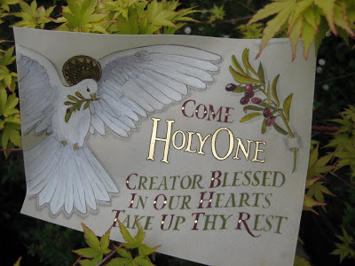
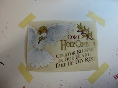
The finished piece in my garden
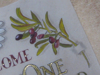
Olive branch detail
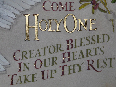
Lettering detail
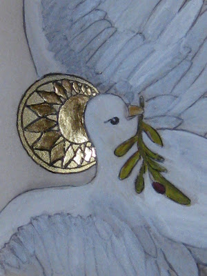
Halo detail
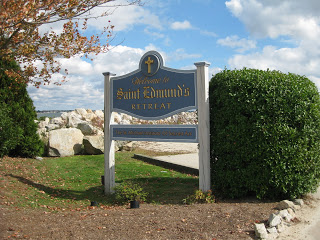
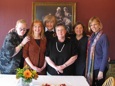
Once you've been to a place like Enders Island, there's no way you can stay away when you have another chance to go.  My trip last October was still vivid in my mind, and as it turned out, all five of us from that class--plus two new friends-- would be returning to take another class, "Illuminated Prayer on Vellum", with the inimitable Harvest Crittenden at St. Michael's Institute of the Sacred Arts on the island.  (BTW, check out Harvest's brand new Photoshop for Calligraphers online class, coming up in June!)

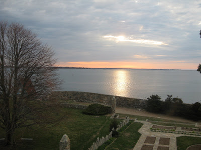
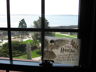
Sunrise the first morning was worth the trip!

View from my window
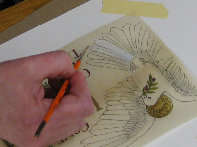
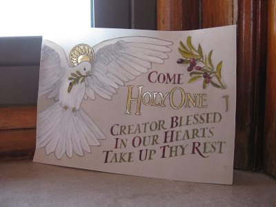
Harvest had created a lovely design with haloed dove, olive branches, and text, which we transferred onto sheets of vellum we had prepared with dental-grade pumice.  Over the four days of the class, we learned tips and techniques on gilding, shell gold, color theory (Harvest uses the CMYK palette), shadowing, and how much patience it takes to paint v-e-r-y tiny Roman drawn letters.
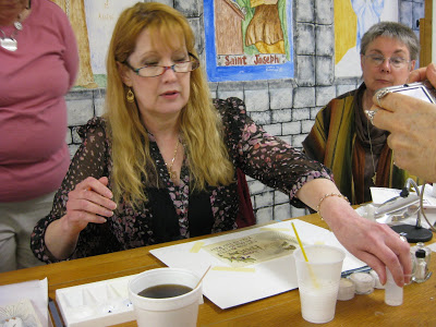
Harvest in action
Harvest demos feather detail
My piece in progress
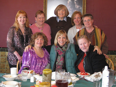
As if that weren't enough, the chef outdid himself and each meal was more amazing than the last.  And for me, the camaraderie and exchange of knowledge and information was just as valuable as the workshop.  It was truly an amazing group of women.

The Class
Translucence
Farewell to Enders

Once Upon an Island

The work in progress...
It was an impulsive and fortuitous decision, clearly meant-to-be:  just a week ahead of time, I put in motion a plan to attend a workshop at the St Michael Institute of Sacred Art entitled "The Decorated Page", taught by the incomparable Harvest Crittenden, herself rather decorated as a Master Penman and Master Engrosser.  I had blocked out a week's vacation--the same week I had gone to the Spencerian Saga the last two years, but I had done a third West Coast Saga in April this year in Berkeley--and had not been able to come up with something that appealed to me to do.  Then I woke up one morning and the plan seemed to have fully formed itself in the night:  Enders Island, Mystic, Connecticut.
A few emails and phone calls were made, and before I knew it I was on a plane bound for Providence, armed with my left-handed nibs and some delicious anticipation.  Any picture I had in my mind was pale compared to the real thing:
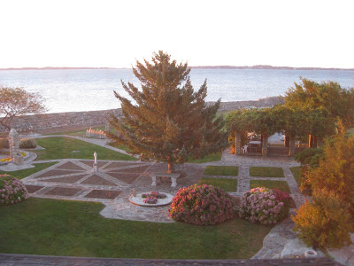
Enders Island, Mystic CT
It was sheer magic from the moment we arrived.


This was the view from my room, the first morning at sunrise:


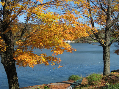
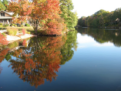
Autumn was in its full glory and I gratefully got my "fix" of fall color.  This was taken on a walk in a nearby neighborhood.


Add to this some fantastic meals and a whole island of friendly people, and the stage was set for an incomparable experience.

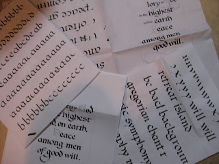
The first two days were spent studying the work of local hero Angelo Rassu, (a mid-20th century engrosser whose amazing collection is housed on Enders and curated by Harvest--stay tuned for her forthcoming publication on him!); practicing Engrosser's Text (new to me, not to be confused with Engrosser's Script!) with a broad nib;  laying out our text designs; and finally, putting the lettering onto the page Harvest had prepared for us with the outline of the border design.


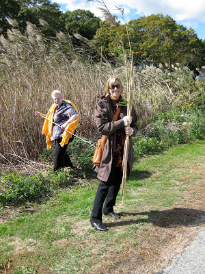
Next we learned to apply gold and palladium leaf.  This included a field trip to a nearby marsh to collect reeds to cut into tubes with which to moisten the dried Instacoll for receiving the leaf.


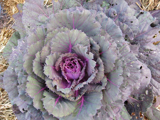
With the gilding beautifully in place, we then were extensively schooled in color theory--specifically Harvest's fabulous CMYK primary palette--and set about creating our colors, hues and shades.  I was drawn to the seasonal decorations in front of the main building (where our scriptorium was housed) which included this ornamental kale...


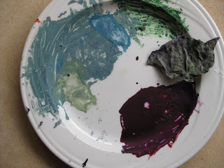
...and became, with much tutelage from Harvest, this palette of gouache.


Thus began the Painting of the Acanthus Leaves, a relaxing and pleasurable activity accompanied by Gregorian chant from the workshop upstairs, and/or conversation  (oh, and some SF Giants radio baseball, too, couldn't help myself!)  among the most simpatico group of women I have had the pleasure to be in a class with.


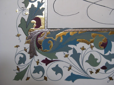
Some of us worked into the wee hours and all enjoyed every minute.  Here are some of the "raw" painted leaves:


...later shaded and outlined to make them "pop", along with some tooling on the gold.  The illuminated G includes a traditional white vine design.


It is difficult to express how enlightening and restorative those few short days were for me. The place, the people, the art.  In some ways it felt so personal and inward that it is daunting to attempt to put it into words.  I can't say enough about Harvest's teaching: she is thorough, original, imaginative, attentive and flexible---and it goes without saying that her artistry is magnificent inspiration.

I don't know if I'll ever finish this piece, or whether it would even be possible to know when it was finished.  But maybe that's the way to keep the essence of the experience alive for myself.  It's a wonderful reminder that in this era of instant gratification and 24/7 access, one can delve deeply into something for an entire week and know that it has only just begun.