It's a Wrap
 |
| Cavallini & Co. images |
Enter four certificates created for much-appreciated volunteers at my school (sorry, can't reveal them here in the unlikely event the recipients follow my blog). I always hesitate to frame things for other people, not wanting to assume that the piece will live on display rather than tucked in a safe place and taken out occasionally to enjoy. But how to present in a decorative fashion?
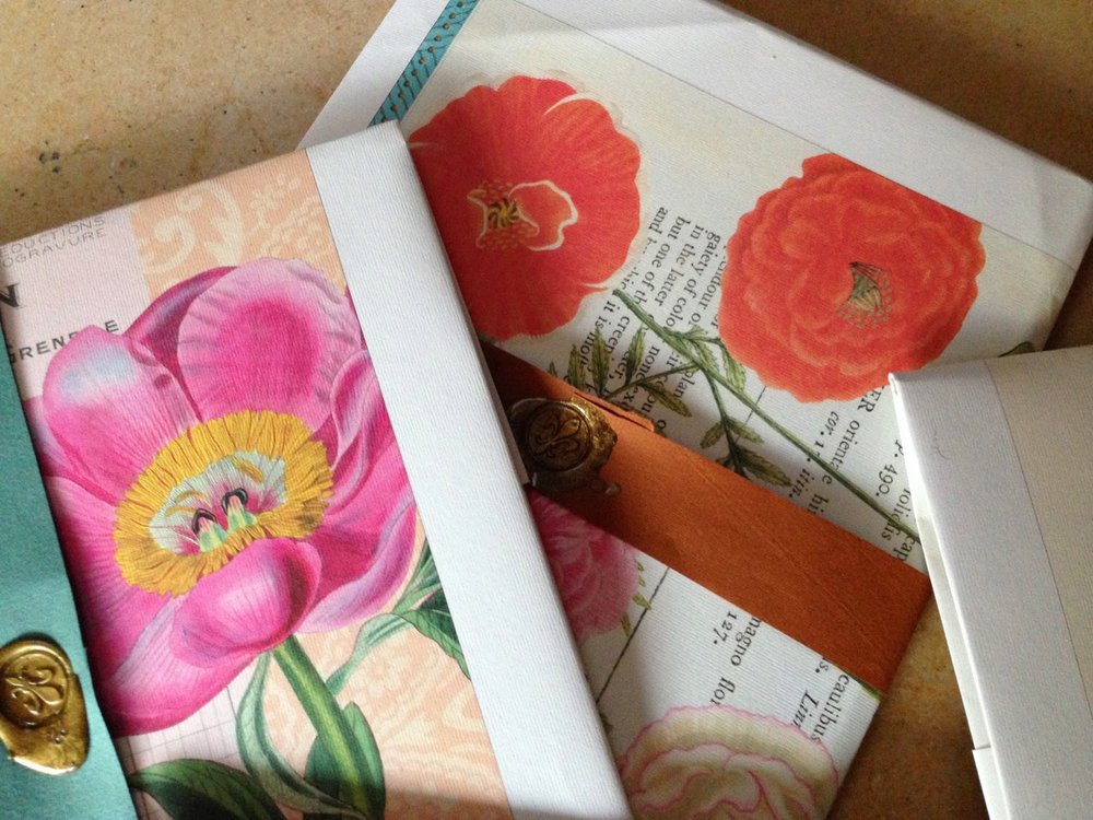
Inspiration, fortunately, struck: I took a calendar page, cut a piece of vintage Fabriano colored paper the same size and lay it in as a liner (Canson Mi-Teintes would work well, too), set the certificate in the middle and folded the calendar and the liner squarely. A strip of the same paper was used to made the band, and fastened with fragrant Atelier Gargoyle sealing wax. (I'm a little out of practice with the creme brûlée torch, but it got the job done.)
 |
| Cavallini & Co. images |
 | |
|
 | |
|
 | |
|
This isn't the first time I've upcycled these gorgeous images; here's a link to my post on some more complex stationery portfolios. Enjoy!
Smoke Gets in Your Eyes
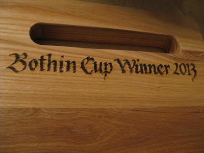
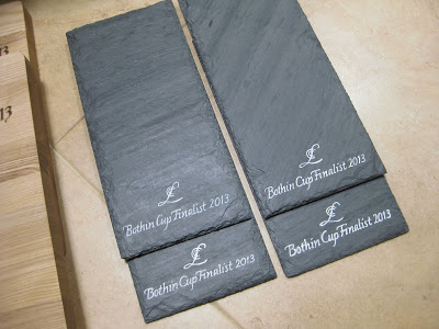
Just when I think I've seen it all...along comes a client who wants to present cutting boards and cheese stones to winners of a local tennis tournament! Four. Of each.
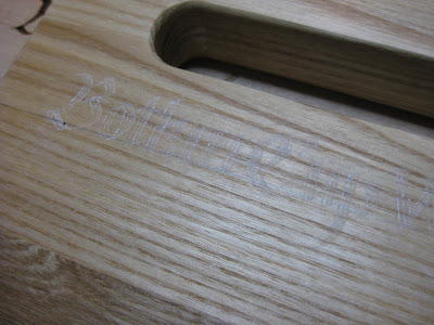
After practicing on scrap wood, I did the lettering on paper, then transferred it in chalk before taking the woodburning tool to it.
The first pass was a little funky. Although I had sanded and steel-wooled the area lightly, there was still some kind of wax or oil on the surface.
The cheese stones were a little easier--and more forgiving. Slate is so soft I could just scratch off any errant blobs of paint and after wiping with a damp paper towel, it didn't show at all. Since the surface was rather uneven, I stuck with monoline and used a new-to-me Montana Acrylic marker (refillable!) with an extra-fine tip.
Certainly not perfect, but way more useful than trophies!
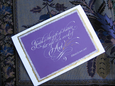
Age as Art
To Have and to Hold
 |
| Bleedproof white lettering, 23 kt gold leaf dots, approx. 9" X 12" |
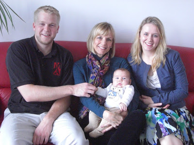
But wait, there's more! I'm somebody adorable's "American grandma"!
My two grown-up "babies" went along and I loved every minute. It was a happy, happy occasion.
A Sphinx @ Sixty
Anyway, I've had a great day, taking off from work and spending the morning in San Francisco to visit the stunning Cult of Beauty exhibit at the Palace of the Legion of Honor which includes, among multitudinous other treasures, many original William Morris drawings, fabrics and wallpapers. More peacock feathers and acanthus leaves than you can shake a nib holder at!
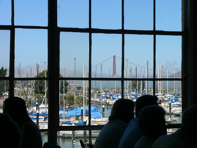
Afterward, at the legendary Greens for lunch, we enjoyed great food and a great view (yep, that's our Golden Gate Bridge, turning 75 on May 27th...and I guess she's pretty spry too).
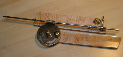
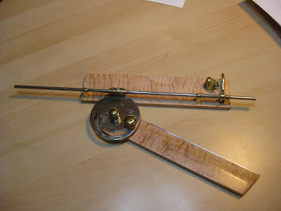
Then my sweet husband presented me with THE coolest gift ever! You can tell you've been with someone more than half your life when he knows you would be over the moon to receive one of these:
Whatever is it, you might ask? (The waiter at Greens did!)
Well, have you ever wondered how the old penmen did those amazing perfectly-spaced lines for shading and definition in black-and-white, like this
or this?
 |
| Bookplate, 1900 |
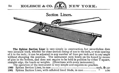
Many used a now-antique drafting tool called a Sphinx Section Liner, also known as a parallel ruler.
They've been very hot items on eBay since pointed pen people caught on to them, sometimes going for several hundred dollars apiece. Michael Sull demonstrated one (which had been a gift to him from Harvest Crittenden) at the Engrossing Spencerian Saga last October. I showed Bob Hurford's write-up on the subject (IAMPETH Penman's Journal Summer 2010) to Bruce and he was fascinated with how it worked. Who knew what he was doing out there in his shop these last few weeks?
Is it not a thing of beauty?!? Gorgeous, smooth-as-silk fiddlehead maple and elegant brass parts, the straightedge raised just enough to avoid smudging, and finished off with a beautiful engraved plaque.
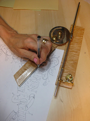
Of course I had to try it out as soon as we got home! The old masters would have used a ruling pen (another must-have drafting tool) but I went with a G-Tec for my first try. In the photo I'm kind of using it upside-down and backwards, but as Sheila Waters is fond of reminding me, we left-handers 'have to figure out our own way of doing things'. Of course, it works perfectly! And I will treasure it always.
I think sixty might be my new lucky number.
Top Brass
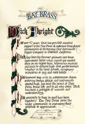 |
| Finished size approx. 12" X 16" |
As I've said before, Pergamanata paper is a dream for corrections and that's my kinda paper! I did have a little trouble with the brushed Finetec metallics buckling and flaking off the page, but after a brief consultation with the inimitable Heather Held (thanks, Heather!) I played around with the thickness and that seemed to do the trick. Next time I would probably pre-treat with gum sandarac, another of her great suggestions.
My initial sketch (full-size):
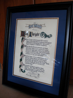
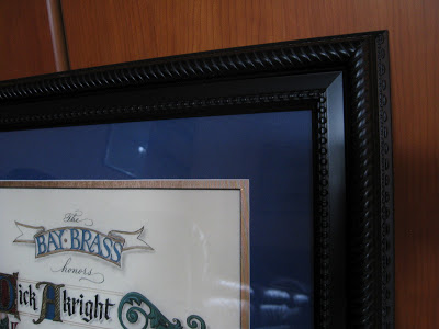
As usual--and especially since this was a hurry-up job--I planned for it to fit in a standard-sized frame (in this case 16" X 20") from our local craft store. With my trusty compact mat cutter I double matted it in blue and gold, 2" and 2-1/2" respectively.
Tools and supplies: Moon Palace sumi; 23k gold leaf; Instacoll; gouache; Finetec gold and silver; Derwent graphite 3B; Zebra G pointed nib; Brause 1mm, 1.5mm and 3 mm; Micron pigma 005; Uniball signo .18; Copic multiliner .03; Neopiko Line 2 005; Pergamanata heavyweight paper. And last but certainly not least: X-acto knife with #4 stencil blade and Faber-Castell Perfection 7058B eraser!
The Way I See It
 |
| ©2011 Jody Meese |
A couple who are some of my dearest friends have these names that a) work in crossword form, and b) are perfectly symmetrical when they do. Amazing! First I drew the letters in Roman caps with a pointed pen, then the ampersand with a broad nib, then mashed them up on PSE9 (BTW the stuff I learned in Harvest Crittenden's"Photoshop for Calligraphers" online class saved me countless hours this holiday season--take it next time it's offered!). The finished design was uploaded to zazzle and applied to a set of lovely and useful sandstone coasters.
(Of course, etched on glass and without the ampersand, the design would be completely reversible! I'm just saying. Welcome to the calligrapher's mind...)
 |
| ©2011 Jody Meese |


