Calligraphy Northwest: Pillars of Reed


It has taken some time to digest the tour de force that was Calligraphy Northwest, which took place last week at Reed College in Portland, Oregon. It was the 31st of these conferences, but my first foray. The Portland Society for Calligraphy, led by Carol DuBosch and Meri Taylor, did a stellar job of running the event---which had a lot of moving parts and a dream team faculty---without a visible hitch. There are not enough hours in the day to report on the full experience, but a few things float to the surface at the moment.

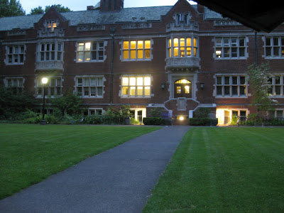
The campus is lush and stunning, and more than a few referred to its vibe as "Hogwartsian".


There was much focus on the life and work of Lloyd Reynolds, initially an English professor at Reed who taught himself Italic from a copy of Johnston's Writing and Illuminating and Lettering, and slipped calligraphy into the curriculum circa 1948, initially as "alphabetic communication"! The class was an enormously popular course (up to 80 in a class!) which he taught until 1970.  The movement spread to the Portland schools and contributed a national revival of the art form. Ironically, calligraphy was forced out of the curriculum a few years after Reynolds' death.  Nevertheless, his influence is felt on the campus and beyond--there are scribes, type designers, and poets who still speak of him with reverence-- and a quiet "calligraphy initiative"is afoot at Reed today.  It was not unusual to see subtle references to Reynolds' legacy about campus, i.e. the attribution for this omnipresent font (one of many designed by his former students).
Lower right says "Lucida typeface designed by Chuck Bigelow '67"
There were a number of conference attendees who studied with Reynolds, and he clearly was a dynamic force and a man of strong opinions.

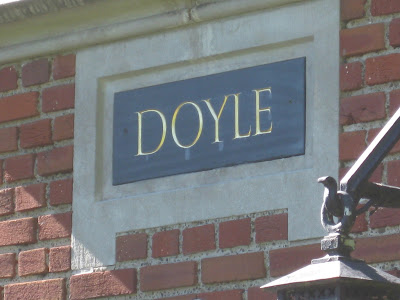
Presumably it was his association with Roman cap scholar Father Edward Catich that resulted in the elegant lettering on the lintels of several buildings, notably Eliot Hall where Reynolds held court in the third floor lecture hall.

Some better shots of his work on the old dorm block:


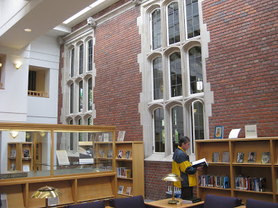
In honor of the conference, there were exhibitions of the work of both men in the college library, a charming meld of old and new buildings.


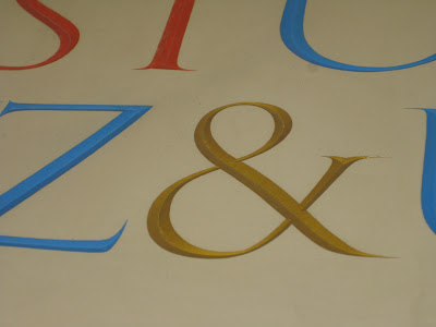
Some Catich stonework was on loan from the Portland Art Museum, so we got a closer look at the carvings and their preliminary brushwork.
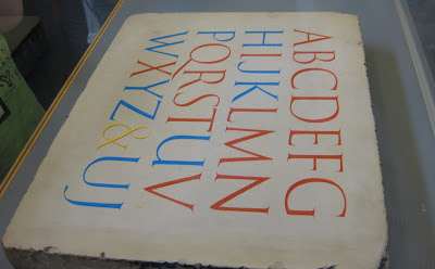
The red letters are Trajan;  the blue letters did not exist in the Roman alphabet,
and were presumably of Catich's invention.

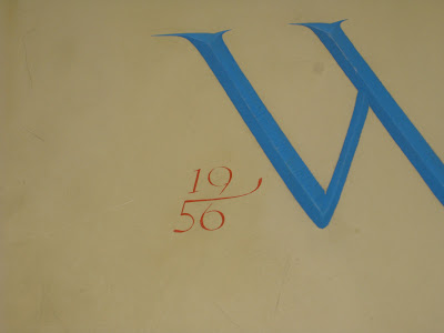
Catich established that the Trajan letterforms were the result of
brush or reed work, later carved into the stone.

I'm crazy for ampersands, but I have to say, the date on the stone below was my very favorite detail!

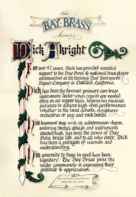
Top Brass

Finished size approx. 12" X 16"
The GRAMMY-nominated Bay Brass (has a nice ring to it, does it not?) had organized a concert to honor the recently-retired repairman who has kept their horns--and those of most brass players in the area--in working condition for many years, and to benefit a music camp scholarship fund in his name.  Last-minute scroll request + free design reign + school vacation week = BLISS!  On break from my day job (only job, actually...), I barely left the studio for ten days;  my sweet husband kept me supplied with liquid and solid refreshment while I put to use some of the techniques I have learned in classes these last several years!
As I've said before, Pergamanata paper is a dream for corrections and that's my kinda paper!  I did have a little trouble with the brushed Finetec metallics buckling and flaking off the page, but after a brief consultation with the inimitable Heather Held (thanks, Heather!) I played around with the thickness and that seemed to do the trick.  Next time I would probably pre-treat with gum sandarac, another of her great suggestions.

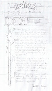
My initial sketch (full-size):


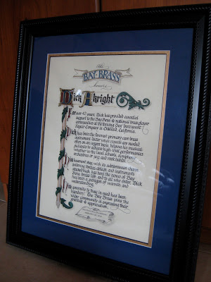
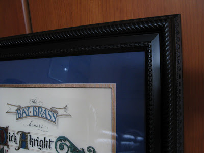
As usual--and especially since this was a hurry-up job--I planned for it to fit in a standard-sized frame (in this case 16" X 20") from our local craft store.  With my trusty compact mat cutter I double matted it in blue and gold, 2" and 2-1/2" respectively.


Tools and supplies:  Moon Palace sumi; 23k gold leaf; Instacoll; gouache; Finetec gold and silver; Derwent graphite 3B; Zebra G pointed nib; Brause 1mm, 1.5mm and 3 mm;  Micron pigma 005; Uniball signo .18; Copic multiliner .03; Neopiko Line 2 005;  Pergamanata heavyweight paper.  And last but certainly not least:  X-acto knife with #4 stencil blade and Faber-Castell Perfection 7058B eraser!

The Way I See It

©2011 Jody Meese
We lettering-type people see things a little differently sometimes.  This was a design I'd had in mind for some time, and finally got together for a Christmas gift this year.

A couple who are some of my dearest friends have these names that a) work in crossword form, and b) are perfectly symmetrical when they do. Amazing!  First I drew the letters in Roman caps with a pointed pen, then the ampersand with a broad nib, then mashed them up on PSE9 (BTW the stuff I learned in Harvest Crittenden's"Photoshop for Calligraphers" online class saved me countless hours this holiday season--take it next time it's offered!).  The finished design was uploaded to zazzle and applied to a set of lovely and useful sandstone coasters.
©2011 Jody Meese
(Of course, etched on glass and without the ampersand, the design would be completely reversible!  I'm just saying.  Welcome to the calligrapher's mind...)


Among Friends


Last summer at the wonderful Liesbet Boudens class sponsored by the Friends of Calligraphy in San Francisco, I was lucky enough to once again share a table with the inimitable Ruth Korch.  As usual we had w-a-a-ay too much fun, and toward the end of the workshop, our esteemed FOC President Meredith Klein approached us about collaborating on the cover and alphabetical headings for the new membership directory, specifically in a Boudens-inspired style.  I'm much too busy preparing for Open Studios, said Ruth; I'm much too busy getting the school ready to open, I said;  then, Okay, we surprised ourselves by saying.

Ruth, always full of ideas, immediately started making thumbnail sketches and drawing a few stylized letters.  Within a week or so she had come up with a complete, gorgeous, quirky and fun alphabet, part of which is shown here:

© Ruth Korch 2011


With such a great starting point, it only took about a hundred drafts (instead of the usual two hundred) for me to put together the titles.  I love that the cover is hot, hot pink!  On the title page it's black & white and a little smaller:


Even without the privacy blur, Ruth's letters practically dance right off the page!


Thank you, FOC, for giving us the opportunity to work together on a very special project!


Lovely Liesbet

© Jody Meese 2011
"Be patient toward all that is unsolved within your heart, and try to love the questions themselves."       ~Rainer Maria Rilke

Last weekend the San Francisco Friends of Calligraphy sponsored a two-day workshop, Designing and Interpreting for Extraordinary Letters with the inimitable Liesbet Boudens of Bruges, Belgium. This was Liesbet's first trip to this country during which she is teaching in Northern & Southern California as well as Monterey.  She is effervescent, funny, charming, and all-around an inspiring teacher.

Liesbet Boudens

Prior to the class, we were asked to choose a short phrase and make some sketches based on drawn Roman caps.  I chose a piece of a Rilke quote I've always loved--plus, I couldn't resist having a letter "Q"to play with!  Liesbet had us working small with a .3mm mechanical pencil, and then enlarging our designs by around 200%.

Final small pencil sketch, ~3"X5"

After a day-and-a-half of fine-tuning our designs, we transferred them to cold press watercolor paper;  Liesbet prefers the texture it gives the letters once they are painted in gouache.  It was a revelation for me to use a broad-nib pen to paint the letters!  Once I got used to it, it was much easier to control than a brush (for me).  Liesbet also recommends that the letters not be painted in order, so that if one needs to remix color, a slightly different shade will be distributed throughout the piece.  Brilliant! She goes over the dried goauche with a white wax Derwent pencil to bring out the grain of the cold press paper.  Haven't tried that yet...

While on the surface, this seemed like a simple project, it was seriously challenging, and the variety and ingenuity of design in the group was amazing! My FOC colleagues have my greatest admiration.


Naturally, it wouldn't have been an FOC workshop if I hadn't sneaked out with my fabulous tablemate and partner-in-crime, Ruth Korch, to do a little shopping.  This time it was the American Craft Council show in the building next door, where I scored this little tea strainer/cheeseboard ensemble embellished with Celtic knotwork in cherry wood from MoonSpoon for a birthday gift!


All in all, a weekend well spent!

Resurrection


Most of the time when I look back through early pieces I find them, well, cringe-worthy.  So it was a pleasant surprise to come across this one, which isn't half bad, I think.  At the time I did not realize this was not Wendell Berry's entire poem, but had been excerpted in the version I had been carrying around for years.  The piece was an assignment from the wonderful Ann Miller in her "Calligraphy & Letterforms" class at the Academy of Art University in San Francisco, summer of 2004. [Ann still teaches the class, but only online. It's pricey (college credit) but an invaluable overview of the history of the artform.] The assignment was to use a curvelinear baseline with a quote of our choice.  It's monoline--probably various Speedball nibs, probably Sumi or Higgins Eternal ink.

That summer was a resurrection of sorts for me and glows in my memory.  I took the ferry across San Francisco Bay early each morning along with the self-described "worker bees" headed to the Financial District, had my ritual bagel and coffee on the boat, then walked a half-mile or so up Market Street to the classroom with my big portfolio and toolkit.  Virtually everyone else in the class was a twenty-something Graphic Design major who didn't quite "get" pen and ink, and couldn't wait to return to their digital lives, but I was enamored and obsessed.  

Here are the pieces of the poem I used in the piece:

Plant sequoias.
Say that your main crop is the forest
that you did not plant,
that you will not live to harvest.
Say that the leaves are harvested
when they have rotted into the mold...
Put your faith in the two inches of humus
that will build under the trees
every thousand years...Be joyful
though you have considered all the facts.
So long as women do not go cheap
for power, please women more than men.
Ask yourself: Will this disturb the sleep
of a woman near to giving birth?
Go with your love to the fields.
Lie easy in the shade...Swear allegiance
to what is highest your thoughts.
As soon as the generals and the politicos
can predict the motions of your mind,
lose it. Leave it as a sign
to mark the false trail, the way
you didn't go. Be like the fox
who makes more tracks than necessary,
some in the wrong direction.
Practice resurrection.
copyright © 1973 by Wendell Berry

Enders Redux

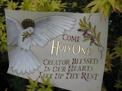
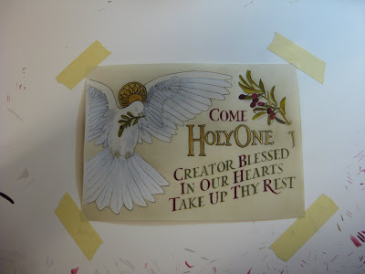
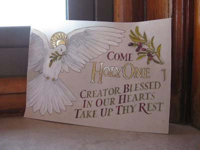
The finished piece in my garden
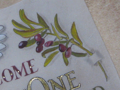
Olive branch detail
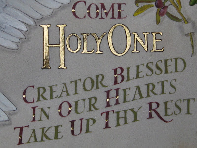
Lettering detail
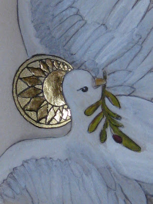
Halo detail
Once you've been to a place like Enders Island, there's no way you can stay away when you have another chance to go.  My trip last October was still vivid in my mind, and as it turned out, all five of us from that class--plus two new friends-- would be returning to take another class, "Illuminated Prayer on Vellum", with the inimitable Harvest Crittenden at St. Michael's Institute of the Sacred Arts on the island.  (BTW, check out Harvest's brand new Photoshop for Calligraphers online class, coming up in June!)

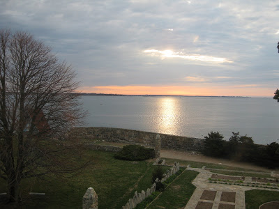
Sunrise the first morning was worth the trip!

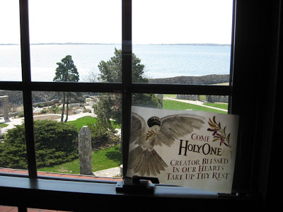
View from my window
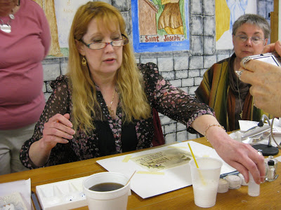
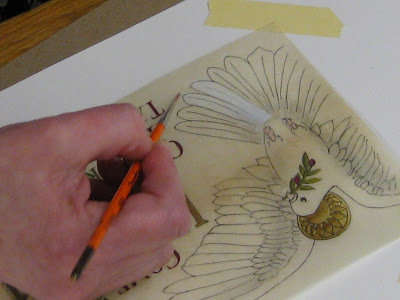
Harvest had created a lovely design with haloed dove, olive branches, and text, which we transferred onto sheets of vellum we had prepared with dental-grade pumice.  Over the four days of the class, we learned tips and techniques on gilding, shell gold, color theory (Harvest uses the CMYK palette), shadowing, and how much patience it takes to paint v-e-r-y tiny Roman drawn letters.
Harvest in action
Harvest demos feather detail
My piece in progress
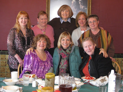
As if that weren't enough, the chef outdid himself and each meal was more amazing than the last.  And for me, the camaraderie and exchange of knowledge and information was just as valuable as the workshop.  It was truly an amazing group of women.

The Class
Translucence
Farewell to Enders

Grandes Dames de la Musique


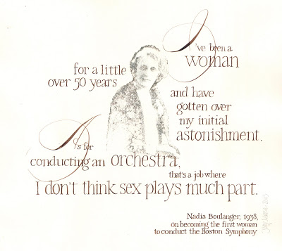
Quotations from these two remarkable women, both female orchestra conductor pioneers in the 1930s, inspired pieces that celebrate their talent and wit. The photocopied images were transferred with xylene (though nowadays I would use Citra-Solv, which is less toxic and smells way better--see their artists' site with all kinds of amazing ideas here), and the calligraphy was done in walnut ink. The hands are copperplate and Roman miniscule. Both were done with pointed pen, and the originals are about 12" x 18".