Chalk One Up


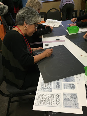
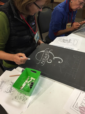
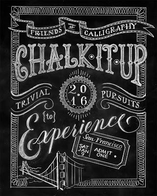
Last weekend I was honored and excited to be asked to teach one of the six mini-workshops at San Francisco Friends of Calligraphy's Trivial Pursuits XXVIII ! The calligraphers' version of speed dating, this event has each teacher meets with five groups of eight for fifty minutes each. The wonderful Evelyn Eldridge chaired the event and made everything run like clockwork.

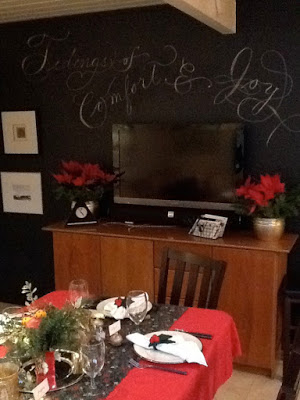
Planning the class gave me the opportunity to reflect on how I got into doing chalk lettering, which was after a kitchen remodel during which it was suggested we paint a wall black to make it 'disappear'. After a few years of staring at that wall, one Christmas I impulsively wrote a snippet of a carol on it to add to the decorations. This was the humble first one:


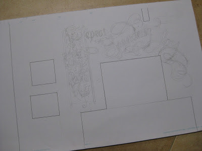
I decided to make it an annual tradition, so I made a template on graph paper, blocking out the 'obstacles': TV, framed artwork, beam, etc.


The designs got a teensy bit more elaborate.
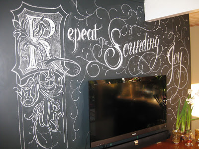


And here is this year's iteration.


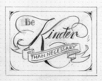
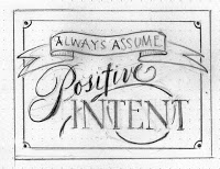
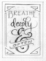
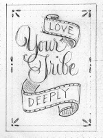
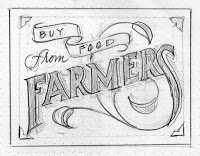
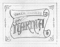
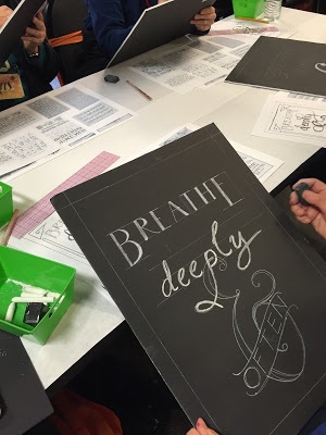
Of course, there was nowhere near enough time at Trivial Pursuits for something this large in a fifty-minute class! Things had to be scaled down. So a sweet little book by Patti Digh, entitled "Four Word Self Help", came to mind.  Four words seemed doable, so I picked a few of them and made thumbnail sketches to scale for our 15" X 20" black foam boards.


And one more I read somewhere, sometime:


After studying a couple of inspiration boards filled with vintage lettering and alphabets, and establishing a list of elements to work into the design, my FOC colleagues dove right in and transferred one of the phrases onto their pieces of foam board--with, of course, artistic license. It was a joy to see what all these talented calligraphers came up with to make them their own!


A fun event and an inspiring day! Thanks to all for your enthusiasm!
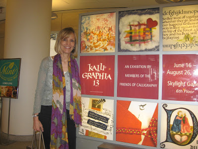
Kalligraphia 13

San Francisco Public Library

My whole family went with me to the opening reception for Kalligraphia 13 last Saturday!  Okay, I had to bribe them with lunch beforehand...but they were gracious and enthusiastic while I oohed and aahed over the amazing, varied, and outstanding work of my SF Friends of Calligraphy colleagues.


I'll never forget the thrill, six years ago, of seeing my Letters of Note exemplar displayed in the Kalligraphia 11 exhibit!  The show happens every three years, but I missed Kalligraphia 12 during the year I couldn't hold a pen due to adhesive capsulitis (frozen shoulder).  It was good to be back.

I came upon my piece, Grace, close to the entrance in a case right next to (gulp) the venerable Thomas Ingmire.  Susie Taylor--gifted calligrapher, Harrison Collection curator, and overseer of the exhibit---made sure I knew that show placement had to do only with where the pieces fit physically, not with comparative artistry.  Well, duh!  Lucky for me, they let anyone in...


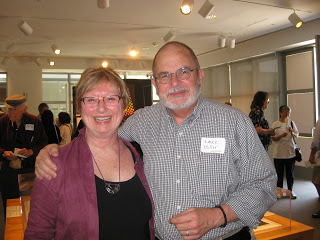
Also sharing "our" display case was Ann Miller, who had been my teacher for a summer course in 2004 at the Academy of Art University, a fantastic overview of pretty much the whole history of calligraphy.  That foundation has served me well. Thank you, Ann!

Ann & Lance Miller
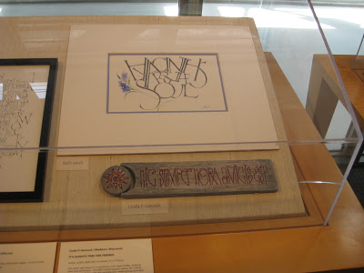
Seems as if six years ago I was just getting going with pen and ink, a stranger in a strange land;  this time I was delighted at how many of the artists I knew, and how many of the pieces I had seen in process during various classes and workshops.  Case in point, Ruth Korch's Hyacinths for the Soul from the Liesbet Boudens weekend last August:
Ruth Korch (top)
I didn't attend the Lisa Engelbrecht workshop last summer but wish I had!  Here's Carla Tenret's piece on fabric:

Carla Tenret
I've never met Marsha Brady but I'm a big fan:
Marsha Brady 
A record 98 calligraphers are represented in the show.  If you're anywhere near the Bay Area before August 26, treat yourself to a visit.  If you go on a Saturday, you might catch a demo by one of the Friends of Calligraphy rock stars (see schedule here) from 2-4 pm.  In the meantime, you can see a lot more of the pieces in the album Raoul Martinez, talented calligrapher and ace photographer, has posted here!

Among Friends


Last summer at the wonderful Liesbet Boudens class sponsored by the Friends of Calligraphy in San Francisco, I was lucky enough to once again share a table with the inimitable Ruth Korch.  As usual we had w-a-a-ay too much fun, and toward the end of the workshop, our esteemed FOC President Meredith Klein approached us about collaborating on the cover and alphabetical headings for the new membership directory, specifically in a Boudens-inspired style.  I'm much too busy preparing for Open Studios, said Ruth; I'm much too busy getting the school ready to open, I said;  then, Okay, we surprised ourselves by saying.

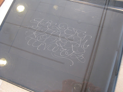
Ruth, always full of ideas, immediately started making thumbnail sketches and drawing a few stylized letters.  Within a week or so she had come up with a complete, gorgeous, quirky and fun alphabet, part of which is shown here:

© Ruth Korch 2011


With such a great starting point, it only took about a hundred drafts (instead of the usual two hundred) for me to put together the titles.  I love that the cover is hot, hot pink!  On the title page it's black & white and a little smaller:


Even without the privacy blur, Ruth's letters practically dance right off the page!


Thank you, FOC, for giving us the opportunity to work together on a very special project!


Lovely Liesbet

© Jody Meese 2011
"Be patient toward all that is unsolved within your heart, and try to love the questions themselves."       ~Rainer Maria Rilke

Last weekend the San Francisco Friends of Calligraphy sponsored a two-day workshop, Designing and Interpreting for Extraordinary Letters with the inimitable Liesbet Boudens of Bruges, Belgium. This was Liesbet's first trip to this country during which she is teaching in Northern & Southern California as well as Monterey.  She is effervescent, funny, charming, and all-around an inspiring teacher.

Liesbet Boudens

Prior to the class, we were asked to choose a short phrase and make some sketches based on drawn Roman caps.  I chose a piece of a Rilke quote I've always loved--plus, I couldn't resist having a letter "Q"to play with!  Liesbet had us working small with a .3mm mechanical pencil, and then enlarging our designs by around 200%.

Final small pencil sketch, ~3"X5"

After a day-and-a-half of fine-tuning our designs, we transferred them to cold press watercolor paper;  Liesbet prefers the texture it gives the letters once they are painted in gouache.  It was a revelation for me to use a broad-nib pen to paint the letters!  Once I got used to it, it was much easier to control than a brush (for me).  Liesbet also recommends that the letters not be painted in order, so that if one needs to remix color, a slightly different shade will be distributed throughout the piece.  Brilliant! She goes over the dried goauche with a white wax Derwent pencil to bring out the grain of the cold press paper.  Haven't tried that yet...

While on the surface, this seemed like a simple project, it was seriously challenging, and the variety and ingenuity of design in the group was amazing! My FOC colleagues have my greatest admiration.


Naturally, it wouldn't have been an FOC workshop if I hadn't sneaked out with my fabulous tablemate and partner-in-crime, Ruth Korch, to do a little shopping.  This time it was the American Craft Council show in the building next door, where I scored this little tea strainer/cheeseboard ensemble embellished with Celtic knotwork in cherry wood from MoonSpoon for a birthday gift!


All in all, a weekend well spent!

Textured Letters with Barbara Close

Photo by Laura Bernabei

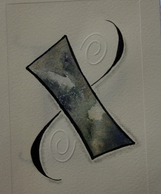
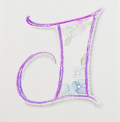
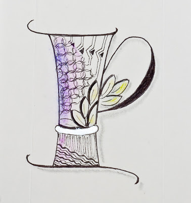
Some catching up to do!  The last weekend in March, the San Francisco Friends of Calligraphy sponsored a workshop by Barbara Close, whose store of techniques and enthusiasm seem absolutely boundless!  I always appreciate an organized, yet flexible teacher, and Barb was certainly all that.

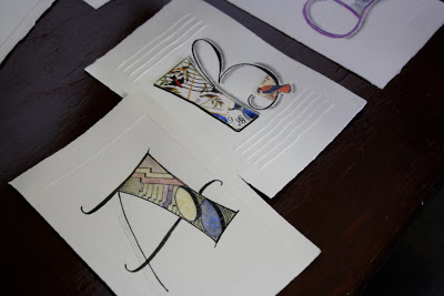
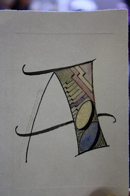
Within the framework of creating textured letters, we played with watercolor, collage, paste paper, embossing, shadows and doodles. 

Photo by Laura Bernabei 
Photo by Laura Bernabei

Photo by Laura Bernabei
Photo by Henry Silva
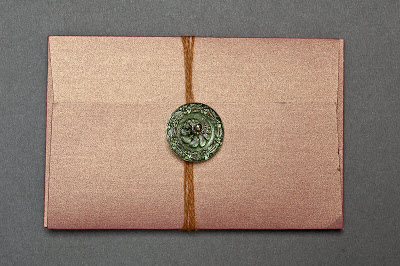
We even made a lovely little folio in which to keep our creations.  (And always happy to find a use for my Czech glass button collection!)

Photo by Henry Silva
It was one of those more-process-than-product workshops where you leave with just a handful of creations but a veritable truckload of techniques and inspiration!

As an added bonus, Ruth Korch--my awesome table-mate and partner in crime--and I dashed over during lunch to the furniture sale in another building at Fort Mason and with Ruth's encouragement I scored this fabulous chair, covered abundantly with French calligraphy!

Photo by Laura Bernabei
All in all, a fun and relaxing way to spend a weekend.