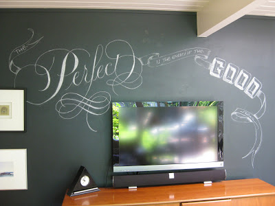
Summer Fun in the Family Room

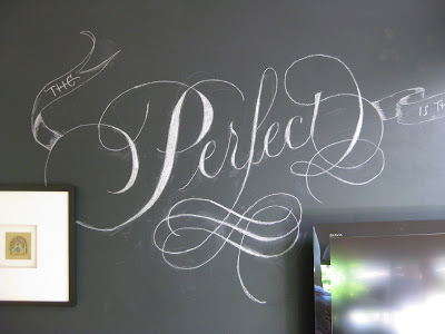
"The Perfect is the enemy of the Good."  ~Voltaire
Much to the amusement of friends and family, I've been at it again, scribbling on the walls!  This quote had been rattling around in my brain for a while, and seemed a propos after coming away somewhat intimidated by the hundreds of more-accomplished calligraphers at Calligraphy Northwest last month.  Not that those inspirational folks are the enemy, mind you--I am perfectly capable of taking on that role for myself--but for me, it's an important reminder that just plain "good" is something to feel, well, good about.

I thought I'd share a bit of process this time.  I started with a little doodle on a graph-paper sticky note;  as usual, television = design challenge.


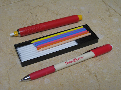
Although the finished project is done with dime store chalk, for some reason it was hard for me to get started with such a blunt tip.  Enter two handy tools, both marketed primarily to quilters:


The Fons & Porter is ultra-fine chalk--about the size of pencil lead--and happens to be sold by Paper & Ink Arts for lining dark envelopes.  The bolder "pen" is made by Dritz and I picked it up at Joann Fabrics.  It comes with a little box of white and colored "leads"! Joy!

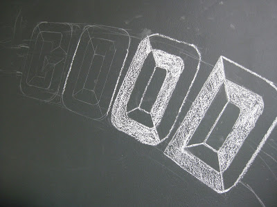
I started out sketching with the Fons & Porter...


Then defined lines a little more with the chalk pen:


Gradually I filled in and tweaked:


As you can see, there's still some clean-up to do, but I kind of like the chalkiness of it all.  By the way, this wall is painted with plain old latex (hadn't actually planned to be writing on it back then), which is getting a bit trashed by all this foolery.  My "buddy" Martha has a recipe for homemade chalkboard paint, and some great ideas for using it, here.  Check it out!

Calligraphy Northwest: Dynamic Duo

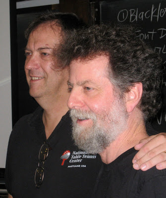
Julian Waters & Carl Rohrs, June 2012
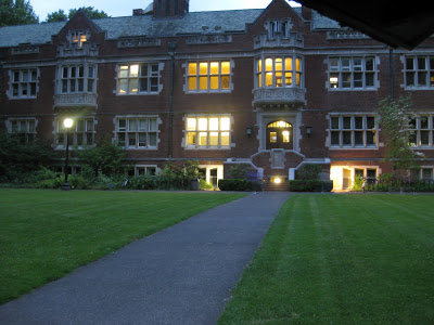
Last post I mentioned that Reed College's Eliot Hall was where Fr. Edward Catich cut the lintel stones, and Lloyd Reynolds taught his calligraphy classes back in the day.
Eliot Hall, Reed College, Portland OR
So there, in the very same lecture hall---well, half of it, the other half is now the college president's office--two present-day calligraphic luminaries held forth with a course titled "20th Century Inspirations and 21st Century Techniques" during the week of Calligraphy Northwest in June.  Julian Waters and Carl Rohrs started out by giving us what clearly had been a labor of love for each of them:  a total of 248 pages, bound in two volumes, of their own work alongside that of their "inspirateurs", some familiar, some obscure (at least to me). There is enough material here for a lifetime of study!  If my house ever catches fire, I know what I'll be grabbing on the way out the door!
Workbooks by Carl Rohrs (top) &  Julian Waters (bottom) for CNW
Most of the time I was so busy listening, observing, absorbing and experimenting that I took very few photos.  To be honest, a lot of it is just now sinking in.
Julian demos while Carl comments
Contrast!

It's all in the details!

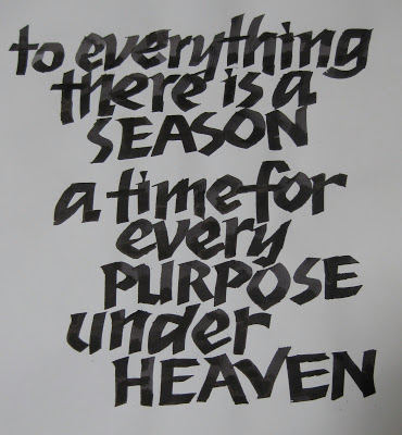
This wasn't a product-oriented class, but a rather stream-of-consciousness romp through big ideas and tiny details--which seem now either too vast or too small to write about here.  In what they had predicted would be a "somewhat improvisatory" presentation, it was fascinating to listen to Carl & Julian's banter, filled with seriously encyclopedic knowledge of fonts and all things calligraphic. For example, did you know that Rudolf Koch had designed minuscules for his1920s Neuland typeface, but they were abandoned?  Here's my attempt at approximation:


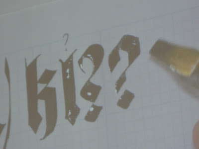
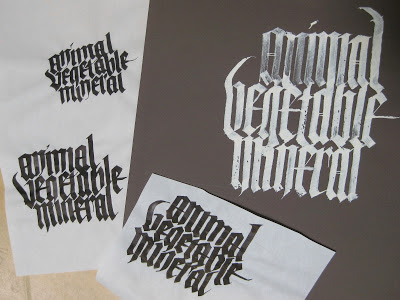
We worked with broad nib, automatic pen, folded nib, ruling pen, flat brush and pointed brush. Here we were trying to eliminate as much negative space as possible in our blackletter:


That afternoon we switched to pointed brush and my head almost exploded!  I won't trouble you with illustrations of my feeble attempts.

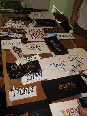
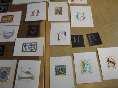
At the end of the week there was a "show and share" in the dining hall.  What a feast!


I apologize for the lack of attribution--way too many to keep track of.

It was announced that in addition to the 2013 conference at Colorado College next summer, the 2015 conference will take place in the Bay Area!  Save the dates!

Calligraphy Northwest: Pillars of Reed


It has taken some time to digest the tour de force that was Calligraphy Northwest, which took place last week at Reed College in Portland, Oregon. It was the 31st of these conferences, but my first foray. The Portland Society for Calligraphy, led by Carol DuBosch and Meri Taylor, did a stellar job of running the event---which had a lot of moving parts and a dream team faculty---without a visible hitch. There are not enough hours in the day to report on the full experience, but a few things float to the surface at the moment.

The campus is lush and stunning, and more than a few referred to its vibe as "Hogwartsian".


There was much focus on the life and work of Lloyd Reynolds, initially an English professor at Reed who taught himself Italic from a copy of Johnston's Writing and Illuminating and Lettering, and slipped calligraphy into the curriculum circa 1948, initially as "alphabetic communication"! The class was an enormously popular course (up to 80 in a class!) which he taught until 1970.  The movement spread to the Portland schools and contributed a national revival of the art form. Ironically, calligraphy was forced out of the curriculum a few years after Reynolds' death.  Nevertheless, his influence is felt on the campus and beyond--there are scribes, type designers, and poets who still speak of him with reverence-- and a quiet "calligraphy initiative"is afoot at Reed today.  It was not unusual to see subtle references to Reynolds' legacy about campus, i.e. the attribution for this omnipresent font (one of many designed by his former students).
Lower right says "Lucida typeface designed by Chuck Bigelow '67"
There were a number of conference attendees who studied with Reynolds, and he clearly was a dynamic force and a man of strong opinions.

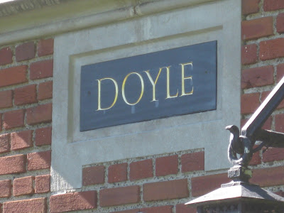
Presumably it was his association with Roman cap scholar Father Edward Catich that resulted in the elegant lettering on the lintels of several buildings, notably Eliot Hall where Reynolds held court in the third floor lecture hall.

Some better shots of his work on the old dorm block:


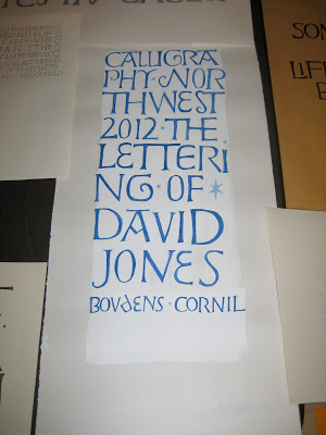
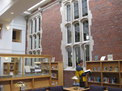
In honor of the conference, there were exhibitions of the work of both men in the college library, a charming meld of old and new buildings.


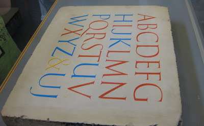
Some Catich stonework was on loan from the Portland Art Museum, so we got a closer look at the carvings and their preliminary brushwork.
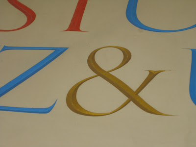
The red letters are Trajan;  the blue letters did not exist in the Roman alphabet,
and were presumably of Catich's invention.

Catich established that the Trajan letterforms were the result of
brush or reed work, later carved into the stone.

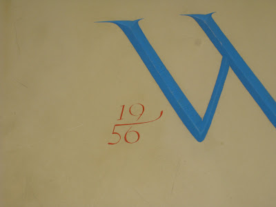
I'm crazy for ampersands, but I have to say, the date on the stone below was my very favorite detail!