Envie Envy

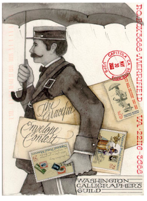
This was my entry to the Graceful Envelope Contest, which is co-sponsored by the Washington Calligraphers Guild and the National Association of Letter Carriers.  The theme was the letter "D", and the entries had to be mailable and postmarked.  It's mostly pen (G-tec, Slicci, Pitt) and pencil.  The texture of the paper did some cool things to the shading, completely serendipitously.  The "D" is Finetec gold, burnished and tooled.  Of course, this scan was pre-mailing so I have no idea how it looked by the time it arrived!

The results are out and my amazingly talented friend Ruth Korch won Best in Show!!!  No doubt you've seen some of her other winning envelopes online and on magazine covers, like this:

Ruth Korch

and this:
Ruth Korch

Ruth's, and the other winning envelopes will be posted here beginning August 8, and for those of you in the DC area, on display beginning in September in the lobby of the National Association of Letter Carriers building.  Can't wait to see the fantastic array of creativity this event elicits!  Congrats to all for postal awesomeness.

Best in the Business


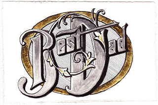
Sweet discussion this morning over Father's Day brunch:  my kids say that not every "father" is a "dad", and theirs is a gem and definitely a "dad"!

Hence this doodle on hot press paper:  Pitt marker and brush pens, pewter Derwent metallic pencil, gold pen, and gold leaf over Instacoll.  And the debut of my section liner!  Any irregularities due to user error...

Sayonara Sylvia


A longtime colleague is departing at the end of this week, and it is bittersweet for her as well as for those of us staying on.  For some time, she has wanted to teach at the same school her children attend--which will significantly simplify her life, we hope--but she has been with us for many years and we all feel like family.

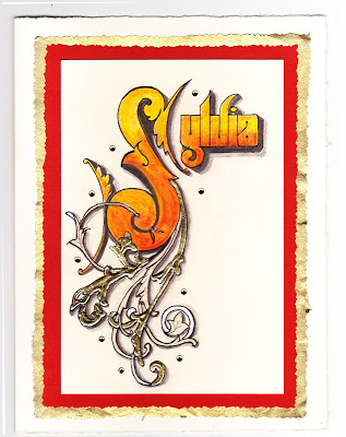
She loves orange, and wears it well.  I wanted to make a going-away card for her that expresses both her favorite hue and the fire within her that makes her so strong and ambitious!  Inktense pencils, lightly brushed with water, give a flame-like feeling.  For the ornamentation, I remembered learning from Harvest Crittenden how lovely it is to combine gold leaf and shell gold (see the halo in this post);  this is the "poor man's version" with gold leaf over Instacoll, and painted Finetec gold and silver.  I love the dimensional look it gives!

The shadows on the Sickels lettering are Zig gray suede (a heretofore under-appreciated brush pen that has patiently awaited attention in my studio) and HB graphite;  outlining is done with a fine-tip Pitt pen.  The paper is Crane's correspondence card, mounted on a piece of old greeting card (cut with deckle scissors), a piece of metallic gold (ditto), and a Fabriano Medioevalis card.  The final touch was a scattering of random crystals from Michaels, glued on.  Hope she likes it!