I Yam What IAMPETH

So I never got around to reporting on my first trip to the annual convention of the International Association for Master Penmen, Engrossers, and Teachers of Handwriting  ("engrossers", not "and grocers", as someone thought I was saying). Was there ever an organization more in need of an acronym?  I think not.

IAMPETH was held this July of this year in Phoenix, which I'm sure is lovely in the winter months. [Phoenicians, you have my total admiration for staying cool in the face of three-digit temperatures day after day. I do not possess that kind of stamina.]  The convention is a virtual candy store for, well, penmen, engrossers, etc.  The mostly half-day classes were enough to whet one's appetite for more on a technique, and to see the IAMPETH rock stars in action, up close and personal.  And just as exciting, to meet in person some bloggy-type friends--you know who you are!

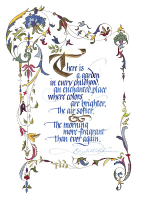
By far the most addictive class I attended was "Leaf Script Capitals" with White House calligrapher Rick Muffler.  The wonderful Jane Farr wrote a terrific blog post with tutorial here;  go read it!

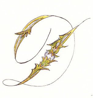
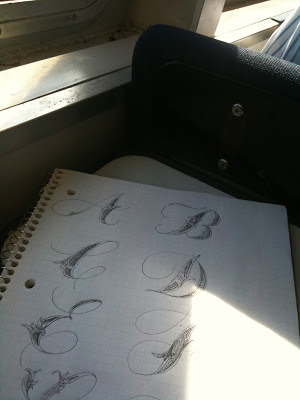
Since my flight home was delayed (we do fog here in San Francisco in the summertime, not great for air travel but nice and cool--okay, freezing), I had plenty of time to start doodling an alphabet while waiting in the airport.


The inimitable Master Penman Harvest Crittenden had sat in on the class and suggested that there would traditionally have been a pearl nested in the greenery, so when I got back into the studio I played around with that a bit...

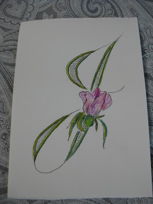
...then tried a rose...


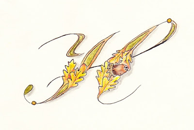
...an acorn (no peeking, Harvest!)...


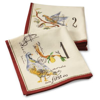
...and some design elements borrowed from a random cocktail napkin I found in my kitchen.


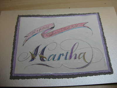
I used it on a birthday card (a little sloppy, rush job!)...


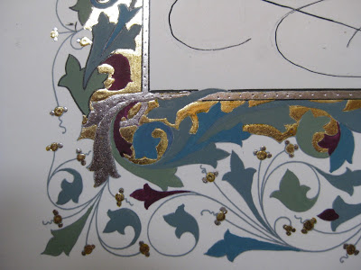
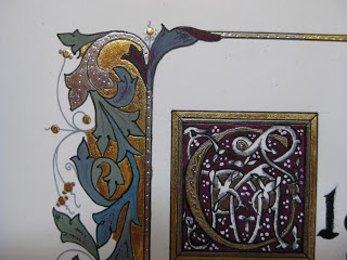
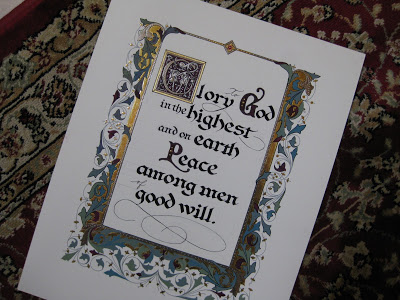
...and experimented with metallics and gratuitous acanthus leaves.

Great fun and great possibilities!


Lovely Liesbet

© Jody Meese 2011
"Be patient toward all that is unsolved within your heart, and try to love the questions themselves."       ~Rainer Maria Rilke

Last weekend the San Francisco Friends of Calligraphy sponsored a two-day workshop, Designing and Interpreting for Extraordinary Letters with the inimitable Liesbet Boudens of Bruges, Belgium. This was Liesbet's first trip to this country during which she is teaching in Northern & Southern California as well as Monterey.  She is effervescent, funny, charming, and all-around an inspiring teacher.

Liesbet Boudens

Prior to the class, we were asked to choose a short phrase and make some sketches based on drawn Roman caps.  I chose a piece of a Rilke quote I've always loved--plus, I couldn't resist having a letter "Q"to play with!  Liesbet had us working small with a .3mm mechanical pencil, and then enlarging our designs by around 200%.

Final small pencil sketch, ~3"X5"

After a day-and-a-half of fine-tuning our designs, we transferred them to cold press watercolor paper;  Liesbet prefers the texture it gives the letters once they are painted in gouache.  It was a revelation for me to use a broad-nib pen to paint the letters!  Once I got used to it, it was much easier to control than a brush (for me).  Liesbet also recommends that the letters not be painted in order, so that if one needs to remix color, a slightly different shade will be distributed throughout the piece.  Brilliant! She goes over the dried goauche with a white wax Derwent pencil to bring out the grain of the cold press paper.  Haven't tried that yet...

While on the surface, this seemed like a simple project, it was seriously challenging, and the variety and ingenuity of design in the group was amazing! My FOC colleagues have my greatest admiration.


Naturally, it wouldn't have been an FOC workshop if I hadn't sneaked out with my fabulous tablemate and partner-in-crime, Ruth Korch, to do a little shopping.  This time it was the American Craft Council show in the building next door, where I scored this little tea strainer/cheeseboard ensemble embellished with Celtic knotwork in cherry wood from MoonSpoon for a birthday gift!


All in all, a weekend well spent!

Generous Jo


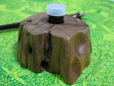
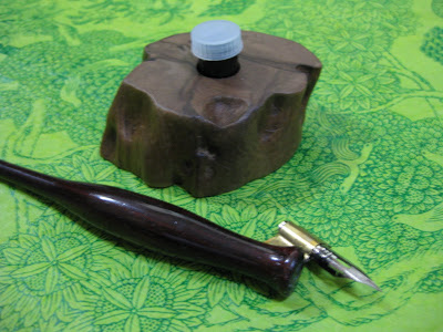
One of the great things about the blogosphere, of course, is that we can virtually meet and get to know people who share our passions, however esoteric and obscure they may be (the passions, not the people).  Now I'm willing to bet there's a pretty small percentage of folks on the planet who even know what "dinky dips" are, let alone have figured out a way to make them more elegant and fun.  Enter the wonderful Jo Miller, calligrapher extraordinaire who recently surprised me with a gift of one of her ingenious creations.  "This holder is made from a piece of driftwood reclaimed from Lake Maurepas in southeast Louisiana," she says.  "It has a hand-rubbed finish which feels smooth as glass."  And, I might add, is so light that filling the dinky dip with ink probably doubles its weight.  Thank you, Jo!


Jo has made these available in her etsy shop, where she also has some darling ones made of reclaimed beadboard.  Dinky dips are a necessity for PPPs (Pointed Pen People)--so easy to see and control the amount of ink on the nib.  A wonderful gift for yourself or a calligraphy friend...and guaranteed to take your lettering up a notch!  At least that's what I'm hoping...

Resurrection


Most of the time when I look back through early pieces I find them, well, cringe-worthy.  So it was a pleasant surprise to come across this one, which isn't half bad, I think.  At the time I did not realize this was not Wendell Berry's entire poem, but had been excerpted in the version I had been carrying around for years.  The piece was an assignment from the wonderful Ann Miller in her "Calligraphy & Letterforms" class at the Academy of Art University in San Francisco, summer of 2004. [Ann still teaches the class, but only online. It's pricey (college credit) but an invaluable overview of the history of the artform.] The assignment was to use a curvelinear baseline with a quote of our choice.  It's monoline--probably various Speedball nibs, probably Sumi or Higgins Eternal ink.

That summer was a resurrection of sorts for me and glows in my memory.  I took the ferry across San Francisco Bay early each morning along with the self-described "worker bees" headed to the Financial District, had my ritual bagel and coffee on the boat, then walked a half-mile or so up Market Street to the classroom with my big portfolio and toolkit.  Virtually everyone else in the class was a twenty-something Graphic Design major who didn't quite "get" pen and ink, and couldn't wait to return to their digital lives, but I was enamored and obsessed.  

Here are the pieces of the poem I used in the piece:

Plant sequoias.
Say that your main crop is the forest
that you did not plant,
that you will not live to harvest.
Say that the leaves are harvested
when they have rotted into the mold...
Put your faith in the two inches of humus
that will build under the trees
every thousand years...Be joyful
though you have considered all the facts.
So long as women do not go cheap
for power, please women more than men.
Ask yourself: Will this disturb the sleep
of a woman near to giving birth?
Go with your love to the fields.
Lie easy in the shade...Swear allegiance
to what is highest your thoughts.
As soon as the generals and the politicos
can predict the motions of your mind,
lose it. Leave it as a sign
to mark the false trail, the way
you didn't go. Be like the fox
who makes more tracks than necessary,
some in the wrong direction.
Practice resurrection.
copyright © 1973 by Wendell Berry

Border Trouble

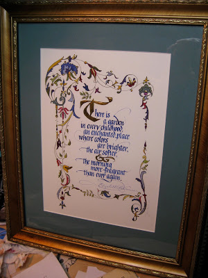
I recently learned the expression "border trouble", in this case referring not to immigration---nor to illuminated borders, like the one above---but rather to the sometimes-daunting obstacle between the idea for a piece and the point at which it begins to take shape.  Since I sometimes struggle mightily to move through that region, it helps me to think of it as just a transition, kind of a bothersome ordeal one has to go through to move into the pleasure on working on the piece once it starts to come to life, not to mention once it is finished.

It's school fundraiser season once again and I created this piece to raise some money for a good cause.  Artwork doesn't always do well in a silent auction but this was displayed nicely and went for a pretty penny!  The border outline came from the fabulous collection of the Graphics Fairy (you really need to go to that site, and bookmark it!);  I was able to take a little shortcut and print it onto tracing paper (rather than actually tracing it) and then transferred it to Arches 140 lb hot press with Armenian bole.

Because of the nature of the quote, I used more colors than I usually would have in the border.  The ink is Pelikan (with some powdered gum arabic added);  the rest of the design is gouache, pen, and 23K gold leaf.  I used a [left-handed] Brause 1.5mm nib;  the image is about 7.5" X 10.5".  I used my Logan Compact Mat Cutter (which has come in handy more times than I can count) to cut the mat, then popped it into a frame I picked up at Michael's half-price.  Ta-dah!

Cursive Catastrophe

Civil War Diary of Charles Wesley Foulk
Did you catch "The Case for Cursive" in yesterday's New York Times?  Apparently there is a new generation of children who not only cannot write in cursive, they can't read it either!  The biggest concerns seem to be that their block-lettered signatures will be easier to forge, and (rather secondarily) that the fine-motor-skill benefit of fluid writing may be lost.  Cursive, one elementary school principal posits, just may not be a "21st century skill".  Hmmmph.

But what I found the most distressing was the account of a 22-year-old and her cousin who found their late Granny's diary but couldn't read it. “ 'It was kind of cryptic,' [the young woman] said. She and the cousin tried to decipher it like one might a code, reading passages back and forth."

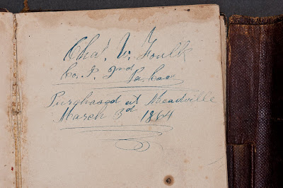
Seriously?  Are those of us who can read cursive going to become sought-after specialists, the dying breed able to interpret archival material---say, my great-great-grandfather's Civil War diary (the first page of which is pictured above)?  I'll admit Charles' authentic Spencerian (according to Michael Sull) handwriting is sometimes challenging to read, but that might be because he was writing with a dip pen in the freezing cold in his army tent.  I'm just saying...

On the upside, I see a new opportunity for parents here!  When our children were young, my husband and I used to resort to speaking a little Spanish when we didn't want them to know what we were saying (which worked well until their Spanish got way better than ours).  Nowadays mom and dad can leave each other notes in plain English that will just look like lovely scribbled designs to their offspring!

In any case, it seems that diary-snooping may be severely curtailed in the near future.  So go ahead and let'er rip in your journals, scribes!  No one now under twenty will ever know your secrets.
Enders Redux

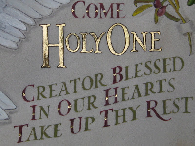
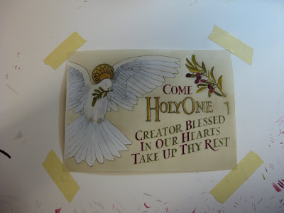
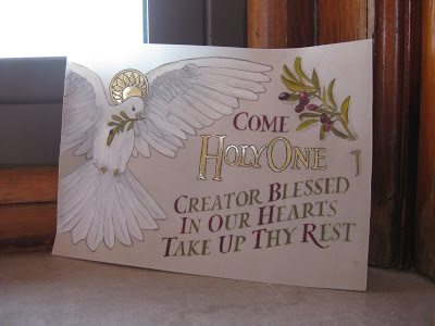
The finished piece in my garden
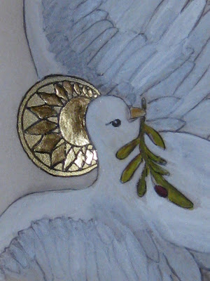
Olive branch detail
Lettering detail
Halo detail
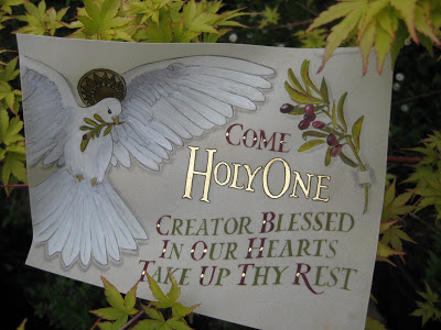
Once you've been to a place like Enders Island, there's no way you can stay away when you have another chance to go.  My trip last October was still vivid in my mind, and as it turned out, all five of us from that class--plus two new friends-- would be returning to take another class, "Illuminated Prayer on Vellum", with the inimitable Harvest Crittenden at St. Michael's Institute of the Sacred Arts on the island.  (BTW, check out Harvest's brand new Photoshop for Calligraphers online class, coming up in June!)

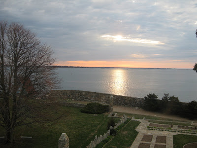
Sunrise the first morning was worth the trip!

View from my window
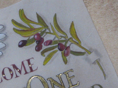
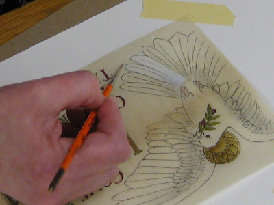
Harvest had created a lovely design with haloed dove, olive branches, and text, which we transferred onto sheets of vellum we had prepared with dental-grade pumice.  Over the four days of the class, we learned tips and techniques on gilding, shell gold, color theory (Harvest uses the CMYK palette), shadowing, and how much patience it takes to paint v-e-r-y tiny Roman drawn letters.
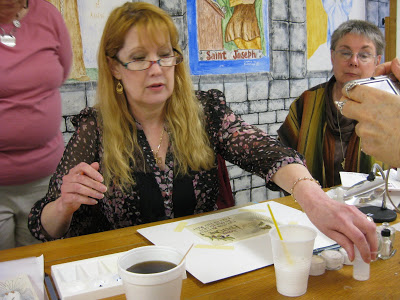
Harvest in action
Harvest demos feather detail
My piece in progress
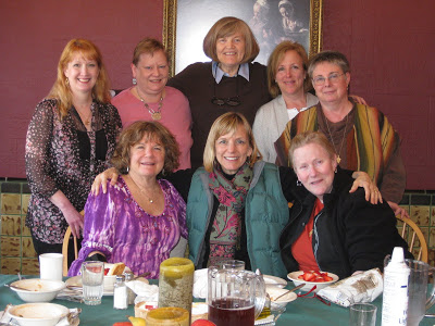
As if that weren't enough, the chef outdid himself and each meal was more amazing than the last.  And for me, the camaraderie and exchange of knowledge and information was just as valuable as the workshop.  It was truly an amazing group of women.

The Class
Translucence
Farewell to Enders

Textured Letters with Barbara Close

Photo by Laura Bernabei

Some catching up to do!  The last weekend in March, the San Francisco Friends of Calligraphy sponsored a workshop by Barbara Close, whose store of techniques and enthusiasm seem absolutely boundless!  I always appreciate an organized, yet flexible teacher, and Barb was certainly all that.

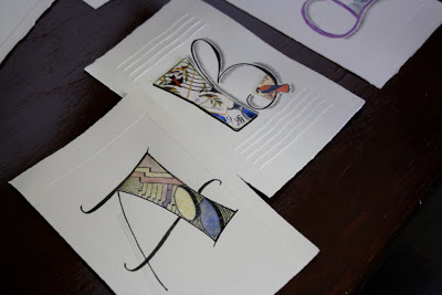
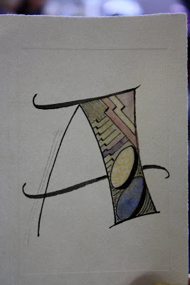
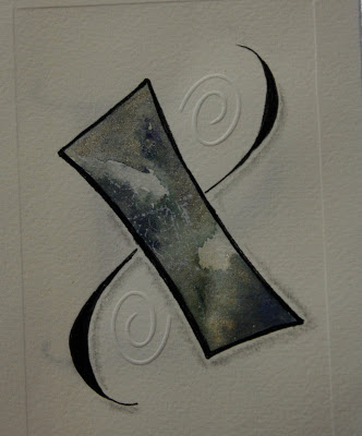
Within the framework of creating textured letters, we played with watercolor, collage, paste paper, embossing, shadows and doodles. 

Photo by Laura Bernabei 
Photo by Laura Bernabei

Photo by Laura Bernabei
Photo by Henry Silva
We even made a lovely little folio in which to keep our creations.  (And always happy to find a use for my Czech glass button collection!)

Photo by Henry Silva
It was one of those more-process-than-product workshops where you leave with just a handful of creations but a veritable truckload of techniques and inspiration!
As an added bonus, Ruth Korch--my awesome table-mate and partner in crime--and I dashed over during lunch to the furniture sale in another building at Fort Mason and with Ruth's encouragement I scored this fabulous chair, covered abundantly with French calligraphy!

Photo by Laura Bernabei
All in all, a fun and relaxing way to spend a weekend.

More Calligraphed Confections: Marian's Cake


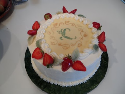
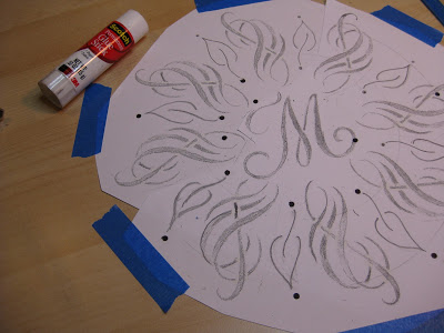
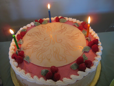
Wendy and I so much enjoyed making the "K" mandala cake that we decided to do it again, this time for my friend Marian,  a self-professed diva who is turning 75.  My idea was to work a stylized treble clef into the design because she is, after all, a soprano--but treble clefs are so, I don't know, ordinary.  There was a lot of trial and error involved, so I worked in pencil on this one.


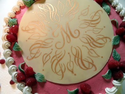
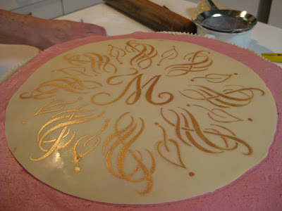
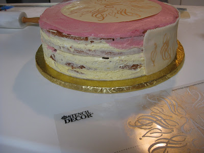
This time I cheated a little bit and when I finally got the motif right I just made seven copies and pasted it up.  I added the leaves freehand for some finer contrast.  The dots were punched from black paper and glued, making much better circles than I could have done by hand.  Again I taped the design to the table, placed a piece of glass over it and then the stencil blank over that.  With my handy "burner" tool I cut the stencil in no time at all.  Then I headed over to Wendy's to test it with "old gold" lustre dust on parchment paper.


Wendy decided we should do the sides of the cake as well (a 14" creation!) and sent me home to make that stencil.  Again, I copied, cut and pasted using elements of the round top design.


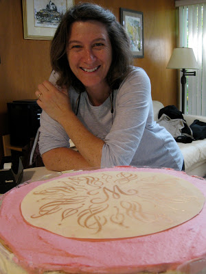
By the time I got back to her house, she had applied the gold to the top of the cake, a perfect disk of white chocolate.


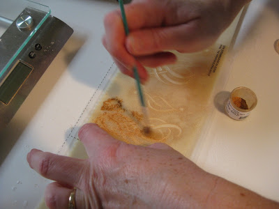
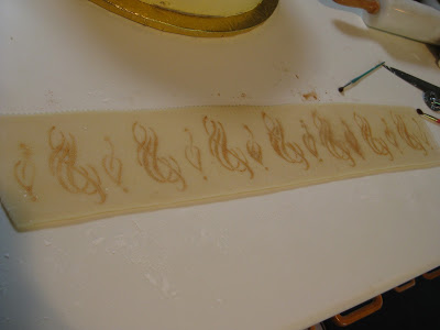
Just imagine:  layers of almond-flavored cake alternating with layers of raspberry mousse and lemon cloud illusion (lemon cream made with lemon curd).  To die for!  We stenciled the sides on two slabs of homemade marzipan (Wendy skinned the almonds herself!).  It was a more subtle look than on the white chocolate, probably because of the moisture element.


Here's the first half applied:


And here's the master pastry chef herself:


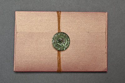
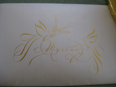
Back into my studio I set to work making a matching card for Marian with my trusty Zebra G nib in Aztec Gold Finetec on Opal Stardust cardstock and envelope.


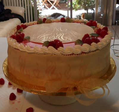
By the time I picked up the cake the next day for the party, Wendy had worked her magic with piping, fresh raspberries and marzipan leaves.


At the party, the beautiful birthday diva serenaded us with her amazing voice (and we serenaded her back with "Happy Birthday")...


...candles were added for "past, present and future"...


...and then it was time for cake!


Wendy and I are having so much fun with this collaboration!  Stay tuned for the letter "T"!

Silk Purse from Sow's Ear


So after four-plus years of Blackletter classes at Atelier Gargoyle, I had acquired an impressive pile of butcher paper practice sheets that it seemed wrong to throw away.  One of my classmates had suggested I use them for wrapping paper, which was fun and different--very cute when tied with string.  For some reason I thought to grab a few sheets as I went out the door to an evening collage class with the inimitable Anna Corba, incongruously but delightfully being held at Knitterly, a favorite local yarn store.  We were provided with kits and lots of boxes of ephemera to dig through, and I thought my walnut-inked specimens were a nice contrast to the image elements.  (Don't look too closely at the letterforms, Linnea & Ward--the sheets are really old, okay?  That's my story anyway.)


We made collages on two pieces of matboard, then coated them with melted beeswax, which gave them surprising depth and dimension.  The covers were assembled with the notebook elements and bound together with ribbon.


 A fun project and a nice mid-week escape!

Let Them Eat Cake!: Karen's Cake


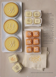
I had already asked my dear neighbor Wendy Remer, an amazing chocolatier, to make a cake for my friend's 50th birthday celebration.  Then we saw the latest issue of Martha Stewart Weddings...


...and were inspired by the wonderful creations of Nan Deluca, Patricia Mumau, Dana Cochran, and Xandra Zamora. We decided to collaborate and create something unique for the occasion.

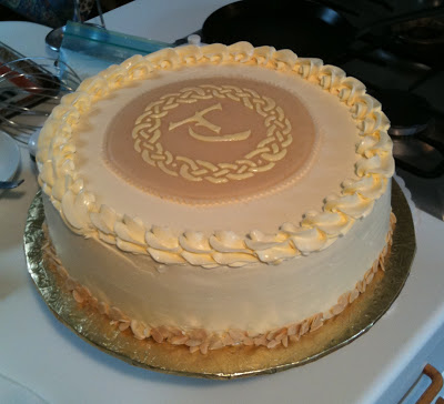
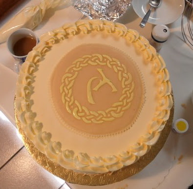
Having admired the work, and especially the mandalas, of Jane Farr, I was delighted to find her outstanding step-by-step instructions for creating them.  I penned my first mandala around the initial "K", then headed to Fedex Kinko's (or whatever it's called this week) to make a few enlargements.

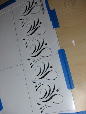
With luck (and a 40% off coupon) I found an electric stencil cutter at Michaels--I didn't even know such a thing existed!  What a dream to work with!  It's kind of like a woodburning tool with a very fine tip.  It seems to work well on .003 and thicker acetate sheets, as well as the stencil blanks that are sold for this purpose.


I taped the design to my work table, then a piece of glass over that, and the blank stencil on top.  With a little practice I was able to keep the tool moving smoothly enough.  (I did have my husband improve the insulation, though--it gets very hot!).


The pieces popped out easily with a craft knife.


I set the stencil over a piece of black paper to make sure I hadn't missed any sections...


...and on a whim, took out my pan chalks and a cotton ball to give it a test run.


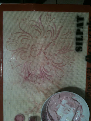
Then it was time to head over to Wendy's for further experimentation!  She had seen a video on using stencils with royal icing, which specified that the icing should be the consistency of mayonnaise.  She tried out the stencil on her Silpat mat with mayonnaise and pink food coloring.  Voila!


Encouraged by success, I cut and pasted elements of the mandala for a stencil to use on the sides of the cake.  We ended up not using it after all.


Though next time we'd make it a bit stiffer, the apricot-tinted royal icing was quite striking over the chocolate fondant, and Wendy added some touches of gold dust to dress it up a bit.  I made a little matching card to go with it (but forgot to take a picture of it).


The Birthday Girl was glowing and gorgeous!

Everything Old is New Again


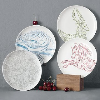
I was walking through West Elm on my way to somewhere else when I spotted these dishes and snapped some photos with my phone.  West Elm is a little too trendy for me, but if Offhand Flourishing is hip, I guess I'm cooler than I thought!  I haven't sleuthed it but the bird looks suspiciously like something out of E. A. Lupfer's  Ornate Pictorial Calligraphy.

The deer and the horse don't have the same graceful thicks and thins, but the idea is definitely there.


I didn't notice it in the store, but according to their website they also have a snowflake, mandala-like design:
 West Elm photo
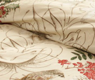
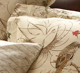
So I guess it should come as no surprise that Pottery Barn, which is also owned by Williams-Sonoma, has also used calligraphy in their holiday bedding design.

Pottery Barn photo
In this case the flourishings are relegated to the background, but I think they really make the design:

Pottery Barn photo
Pottery Barn photo
And for the truly obsessed dedicated, you can complement the ensemble with scribbly sheets!  Couldn't name the hand, but it looks to be French.

Pottery Barn photo
Pottery Barn photo
So I wondered if this was a running theme in the corporation, and headed to the Williams-Sonoma website.  Sure enough.  Napkins, tablecloths, mugs, glasses, plates, and even a cookie jar with calligraphy--some recognizably Spencerian--woven in.  We're taking over!

Williams-Sonoma photo


Disclaimer:  West Elm, Pottery Barn, and Williams-Sonoma have no idea who I am;  just thought these were fun and wanted to pass them along.

Bye Bye Blackletter

The names of everyone who has ever attended a Black Sabbath class
by Ward Dunham
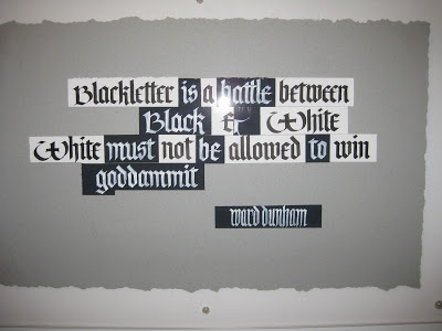
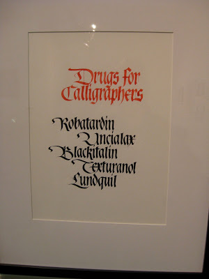
It was a bittersweet event.  On Saturday, December 4, students and friends of Ward Dunham & Linnea Lundquist gathered to celebrate the end of four-and-a-half years of "Black Sabbath" blackletter classes in their San Francisco studio, Atelier Gargoyle.  Those of us lucky enough to attend these monthly Saturday sessions were expertly and enthusiastically schooled in Textura, Johnstonian Italic, Uncial, Batarde, and other related topics by two exceptional calligraphers who happen to be a couple and, often, a comedy duo.


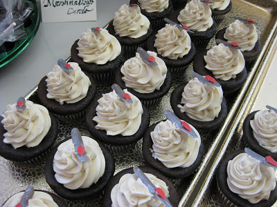
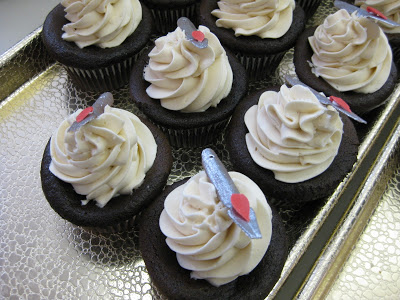
There was food, including cupcakes from the wonderful Jasmine Rae Bakery, who have kept us in yummy gingerbread and other delectables these last few years.


Look closely...those are fondant Brause pen nibs!  Good enough to eat, and we did.


Ward tended bar, offering his signature Hot Apple Pie adult beverage...


...while Linnea helped everyone stock up on supplies from the shop.


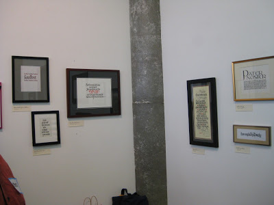
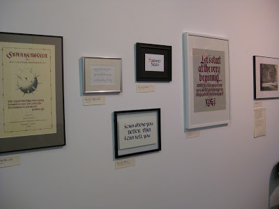
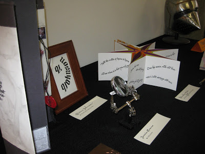
The exhibit of the students' final projects, beautifully displayed on the studio walls and tables, was varied and awe-inspiring!


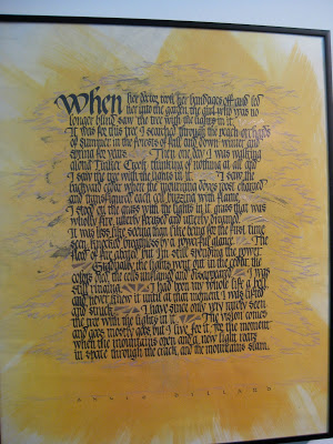
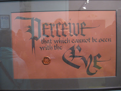
Here is a closer look at a few of the pieces for which the photos came out reasonably well.  There were so many wonderful ones!

Meredith Jane Klein
Paul Costanzo


David Brookes

Patricia Coltrin

Jessie Evans
Helen Fung 
Bonnie Noehr
Dean Robino
Raoul Martinez
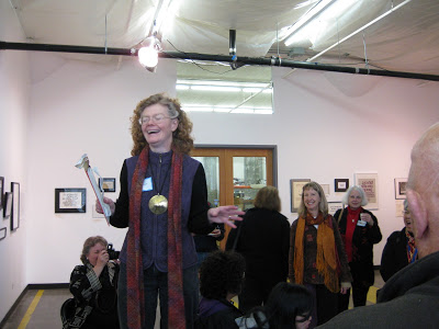
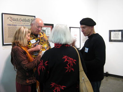
There were awards, speeches, and heartfelt tributes, followed by lively conversation and merrymaking!


Ward made sure we all had the contact information for their new abode in Half Moon Bay...


...and Linnea, along with the rest of us, shed a few tears.


But it has been a great run, and all of us who participated are richer for it.  Black Sabbath has been an important part of the San Francisco calligraphy community, and will be sorely missed.  Thank you, Ward & Linnea!  It has been a pleasure and a privilege.

NO8DO


Before visiting my son in Spain last month I had read about the city of Sevilla's cryptic official symbol, which dates to the 13th century.  I was delighted on my first morning there to come across the lovely calligraphic (and I think, letterpress) rendition above.  And as promised in the guidebooks, it was everywhere.  

On Christopher Columbus' tomb in the cathedral:


At the Plaza de España:


On the sidewalks:


On the utility trucks:


And just about everywhere you look, in some delightful rendition.


So what does it mean?  The symbol's history involves Alfonso the Wise (the "Scholar King") and Sevilla's singular loyalty to him in the face of his son Sancho's attempted overthrow. What seems to be an "8" is a representation of a skein of wool, or madeja.  The play on words is a contraction of "No me ha dejado", or "She [Seville] has not abandoned me." When spoken, the "me ha" typically is run together, making "NO-m[eh]adeja-DO".  A little confusing, but charming nonetheless!  For the full story, click here and scroll down to "Motto".

Christmas Comes Early


I don't know about you, but for me the word "clipart" has the connotation of fairly simple, cartoonish images that really are not of much use in the calligraphic world.  But today I am positively swooning over the discovery of University of South Florida's Center for Instructional Technology's Clipart ETC collection! 

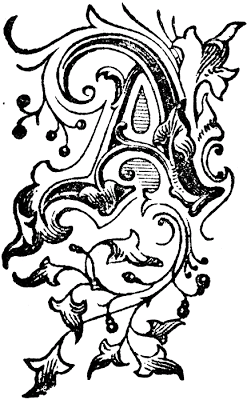
At first glance their logo, an ampersand superimposed over a map of Florida, is a good sign--but does not even compare with the riches to come.  There are 60,000 pieces of free, mostly antique black-and-white clipart, and more are being added every week.  Categories include Decorative Letters (just begging to be illuminated!),  Complete Alphabets, Art (including Celtic and other ornaments), Borders (corner, edge, and full page) plus vines, doodads and tailpieces.   Each is offered in three JPEG or GIF sizes and a downloadable 240 dpi TIFF for printing. The database is easily searchable and will yield many treasures!


And best of all, you can use up to fifty of them in a single project without special permission if it is non-commercial or educational (and "not obscene or scandalous"---so tone it down, you wild and crazy scribes). It's a goldmine!

All clipart courtesy FCIT

Grace Under Pressure

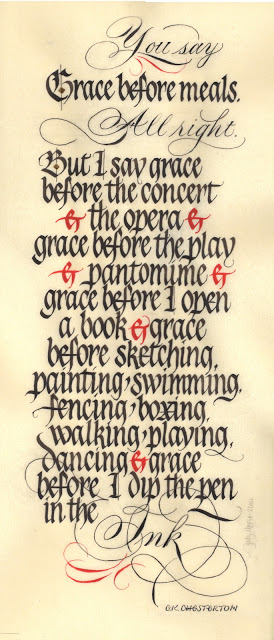
"Grace", original size approximately  8" X 18"
What is it about a looming deadline that brings clarity to our thinking?  This is a piece I had been mulling over for at least a year, occasionally pulling out the quotation and fooling around with it.  Then Linnea Lundquist & Ward Dunham announced they would be closing their wonderful studio, Atelier Gargoyle, on December 4th with an all-day party and show of their students' work.  This was the incentive I needed, and I knew it had to get done and delivered this week since I would be out of town most of the two weeks before the celebration.


It truly has been a gift to have access to Ward & Linnea's wisdom and expertise these last four-and-a-half years at their monthly Saturday "Black Sabbath" classes in San Francisco where we explored Textura, Batarde, Uncial, Johnstonian Italic (aka Pointed Gothic)--in short, all things Blackletter.  Very early on, after Ward made some jokingly snide remarks about Pointed Pen People, I sent them a New Years card I had designed in Spencerian, knowing that I was "outing" myself as a PPP.  They both responded with one of their famous postcards, enthusiastically encouraging me to work with the two styles "for ultimate contrast", and encouraging me to "look to your Bickham".  "Be the one," wrote Linnea, "to combine the two with panache."  I've never forgotten that, and have always been grateful.


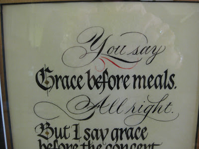
At every Black Sabbath class we painstakingly ground our black Chinese stick ink, and occasionally used Chinese vermillion for electric red accents.  With this piece I wanted to stay faithful to that.  I had originally planned to illuminate the "G" but in looking at my roughs, Linnea encouraged me to keep it simpler.  The diamonds on the G and B are gilded.

When Sheila Waters was in town earlier in the year, she had shown us her latest work on Pergamanata paper, singing its praises and vellum-like qualities, in particular the easy correctability.  I decided then and there it must be the paper for me, and although it took some getting used to, I am now a devoted fan.  It is not at all as mottled looking as in the scan above, and it seemed able to take endless scraping and erasures without complaint.


As I said, there was a deadline involved and with understanding friends and a supportive spouse, I holed up in the studio for days, finally coming through with a piece I could live with, then cutting mats for it and popping it into a frame for the show.  I'm looking forward to seeing my classmates' work and getting together one last time;  we've all come a long way in 4+ years and there is some amazing and varied talent in the group.  It's been a great run and I'm very sad it's over.

Once Upon an Island

The work in progress...
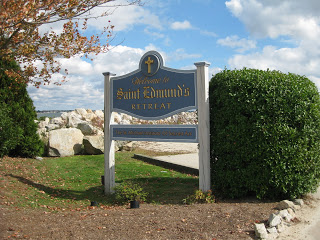
It was an impulsive and fortuitous decision, clearly meant-to-be:  just a week ahead of time, I put in motion a plan to attend a workshop at the St Michael Institute of Sacred Art entitled "The Decorated Page", taught by the incomparable Harvest Crittenden, herself rather decorated as a Master Penman and Master Engrosser.  I had blocked out a week's vacation--the same week I had gone to the Spencerian Saga the last two years, but I had done a third West Coast Saga in April this year in Berkeley--and had not been able to come up with something that appealed to me to do.  Then I woke up one morning and the plan seemed to have fully formed itself in the night:  Enders Island, Mystic, Connecticut.

A few emails and phone calls were made, and before I knew it I was on a plane bound for Providence, armed with my left-handed nibs and some delicious anticipation.  Any picture I had in my mind was pale compared to the real thing:
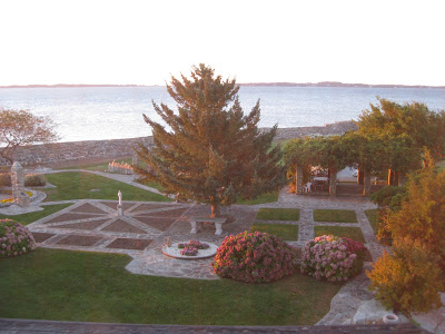
Enders Island, Mystic CT
It was sheer magic from the moment we arrived.


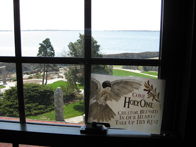
This was the view from my room, the first morning at sunrise:


Autumn was in its full glory and I gratefully got my "fix" of fall color.  This was taken on a walk in a nearby neighborhood.


Add to this some fantastic meals and a whole island of friendly people, and the stage was set for an incomparable experience.

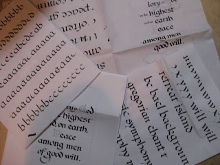
The first two days were spent studying the work of local hero Angelo Rassu, (a mid-20th century engrosser whose amazing collection is housed on Enders and curated by Harvest--stay tuned for her forthcoming publication on him!); practicing Engrosser's Text (new to me, not to be confused with Engrosser's Script!) with a broad nib;  laying out our text designs; and finally, putting the lettering onto the page Harvest had prepared for us with the outline of the border design.


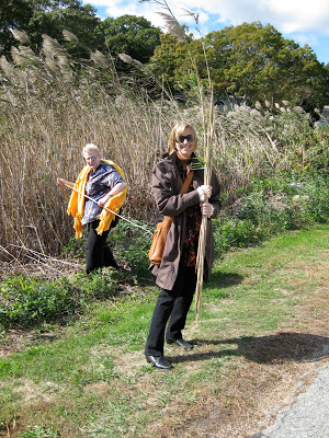
Next we learned to apply gold and palladium leaf.  This included a field trip to a nearby marsh to collect reeds to cut into tubes with which to moisten the dried Instacoll for receiving the leaf.


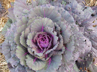
With the gilding beautifully in place, we then were extensively schooled in color theory--specifically Harvest's fabulous CMYK primary palette--and set about creating our colors, hues and shades.  I was drawn to the seasonal decorations in front of the main building (where our scriptorium was housed) which included this ornamental kale...


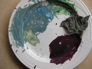
...and became, with much tutelage from Harvest, this palette of gouache.


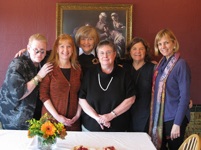
Thus began the Painting of the Acanthus Leaves, a relaxing and pleasurable activity accompanied by Gregorian chant from the workshop upstairs, and/or conversation  (oh, and some SF Giants radio baseball, too, couldn't help myself!)  among the most simpatico group of women I have had the pleasure to be in a class with.


Some of us worked into the wee hours and all enjoyed every minute.  Here are some of the "raw" painted leaves:


...later shaded and outlined to make them "pop", along with some tooling on the gold.  The illuminated G includes a traditional white vine design.


It is difficult to express how enlightening and restorative those few short days were for me. The place, the people, the art.  In some ways it felt so personal and inward that it is daunting to attempt to put it into words.  I can't say enough about Harvest's teaching: she is thorough, original, imaginative, attentive and flexible---and it goes without saying that her artistry is magnificent inspiration.

I don't know if I'll ever finish this piece, or whether it would even be possible to know when it was finished.  But maybe that's the way to keep the essence of the experience alive for myself.  It's a wonderful reminder that in this era of instant gratification and 24/7 access, one can delve deeply into something for an entire week and know that it has only just begun.