Birthday Central

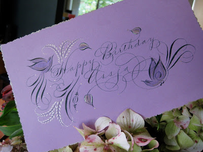
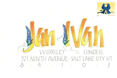
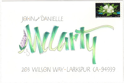
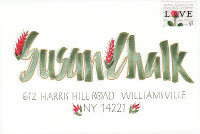
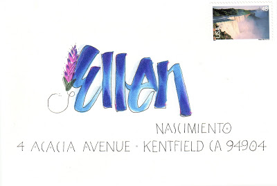
Having just finished a wedding envelope job with a lovely forest green ink, and envious of those who were able to attend some of the wonderful flourishing classes offered over the summer, I decided to try my hand and move into Autumn with a greeting for a fine colleague. The ink is Bill Lilly's recipe of Pelikan 4001 with the addition of powdered gum arabic, brilliant green with a few drops of black. Also some Spectralite nickel, Twinkling H2O copper, and pastel pencils. So nice to be back in the studio!
Buncha Uncial
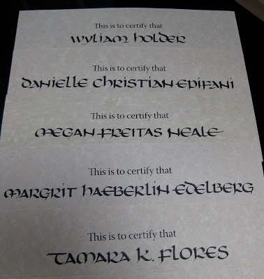
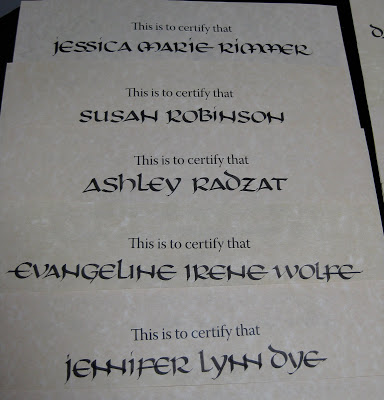
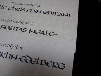
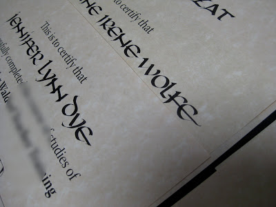
There's a local institution that asks me each year to inscribe their graduates' names on their diplomas. The first year, I was given a sample of their previous calligrapher's work, which was a very bold Uncial hand. I thought it was a bit odd for a diploma, but have come to appreciate how it goes with the rest of the document (which I'm not showing here, but take my word for it...). Now I have lots of fun playing with letter variations, "to-dot-or-not-to-dot" (a point on which Ward Dunham and Sheila Waters will forever disagree), and how to squeeze some of those very long names onto the page with this expansive hand.
One solution is to overlap letters---love the double-double-Ns.
Thoroughly Modern Mark Making
Well, here's a new take on a calligraphy tool! This is a representation of about 45 minutes worth of work on my laptop, every trackball movement and click, as recorded by a cool little (free) app called IOGraphica.
What if I put a frame around it, courtesy of the Graphics Fairy?
Here's about an hour's worth of work in Photoshop with the cordless mouse; I'm obviously a little more agile with that:
And here's about two hours of random work, doing finances, looking at blogs and answering emails.... how long would it take to fill up the whole page?!?

Kind of a new-age Etch-a-Sketch! Fun to play around with, but don't think I'll be giving up the pen and ink just yet...
Which Way is Up?
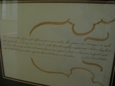
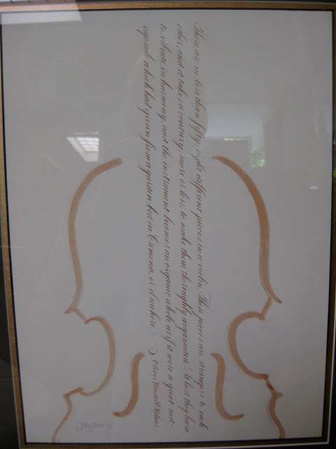
This is a piece I did a while back that continues to puzzle me. I originally designed it and hung it this way:
...which makes it easier to read. In fact, another version of it was published in Somerset Studio magazine in the Fall of '05 and they oriented it this way as well.
But then...I lent it to a show for charity, and when I walked in it had been hung this way:
...which I kind of liked. No so readable, but the texture is nice and maybe more interesting.
What do you think???
New Year Anytime
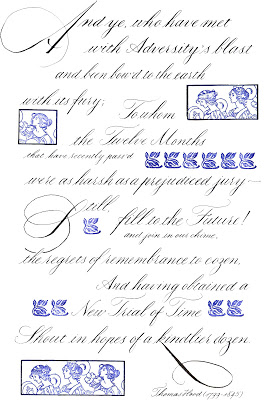
I sometimes wish friends a happy "personal new year" when they are celebrating their birthdays. But I got to thinking, why stop there? When things haven't been going well, can't we just hit the figurative reset button anytime, return to "Go", tabula rasa? This was my first in a series of New Year's cards, but now that I look at it, the "Twelve Months that have recently pass'd" could be anytime. "Still, fill to the Future!...Shout in hopes of a kindlier dozen."
Full text of the poem:
And ye, who have met with Adversity's blast
and been bow'd to the earth with its fury;
To whom the Twelve Months that have recently pass'd
were as harsh as a prejudiced jury---
Still, fill to the Future! And join in our chime,
the regrets of remembrance to cozen.
And having obtained a New Trial of Time
Shout in hopes of a kindlier dozen.
Thomas Hood (1799-1845)
Pretty in Pink
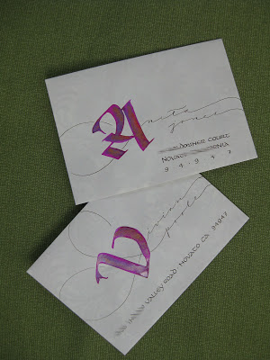
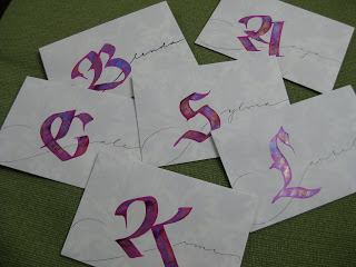
Still riffing on Judy Detrick's wonderful "Decorated Caps" class for the Friends of Calligraphy a while back! For these I used my largest broad nib and drew the letters in J. Herbin cyclamen ink, then dropped in my old standby, Spectralite 56K gold (which conveniently comes with an eyedropper installed).
After the letter was dry (sometimes with a little paper-towel wicking to take away the puddles) I added the rest of the name with pointed pen, full bleed.
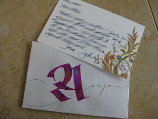
Thank goodness for thank-you notes, which give me a great excuse to play!
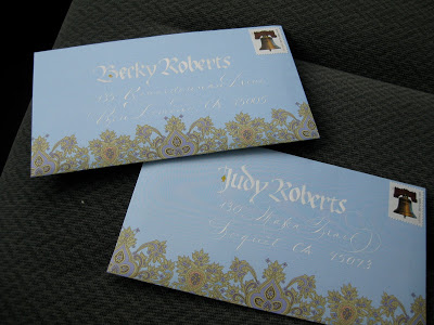
As always, a beautiful notecard helps to inspire...
Mail on the Seat #2
Stationery © Wooster & Prince Papers Inc
I picked this notepaper up at the wonderful Paperwhite on Kentucky Street in Petaluma. I just love paisley, and there's nothing like a beautiful design to motivate me to get out the pens and ink!
Letters of Note(s)
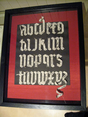
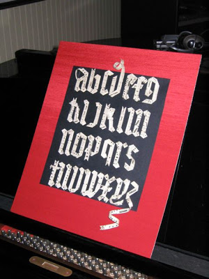
I was browsing through gothic exemplars one day and found a picture of a woodcarving where the letters looked as if they were made from ribbons. I started wondering if that were possible. Some antique sheet music pretty much jumped into my hand and let me cut it into strips, and then the fun began, twisting and folding and gluing. I made the curls by winding the paper around a pencil for a few minutes, then tacking it in place.
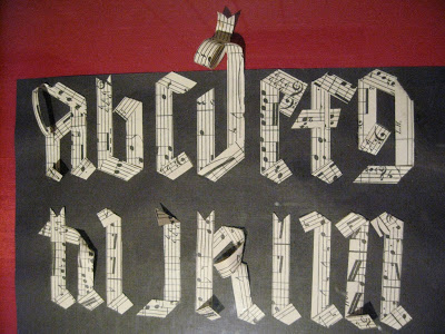
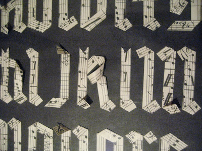

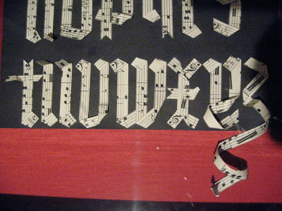
For me this piece was symbolic because right around that time I had decided to give up a longtime musical career, which had floundered for lack of enthusiasm, and pursue calligraphy as my artistic outlet. I've never looked back! (Thanks, Carole, for the photos!)
Flock o' Placecards
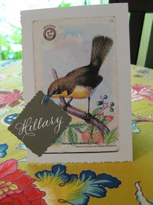
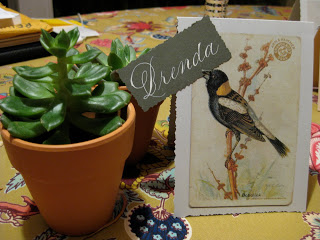
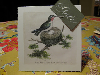
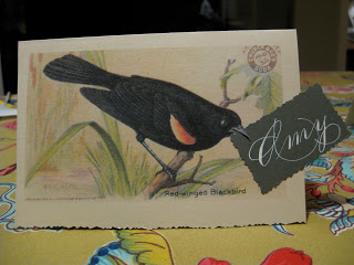
I seem to be on a roll here with placecards, party favors and the like. But they're fun, easy and usually a lot of bang for the buck. Borrowing (okay, stealing!) an idea from Martha Stewart's "Messenger Birds" and using images from 19th century Arm & Hammer bird trading cards, mostly found on the wonderful Graphics Fairy blog, I put together these placecards/thank you notes for a luncheon at work.
According to the Arm & Hammer website: "This early promotion was a hit and lasted, in various forms, for five decades. The first ARM & HAMMER® cards, 2X3 inches in size, were entitled "Beautiful Birds of America". These cards showcased talented artists and they promoted the importance of preserving our environment."
The ink is McCaffery's ivory. Word to the wise: the ink was still tacky and the cards stuck together when stacked, even after drying for twelve hours! Luckily, no harm done.
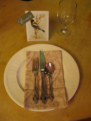
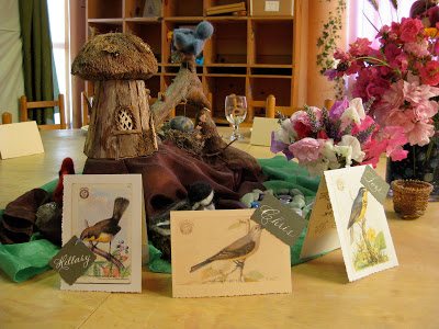
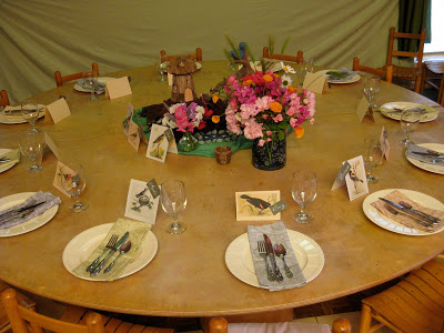
What fun it must have been to find one of these in your box of baking soda!
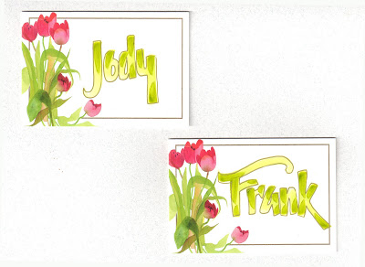
Paintbox Placecards
Paintbox Lettering
More Gothic Gratitude
"Toscana Fruit 4 Color Flat Paper"©K&Company, LLC
I am fortunate to work at a school full of wonderful and very generous families. At the end of the year they sometimes surprise the staff with gifts of "greenery". Rather than trying to write 40+ individual thank you notes, I like to make something a little special, reproduce it onto a nice background, and give one to each family. On this one I was playing with ragged edges and line spacing as tight as I could make it.
I am fortunate to work at a school full of wonderful and very generous families. At the end of the year they sometimes surprise the staff with gifts of "greenery". Rather than trying to write 40+ individual thank you notes, I like to make something a little special, reproduce it onto a nice background, and give one to each family. On this one I was playing with ragged edges and line spacing as tight as I could make it.
Stationery Portfolio - Tutorial
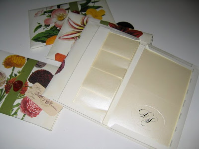
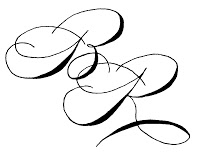
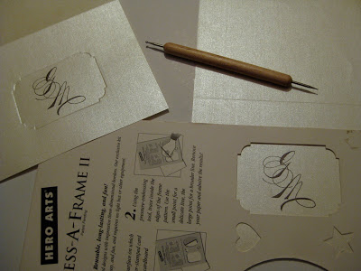
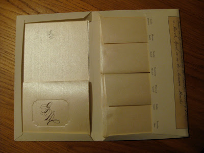
In my never-ending quest to find excuses to spend time at the calligraphy table, a few years ago I came up with the idea of making monogrammed stationery for my friends and colleagues for the holidays. The monograms are sketched quite large in pencil, then scanned and cleaned up in Photoshop Elements. Here are a couple of samples:
I bought paper (and matching envelopes) with a semi-gloss finish and after cutting it to size, ran it through my inkjet. Because of the surface, the ink was still wet as each page came out, so there was time to sprinkle it with clear embossing powder made for use with rubber stamps. After tapping each to remove the extra powder, I set them all aside and then zapped them one-by-one with the heat gun, creating a raised surface over the printed monogram.
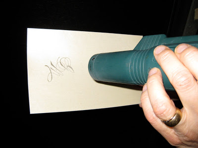
Presto! Home thermography.
I added a blind-embossed oval by hand and scored the notes at the fold.
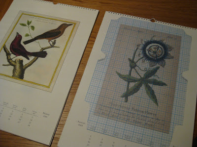
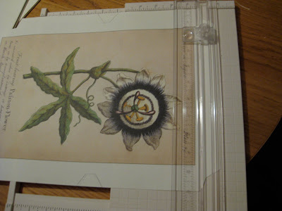
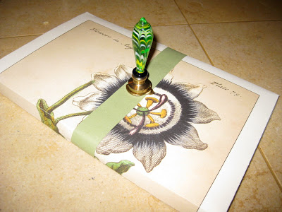
The folios are cut from old Cavallini calendar pages with a template I designed (you could take apart and trace an old stationery folio for this).
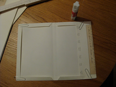
The folds are scored, then glued and clipped in place to dry.
Then the notes and envelopes are loaded inside...
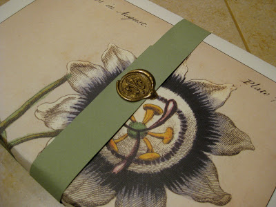
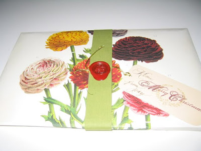
...and the folios are finished off with paper strips and embellished with sealing wax.
Add a tag and you don't even need to giftwrap.
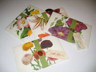
Personalized, thermographed sets of stationery for little more than the cost of the paper!
"No" is a complete sentence!
Upcycled Party Favors, Upbeat Party
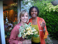
After a several-year hiatus, we finally were able to re-convene, and add to, our group of "Spring Birthday Ladies", which along the way has expanded to include "Honorary Spring Birthday Ladies", meaning pretty much anyone with a birthday and an evening to spend celebrating ourselves.

Though most of us are half-century-ish in age, the group ranged from 24 to 84! It was an extraordinary group of women who inspire me just by being.
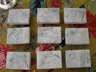
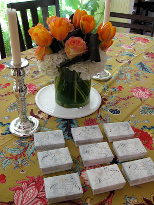
For party favors I wrapped the lids of these boxes in some old stationery after doing a little quickie Spencerian and offhand flourishing. I used Bill Lilly's Pelikan/powdered gum arabic recipe for the black, and Spectralite gold for the flourishes. Though the box itself was the favor, I tucked a little bar of soap into each one to make sure no one was disappointed by an empty box!
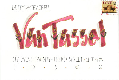
You've Got Mail
Capitalizing on Caps

Last Saturday I took a Friends of Calligraphy workshop with Judy Detrick, whose work I've long admired but whom I had never met. It was titled "Decorated Caps" and was a fun bouquet of techniques we were given to apply to our own letter designs. The Vs above were probably my most successful experiments.
We started by designing a letter and tracing it onto nice paper, then filling it in with gouache to get a feel for the medium.


For transferring the image to its final destination we used a reddish-brown powder called Armenian bole rubbed on the back of the tracing paper; it was magical and worked really well (and looks suspiciously like a makeup product sold in little terra cotta pots called Indian Earth, very big in the late 60s/early 70s). Seems like there's always some new (to me) "must-have" in the calligraphy/design world!
We experimented with framing the letters and filling them in with patterns.
West Coast Saga
The first-ever West Coast Spencerian Saga with master penmen Michael Sull and Bill Kemp concluded over two weeks ago, and I'm still digesting it all.
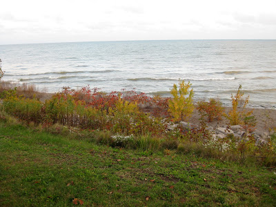
It was a completely different experience from the longstanding Geneva-on-the-Lake Sagas, which are retreat-like in nature, held at the beautiful Lakehouse Inn on the south shore of Lake Erie in October when the air is crisp and the leaves are turning. Platt Rogers Spencer himself lived, taught, and is buried in Geneva.
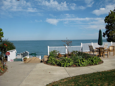
 In April the Berkeley venue, Castle in the Air, is busy, lively, and very connected to the Fourth Street goings-on, with lots of great places to eat and shop during breaks from the pen and ink. Art seems to be in the very air there. And... just a twenty-minute drive across the Richmond bridge from my house!
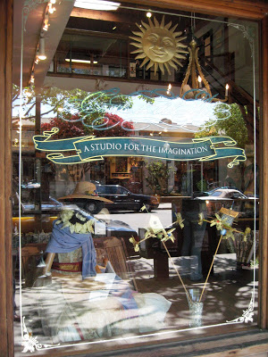
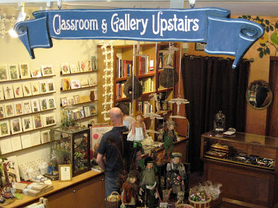
Both experiences are awesome: the former rich with penmanship history and the latter showing Spencerian's relevance in a contemporary setting.
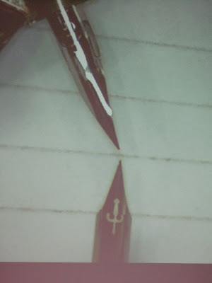
Bill's digital overhead projector enabled this kind of detail! Sure beat struggling to watch over someone's shoulder. This is a comparison of the Nikko G and EF Principal nibs...
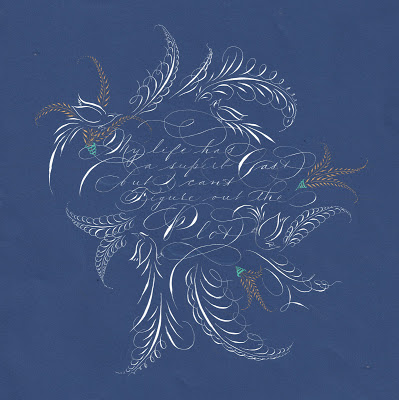
At the top is my final project: My life has a superb cast, but I can't figure out the plot, a quote I love and neglected to attribute to Ashleigh Brilliant. The script is Spencerian, of course, in Dr. Ph. Martin's Bleedproof White with embellishments in Spectralite gold. I used an EF Principal for the text and a Nikko G for the offhand flourishing.
Castle in the Air has published all of our final projects on its blog. I was amazed at the variety and ingenuity as the participants--who ranged from first-timers to twenty-year veterans, hobbyists to seasoned professionals--showcased the variety of techniques we had learned during the week from . It was a fun and lively group!
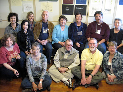 And the entire week we had the strangest feeling someone was watching us...
