Eleven for the Class of '10

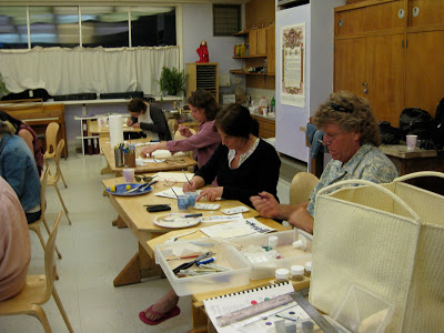
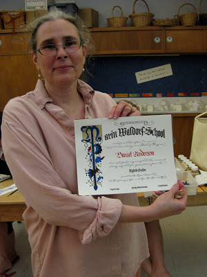
Last weekend I met with the parents of Marin Waldorf's Class of 2010, while the students were on their eighth grade trip, to help them paint their children's diplomas. This one is all new elements (sometimes I re-use pieces from year to year, see the older ones here) and I'm kind of tickled with my first curved masthead and the little ribbon banner at the top. The lettering is Spencerian and blackletter.

It was an enthusiastic, talented and focused group! We had ten of eleven families represented, so one parent worked on two diplomas.


It was really fun to hear the conversation as snippets of news about their children were shared.


Notice the poster in the background above: a gloriously engrossed and illuminated poster of the Gettysburg Address! A little unexpected inspiration.


I wanted a picture of each painter, but my camera battery didn't cooperate. Everyone did a great job and I think they look beautiful!

Walnut-Covered Chocolate

This was a homework piece for Ward Dunham & Linnea Lundquist's monthly "Black Sabbath" class at their wonderful studio, Atelier Gargoyle. The assignment was to write one word all in Gothic caps--something you'd probably never want to do in the real world. It was an exercise in spacing, and legibility be damned! Considering my choice of word, walnut ink was the obvious medium.

Brush Lettering

When I'm ready for a break from dip pens and ink, I find that brush pens are fun, easy, and eminently portable. I used to use the old Zig markers, though they don't seem to be around anymore...but the Tombows seem to stay juicy longer anyway, and have a nice fine tip on the other end that's good for outlining. I've used them for all kinds of signage. This one was an idea for a Western-themed fundraiser logo.

Graduation, Illuminated: Diploma Tutorial

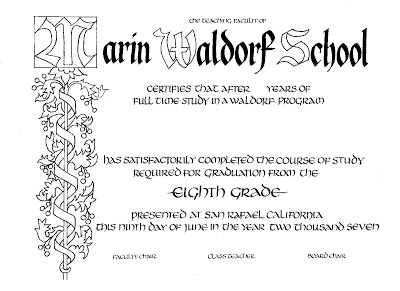
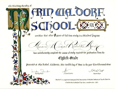
One of my first projects after taking an awesome illumination class with Bill Kemp at Castle in the Air in Berkeley back in 2004 was to design a diploma for my son's eighth grade graduating class at Marin Waldorf School. Since there were only nine graduates that year, I was able to hand paint each of diploma after printing the basic wording and design on my inkjet and inscribing each student's name. The illumination design here is Bill's from the class; I just changed a "W" to an "M".

Word got around, and the next year's class requested a diploma, but I didn't have time to paint them all myself--so I decided to enlist the help of the parents by giving a mini-class in illumination around my kitchen counter.

The end result:
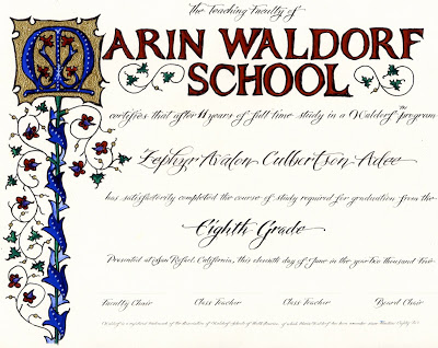

Now it has become an (almost) annual tradition for the parents to gather--often while the class is on its eighth-grade trip--and sometimes they "do it up" with a potluck dinner as well. Groups have ranged from four to about twenty. Each parent paints his/her own child's diploma; if a parent can't attend, usually someone in the group will take on an extra one. It's a bittersweet time for these families who have devoted so much of themselves to the school, and who are preparing for their not-so-little ones to begin the high school adventure.

Although I do reuse some elements (usually cutting and pasting digitally), I try to make each year's diploma unique. For Marin Waldorf School, I'm always on the lookout for versions of the letter "M" that will work in this context.

Here is what we start with, printed on diploma parchment or any kind of nice heavy-ish paper that is smooth enough for me to calligraph the name, and sturdy enough to hold up to the gouache with which we will paint it:

Before meeting with the parents, I inscribe each student's name and cover it thoroughly with post-its to protect it during the painting process.

I prepare a bookmark-sized color key, and copy one for each painter/parent. I like to use pencil because it shows the shadings better, and doesn't "give away" the full effect of the deep-toned gouaches.
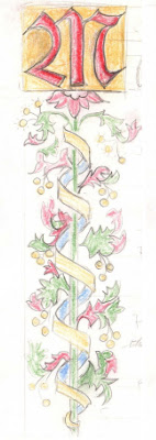
Provided for each participant:
  • palette
  • size 00 or 0 brush
  • black gel pen
  • water cup
  • cardboard cushion
Shared among the group:
  • gouache in red, blue, green, and purple
  • Windsor-Newton gold ink
  • several burnishing tools (bone folders or backs of spoons will work too)
  • several embossing tools
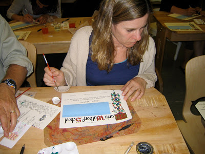
We start by painting the gold background for the illuminated letter. Each coat, as it dries, is burnished. It usually takes about three coats, burnished after each one, until the gold looks opaque. The gold is then "tooled", or debossed, in traditional designs. Next we paint the colors in gouache, following the key card (or not--always a rogue in the group!). Shading is added in slightly deeper tones, and finally everything is outlined carefully in black with a fine point gel pen to set if off and define the design.

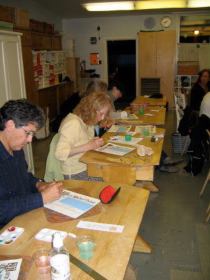
This was a large group, so we used a school classroom. Great concentration!


And the final product:

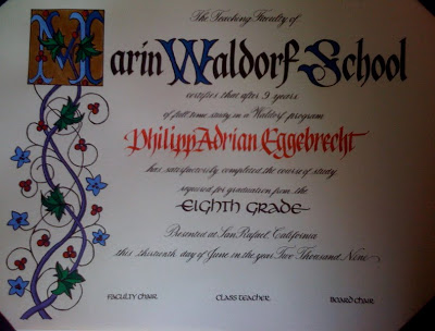
Here is the most recent edition (sorry for the camera phone photo):


The finishing touch is a diploma cover, which can be purchased for under $5 each. For a few more cents you can even add a tassel! The diplomas are then taken to the appropriate "authorities" to be signed and made official.

It is important to stress that this is about a four-hour process, and because of the specialized tools, materials and instruction involved, is not a take-home project. It's not always easy for busy parents to set aside this much time! But well worth it.

Placecards and Pavlova


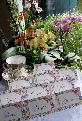
It's Easter Sunday and we're going to brunch later today with our dear friends; as usual my contribution is placecards.


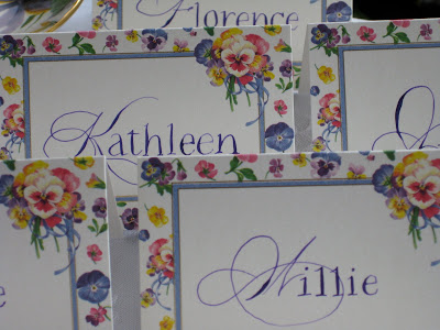
Once again I've mixed styles: Spencerian for the cap and pointed pen Roman miniscules for the rest of the name. I like the playful look. The ink is J. Herbin Violette Pensee´with some Twinkling H2Os mixed in.


There's a "regular crowd", but I'm always happy when our hostess invites a new "letter". Haven't had an "F" or a "W" in a while!


This year, I'm bringing dessert, too: Pavlova with strawberries. Off to the Farmers Market for the freshest berries to put on top!

Copperplate Goes to Washington


My storyteller friend Anita had a dream: to tell an African folk tale at the Presidential Inauguration in January of 2009. She had been a passionate campaigner for him, and she wanted to do everything she could to get Obama's attention to her proposal. So she asked me to address an envelope to him and do some offhand flourishing on the folder that contained a copy of the story.
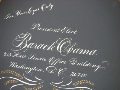
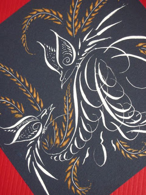

I believe the envelope was actually a "Presidential blue" color, not black as it appears here. The script is Copperplate, or Engrossers' Script; the inks are Dr. Ph. Martin's Bleedproof White and Spectralite gold.


I did three different outer envelope styles and let her choose. This is the one that went to Washington...


...but alas, no response! But as Anita's grandma told her, "The only failure is not trying!"

Have Tag Will Travel (Tutorial)


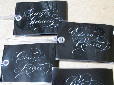
A nice sturdy luggage tag is a big help when you’re trying to recognize your suitcase among all the others. It’s essential if your luggage is lost or misplaced, but it’s not a good idea to have your address readily visible. These tags proclaim the owner loud and clear, but keep contact information tucked inside yet accessible when needed.

Luggage tags were my go-to holiday gift this past season, and people really seemed to like them and want to know how to make them, so here they are.

Materials & Tools

  • black (or any deep color) paper, not too heavy, cut 3” X 10½”
  • x-acto knife and cutting mat
  • ruler
  • pen and white ink or gouache (I used Dr. Ph. Martin's Bleedproof White)
  • ¼” hole punch
  • blank white stickers, approximately 2 ¼ “ X 3 ¼ “ (I used Staples name badge labels)
  • ¼ “ (6 mm) eyelet kit (I used Dritz from Jo-Ann Fabrics)
  • hammer
  • sticky-backed Velcro dots (found these at Jo-Ann’s and at FedEx Office). Alternatively, you can purchase larger pieces and cut them to size, as long as they’re self-adhesive.
  • plastic loops for luggage tags known as “worms” [at office stores they usually come in packs of 25 along with laminating pouches (pouches are too small for this project), but they also are available separately in packs of 100 online at http://stores.ebay.com/Pouch-and-Coil__W0QQ_sidZ3406767?_nkw=worm&submit=Search]
  1. Lightly pencil in vertical dotted lines to define writing area. These lines will also be scored after laminating. Do not fold yet!
  2. Calligraph name in glorious Spencerian, slightly to the right in the space to leave room for the eyelet.
  3. Take to office store, (i.e. Staples or FedEx Office) and have laminated with 5 mil film. Three mil would also work but 10 is too thick to fold.
  4. Trim lamination close to paper all around, leaving about 1/16” to 1/8” of film. Optionally, trim corners (I use a corner punch for this).
  5. Score firmly along penciled lines on front (side where name is written).
  6. Fold shorter (2 ½”) side toward back and punch hole as shown through two layers.
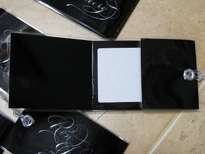
  7. Place sticker on back of tag directly opposite name inscription. It will be on the inside of the luggage tag.
  8. Insert eyelet through both holes so that it holds the fold in place. (You may need to widen the hole a little by pushing a pen or pencil through it.) Use tools (“anvils”) that come with eyelets and secure with hammer.
  9. Fold longer (3 ½”) side and tuck under shorter side. It will probably stay in place as is, but will be more securewith Velcro dots attached.
  10. Loop “worm” through eyelet as shown.

End-of-an-Era Envelope


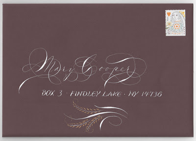
This was the last envelope I sent to a dear old family friend before she moved from her lakeside home of sixty-five years to a high-rise retirement community on Lake Erie---where, by all reports, she is having a blast. I can hardly imagine Findley Lake without her. I would see her during summers my family spent at the lake, and we corresponded regularly the rest of the year thoughout my childhood and beyond. She still writes me long, "newsy" letters, as she calls them, at least a couple of times a month, in hand-addressed envelopes, of course. I try to reciprocate in kind.

The script is, of course, Spencerian, and the blocky lettering is after a style (unnamed?) designed by the inimitable Michael Sull. The ink is Dr. Ph. Martin's Bleedproof White, with the cartouche detailed in Spectralite gold. And of course, the Queen of Hearts stamp is perfect.

Nibs to the Highest Bidder


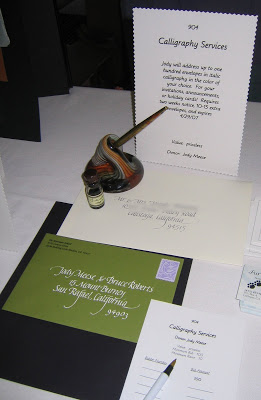
Seems like for a while there, every school and sport my kids were involved with was soliciting donations for silent auctions. Another successful item was simply offering to address a hundred envelopes--invitations, announcements, or holiday cards. Good practice for me, a little cash for the school. This was the display set up at the fundraising event. The green envelope is done in Dr. Ph. Martin's Bleedproof White, the ecru envelope in J. Herbin Nuages Gris. Both are Italic hand.

Mission (Statement) Accomplished


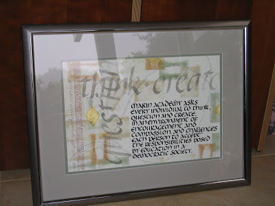
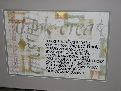
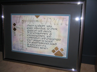
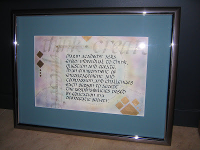
The mission statement at my kids' alma mater, Marin Academy, is oft-quoted and central to the life of the school, so it seemed like a good idea to render it calligraphically for an auction item at their fundraiser a few years back. It's a potpourri of Uncial, Italic, Copperplate, my own scribbly handwriting, and some bits of stamped color and gold ink. The large Italic was done using my rinse water as ink. By cutting the mats myself I was able to make it fit into a stock frame size, which saved custom framing costs.

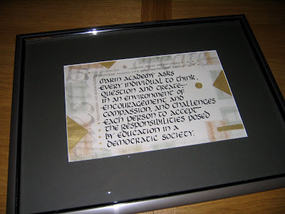
I don't remember exactly how much the piece went for, but it was a respectable sum. I was later asked to make a similar piece as a tribute to the Head of School's tenth anniversary (two different mattings here, not sure which one we settled on)...


...and another to honor a founding Trustee.


Paperweight of the World


I'm always looking for little gifty ideas that involve calligraphy, and this was a pretty simple one. I purchased crystal dome paperweight blanks, which come with pre-glued felt ready to finish off the bottom. A few strokes of the pen with walnut and gold ink, a pretty coin from Buenos Aires, and I had a little keepsake to give a fellow traveler. The same company sells glass coaster blanks as well.

Grandes Dames de la Musique


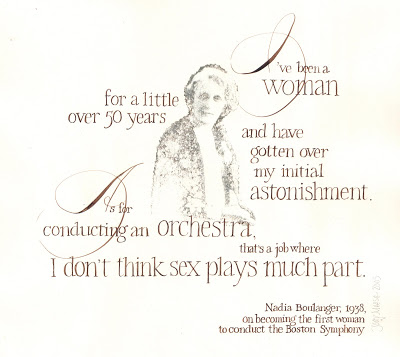
Quotations from these two remarkable women, both female orchestra conductor pioneers in the 1930s, inspired pieces that celebrate their talent and wit. The photocopied images were transferred with xylene (though nowadays I would use Citra-Solv, which is less toxic and smells way better--see their artists' site with all kinds of amazing ideas here), and the calligraphy was done in walnut ink. The hands are copperplate and Roman miniscule. Both were done with pointed pen, and the originals are about 12" x 18".

Not Their Cup of Tea


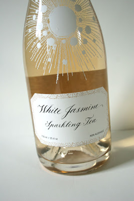
Every so often I am asked by a graphic designer to create some calligraphy for a commercial or corporate project or product. The designers always love the hand-crafted look but the clients...not so much. It would seem we've grown so accustomed to the "perfection" of the digitally rendered letter that it is rare for the look of real pen and ink to be appreciated. Here is a label I did that was pitched by the designer to the client but didn't fly....sigh...although, to be fair, neither did this logo created by the firm.

Mixing It Up Again


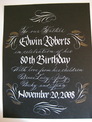
Here's another piece I did for the frontispiece of a family memory book. It is photographed rather than scanned, so the shape looks odd. Again, the contrast of two very different hands, one with pointed and one with a broad nib: this time Spencerian and Blackletter/Pointed Gothic/Johnstonian Italic. The little gold feathery flourishes are done with the pointed pen and Spectralite, a line of paint made for airbrushing. The white is Dr. Ph. Martin's Bleedproof Ink.