The Magnolian Hand


I've never looked at nature quite the same since attending the Spencerian Saga in Geneva-on-the-Lake, Ohio. It was there I learned that Platt Rogers Spencer himself took his cue from the oval shapes of the stones he found on the shores of Lake Erie to create the lovely and lively ornamentation of his Spencerian hand. According to Wikipedia, "...because paper was difficult to obtain at the time, Spencer wrote on birch tree bark, sand, ice, snow, the fly-leaves of his mother's Bible and, by permission of a cobbler, the leather in his shop."

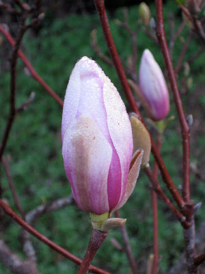
Surely these about-to-burst magnolia blossoms in my front yard this morning could inspire some lovely letterforms! If nothing else, they say that Spring is surely on its way.
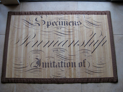
Bickham on Bamboo?


Look what I found yesterday in Columbine, a little local gift shop! It's a bamboo floor mat about 2' x 3' in size, made for indoor use. There's another design you can see here. Presumably the artwork is taken from the cover of a handwriting text (unfortunately the binding partially obscures the last word, "youth"), could be Bickham Sr. or Jr., (or any number of other penmen) and features pointed pen, Roman, and blackletter styles blended artfully and flourished beautifully. Perfect for my studio!

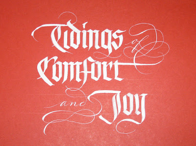
This Year's Runner-Up


Though I seem to be in a New Year's card groove, I've always loved this snippet of lyrics from "God Rest Ye Merry Gentlemen"--such a simple and universal wish. So when the November assignment at Ward Dunham & Linnea Lundquist's monthly Black Sabbath blackletter class at Atelier Gargoyle in San Francisco was to make a design with two or three seasonal words, I went back to this tried-and-true sentiment. To tie it all together, for the little words I took out my pointed pen and went for the ultimate contrast (blackletter--though in this case, whiteletter--and Spencerian), as Ward has encouraged me to do. ("Look to your Bickham," he says.) Guess I'll file this one away for a year when no inspiration strikes, or I break my shoulder again...

Spreading a Little Sunshine (Tutorial)


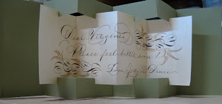
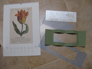
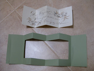
Our dear neighbor Virginia had some surgery recently and was feeling under the weather, and the weather has been gloomy enough for weeks. So I decided to make a card she could enjoy while she recuperates, using a simple format so it would stand up on her table. These used to be available for purchase blank, with the cuts and scoring for folds all done, but I haven't seen them for years. Luckily, before I used my last one, I had made a template with those sheets of gridded plastic quilters use.


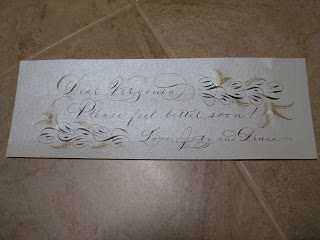
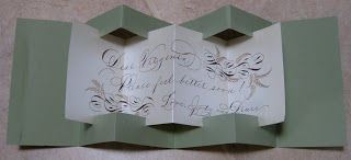
I wrote a simple message to her on the middle part in my best Spencerian, with walnut ink with gold details on the flourishes...


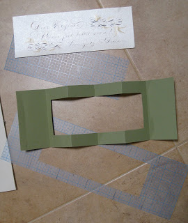
...then made the simple cuts and scored the folds for fitting it together.


I added a dab of sealing wax, tied it with twine and tucked it into pretty orchid from the farmers' market. Hope it brought her a little cheer!

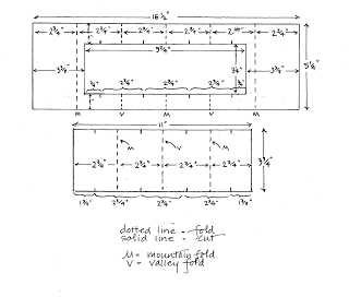
Here's a drawing of the template, with all the measurements.
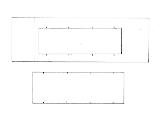
Or, you could just copy this and enlarge it--in theory it will work at any size. I've marked the cuts and the outside folds; the rest of the folds fall midway between the cuts. [Note: It might look as if you could use the piece you've cut from the middle of the frame for the other part, but you can't. It needs to be a little larger.]
Have fun with this !

Post of New Year's Past

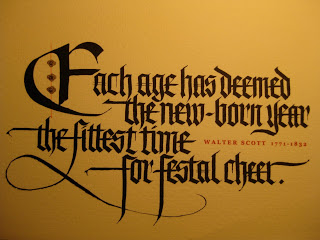
I missed 2009 (the card, not the year) because of a shoulder injury on my writing side, but here is 2008's edition. The Walter Scott quote is in Blackletter Textura, scanned and printed on the inkjet. The red line and gold ornamentation are hard to see in this photo, but were added to each card by hand.

Since my cards usually go out closer to Lunar New Year than January 1st, I like to give it a little shout-out. Oh-eight was a pretty good year considering it was "of the rat"!


The Year is Still New, and So Am I (at this)


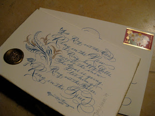
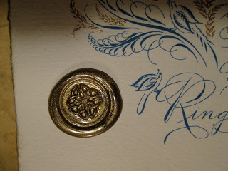
The ink is dry and my annual New Year's cards are in the mail. Finally. This year's features a piece of a Tennyson poem. I love the ending: Ring out the false, ring in the true! Amen to that.

The calligraphy is done quite a bit larger, scanned, and (full disclosure) cleaned up a bit in Photoshop Elements, then printed onto yummy Fabriano Medioevalis with my trusty inkjet.

I'm a realistic kind of gal: I don't even try for the holidays, and my cards been known to go out in May...but better late than never and all that, and what's so special about the Gregorian calendar, anyway? I like to give a nod to the Lunar New Year (okay, because it gives me a few extra weeks) and here's the back of the card:

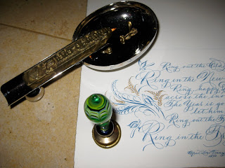
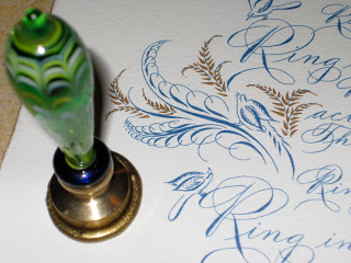
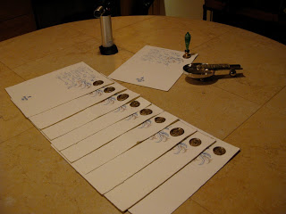
I tend to get way involved adding gold ink flourishes to the printed cards...

and using the best sealing wax ever from Atelier Gargoyle, in this case not to seal anything but as an ornament. It's "bullet-proof and almost post office proof,", say Ward & Linnea.


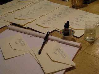
The envelopes are another part of the production line; the return address is printed from a scan of the calligraphy, and some gold ink touches are added.

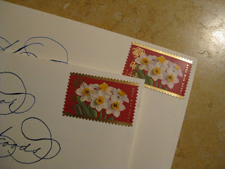
Finally, they're all addressed and ready for the gorgeous Year of the Tiger postage. Always nice when the USPS puts out a winner.

Now the best part: hearing from friends and family, who often call or email to tell me they've just received the card. That makes me and my New Year very happy!